
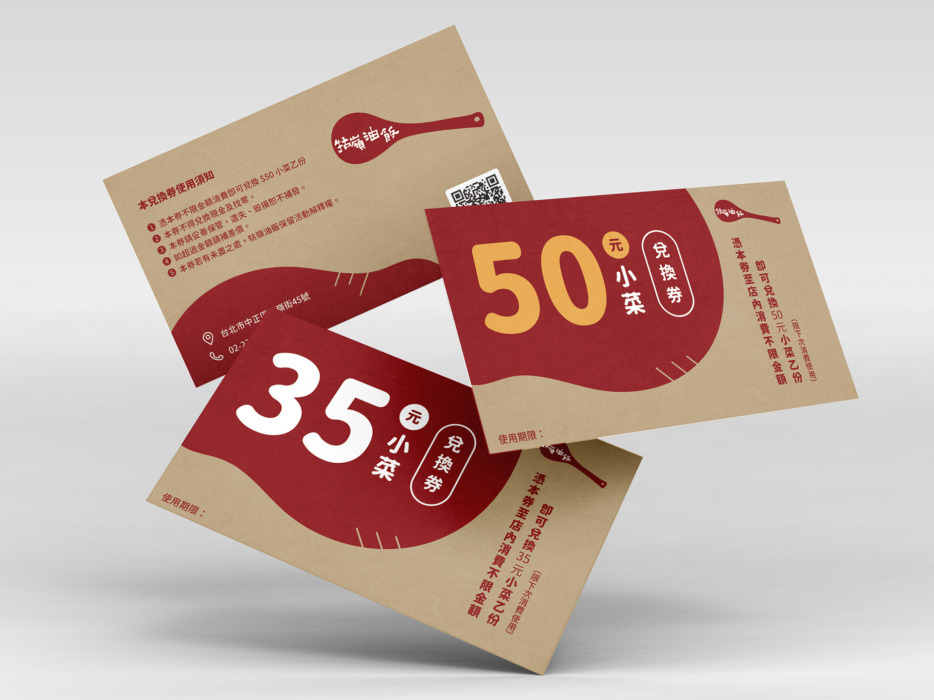
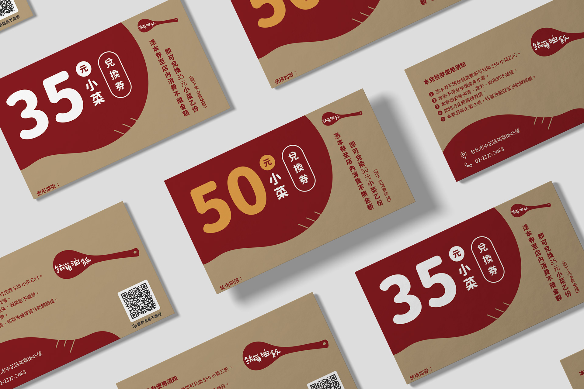
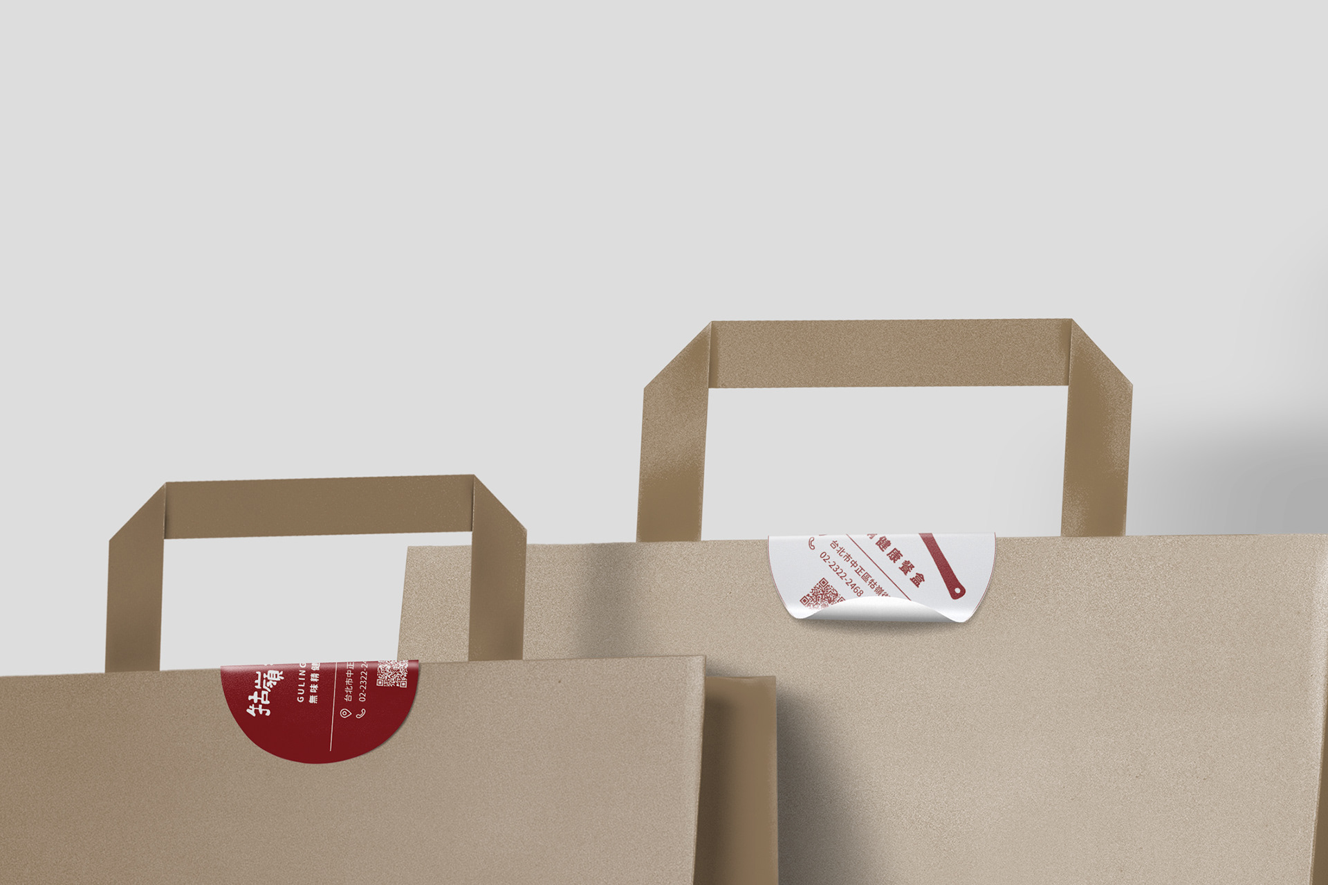
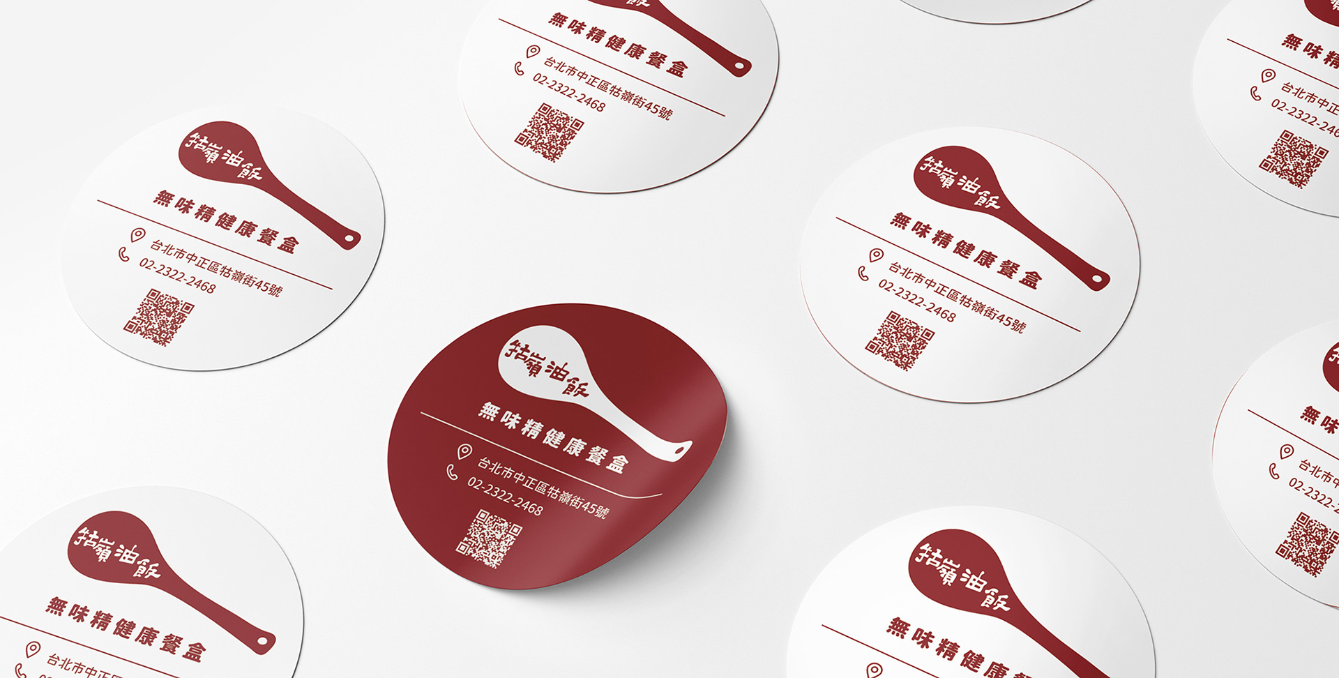
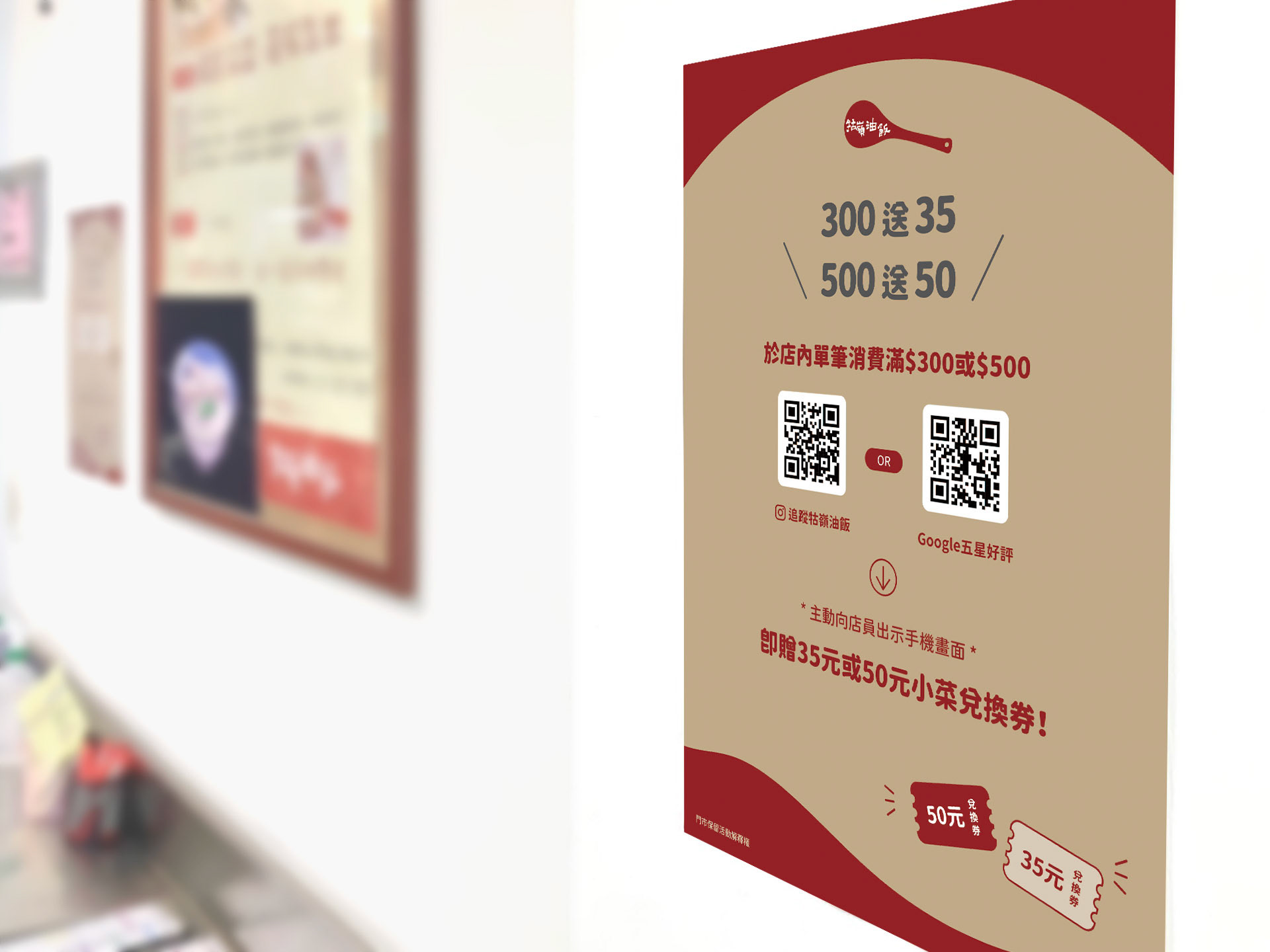
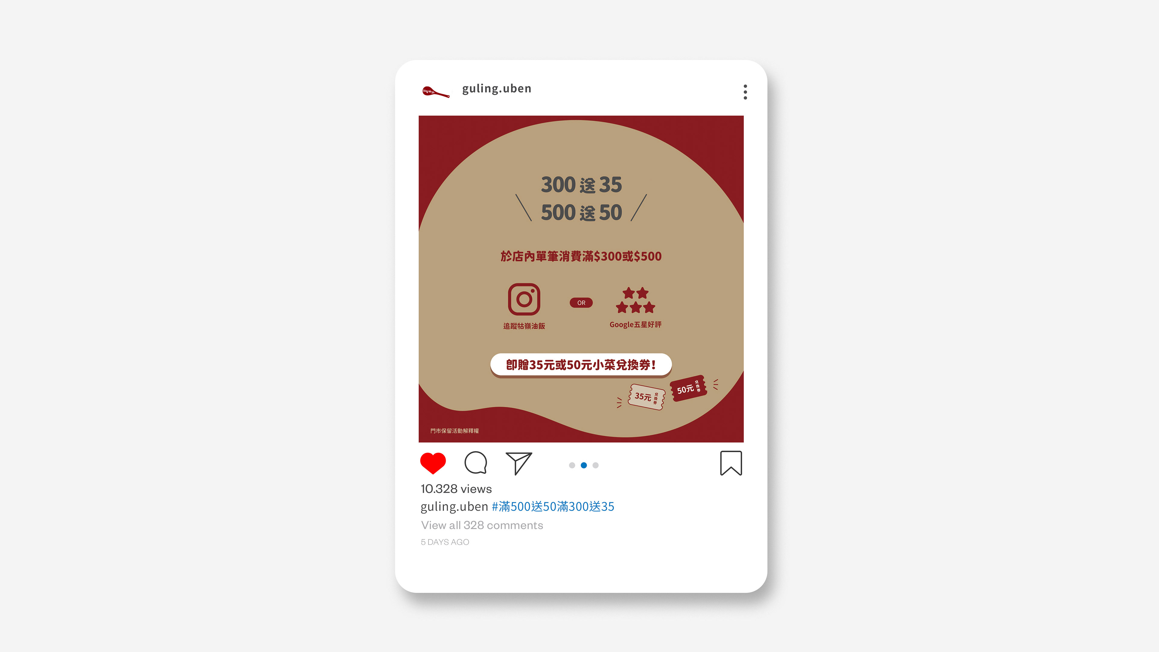
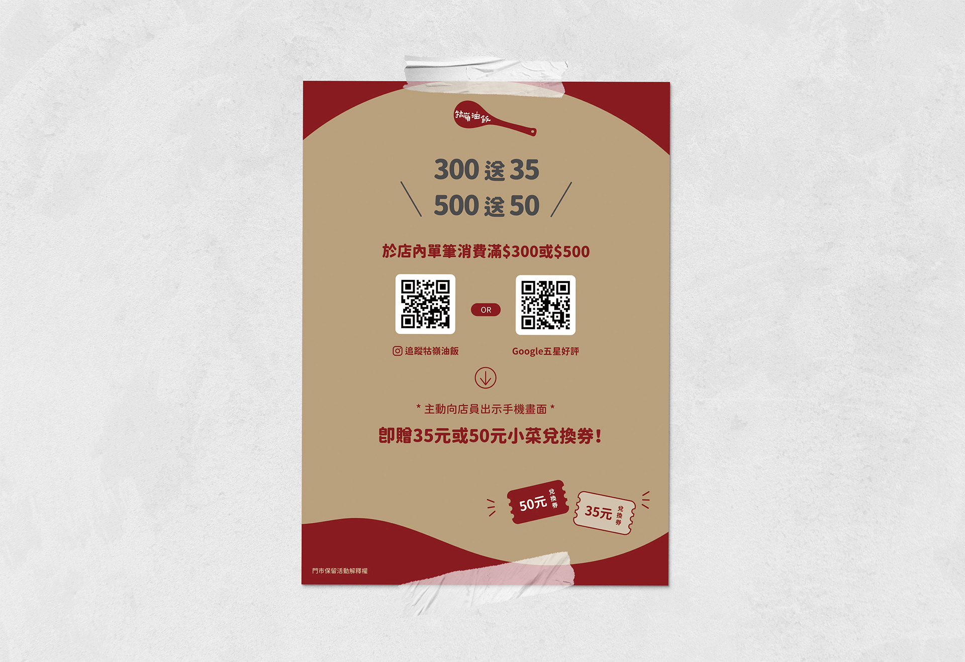
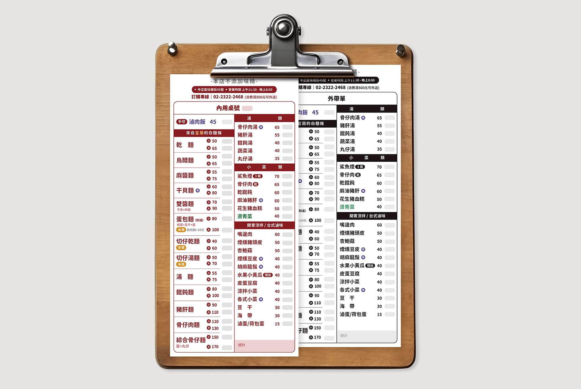
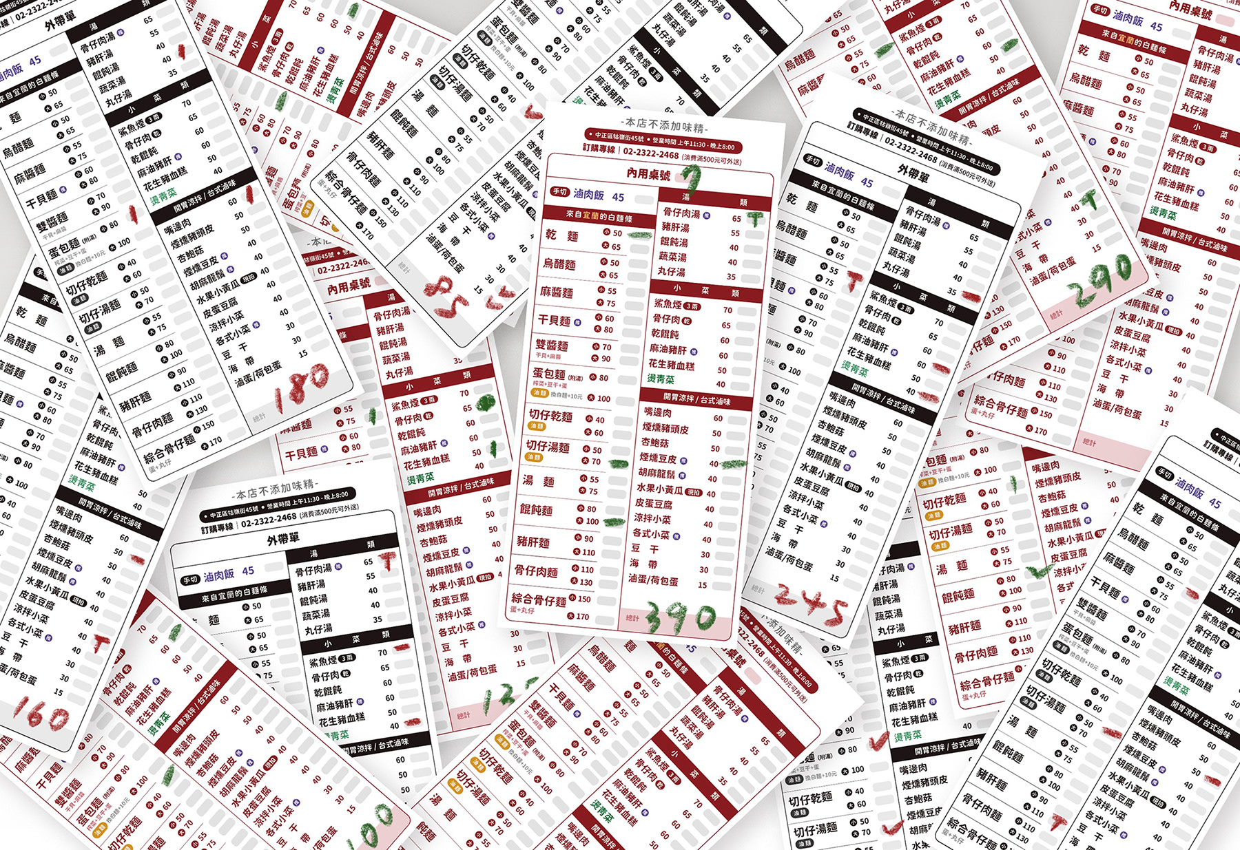
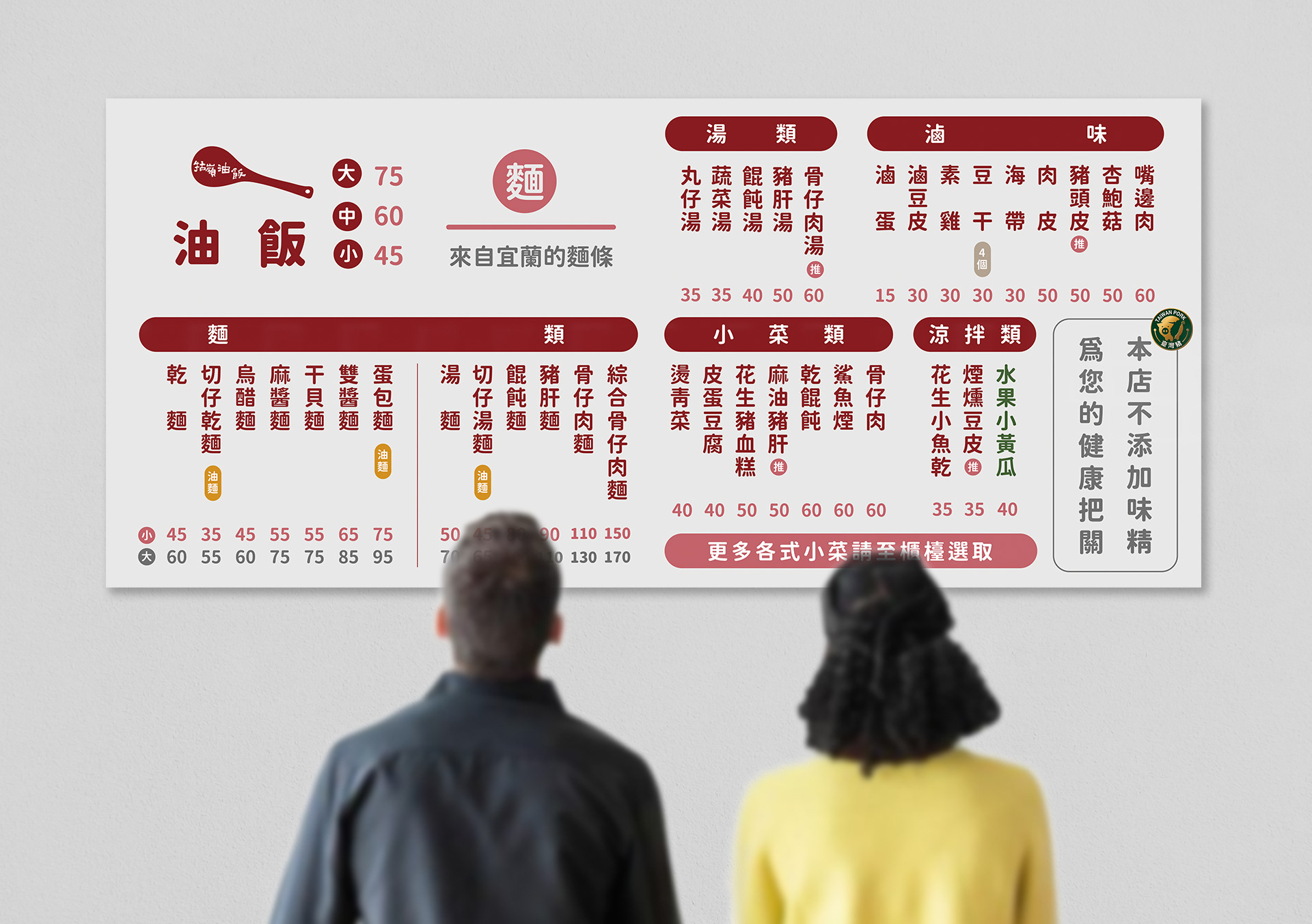
*本專案為傳統小吃品牌「牯嶺油飯」之品牌輔銷物與全套周邊視覺重塑設計。設計核心旨在翻轉傳統小吃生硬、陳舊的既定印象,將在地人情味與當代文青美學進行深度揉合。視覺上大膽採用具備食慾感且沉穩的胭脂紅與複刻牛皮紙質地相互碰撞,並提煉油飯核心元素,打造具備手感溫度的專屬標誌與插畫語彙。整體範疇涵蓋兌換券、提袋、菜單與線上宣傳載體,為傳統餐飲注入具備時代質感與高度辨識度的全新品牌生命力。
*This marketing collateral and merchandising redesign project was developed for Guling Oil Rice, a traditional local eatery brand. The core objective of the design was to revitalize the conventional, outdated impression of heritage street food, seamlessly blending local nostalgia with contemporary lifestyle aesthetics. The visual identity features a bold contrast between an appetite-stimulating carmine red and a tactile kraft paper texture, accompanied by organic logos and illustrative elements derived from the culinary craft. The executive scope spans redemption vouchers, packaging bags, menus, and digital promotional assets, injecting a highly recognizable, modern aesthetic into a traditional dining brand.
Client | 牯嶺油飯 Guling Oil Rice
Year | 2022
Role | Marketing Materials & Graphic Design
ensu design ©