
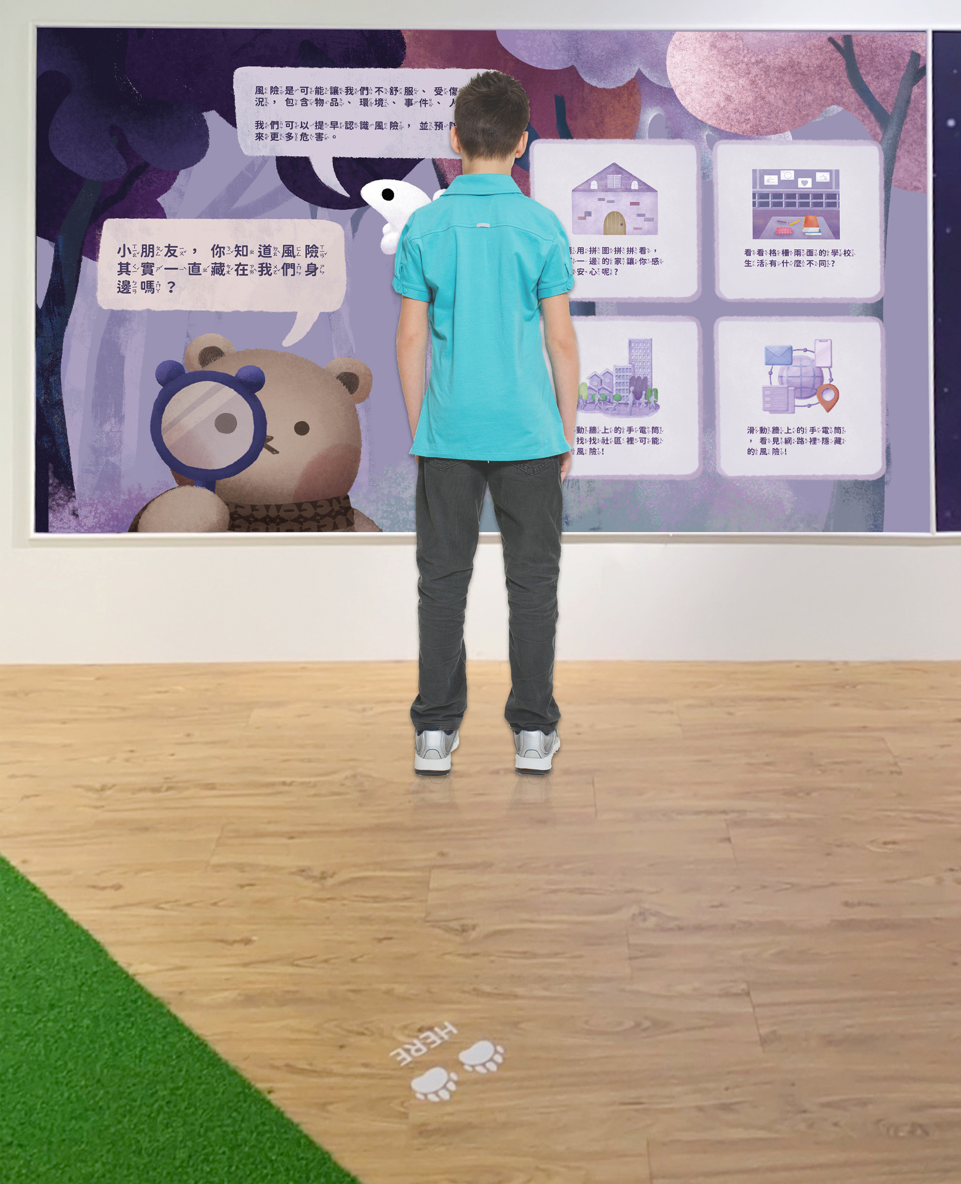
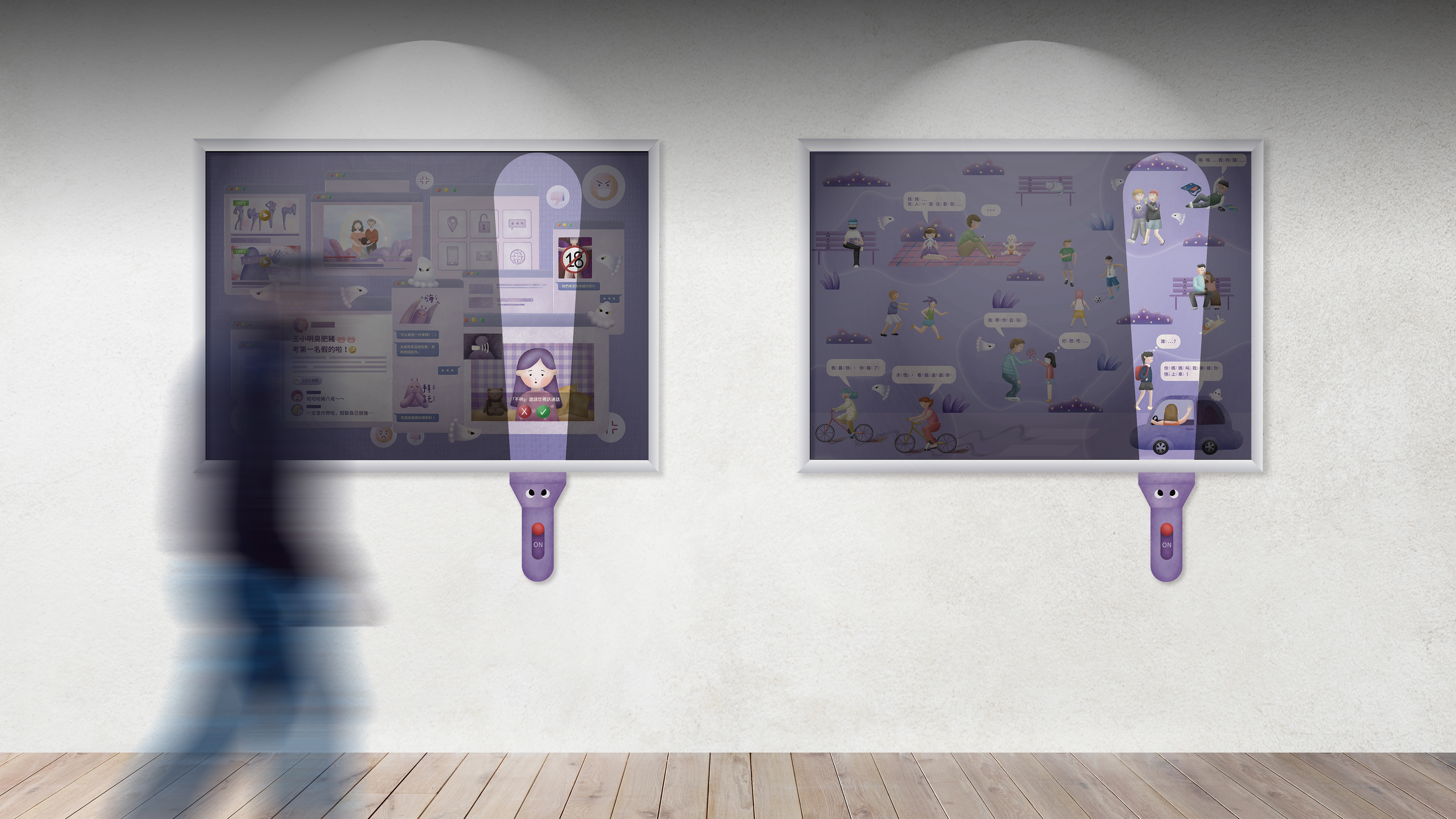
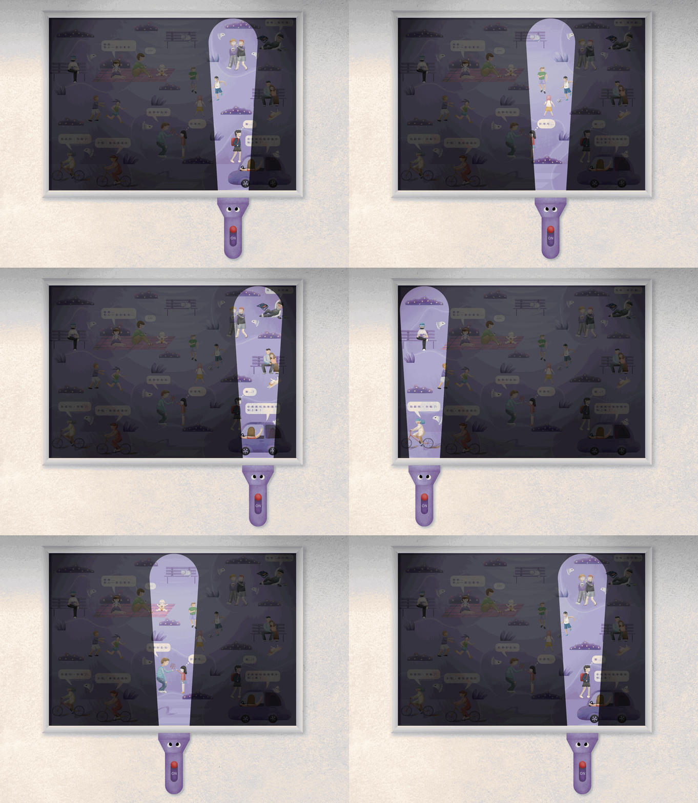
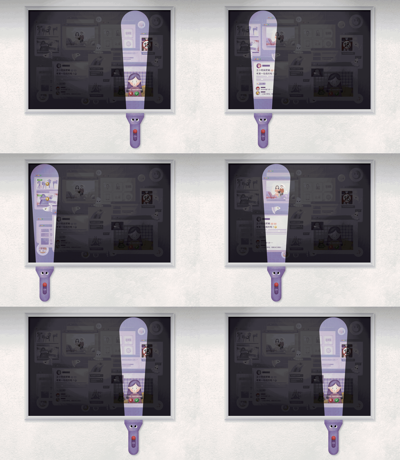
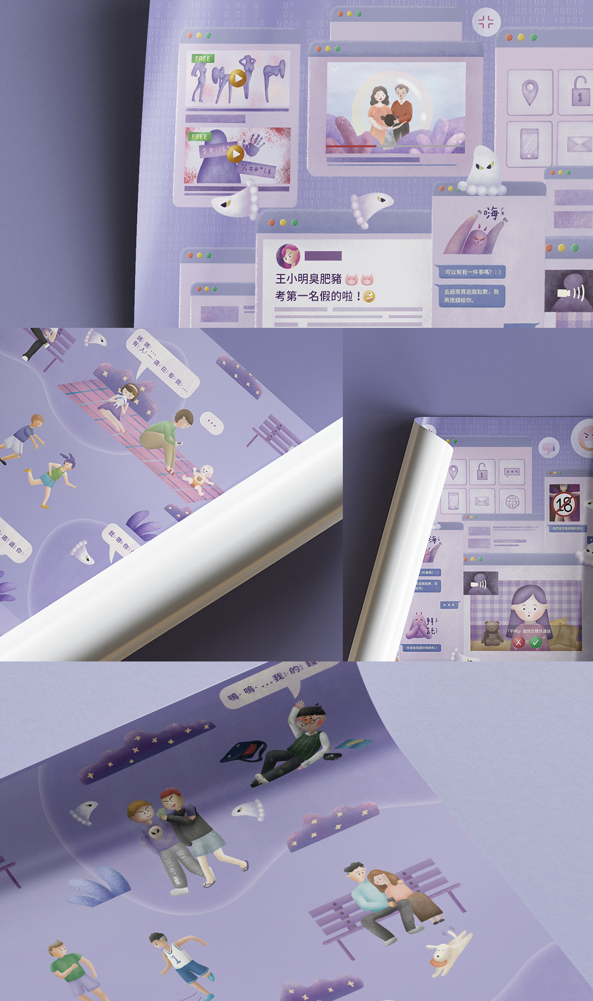
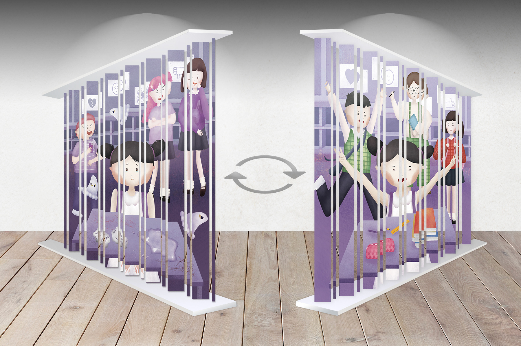
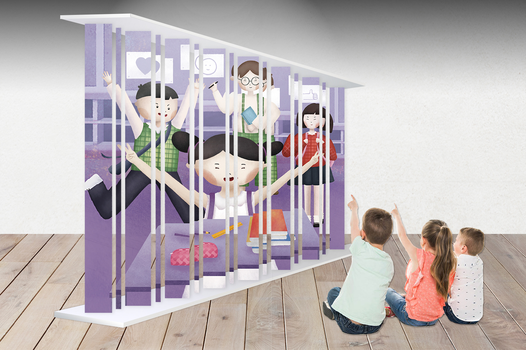
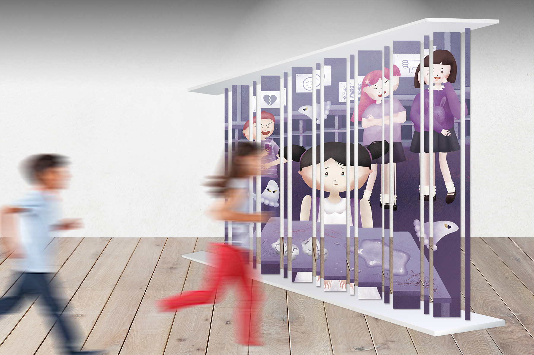
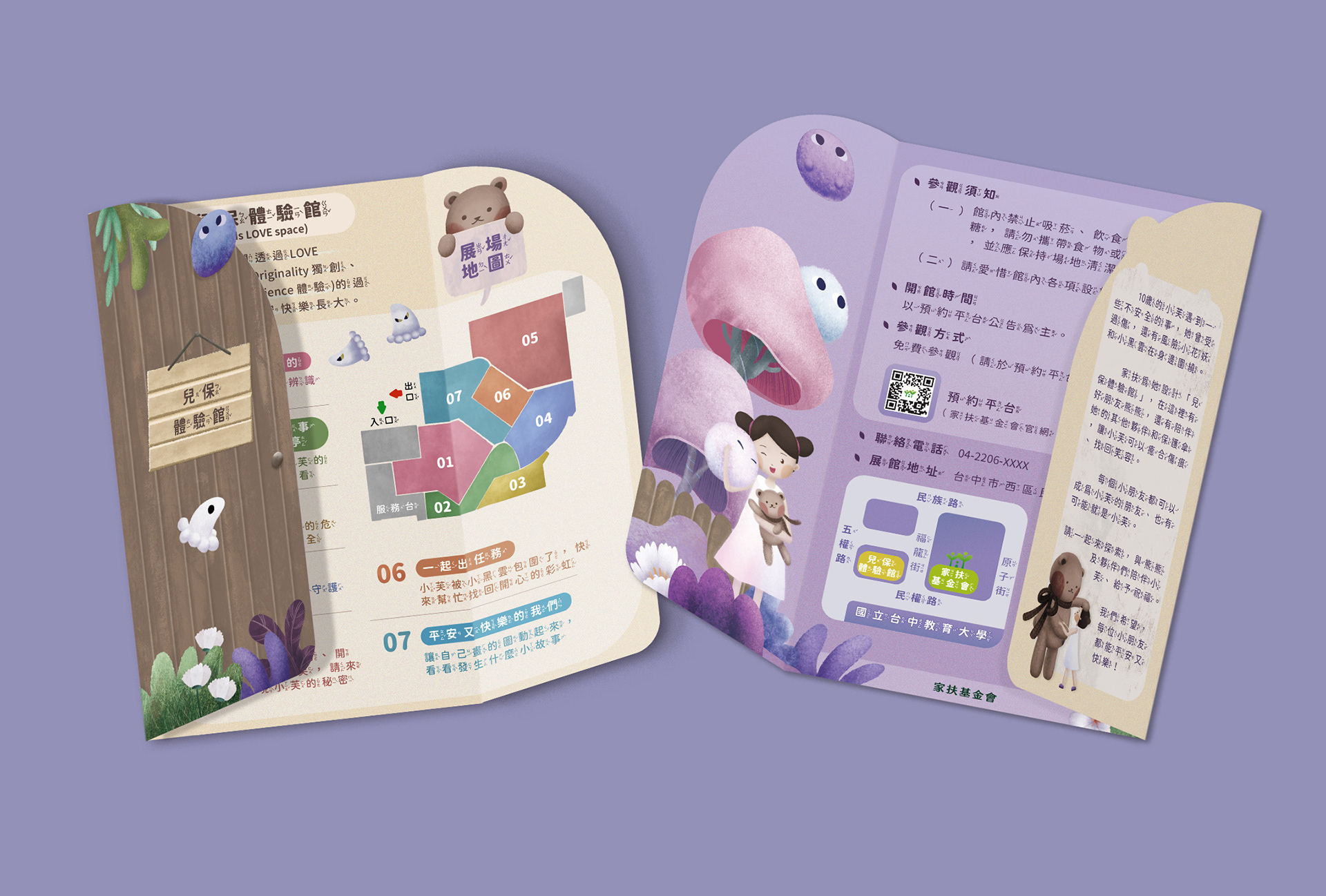
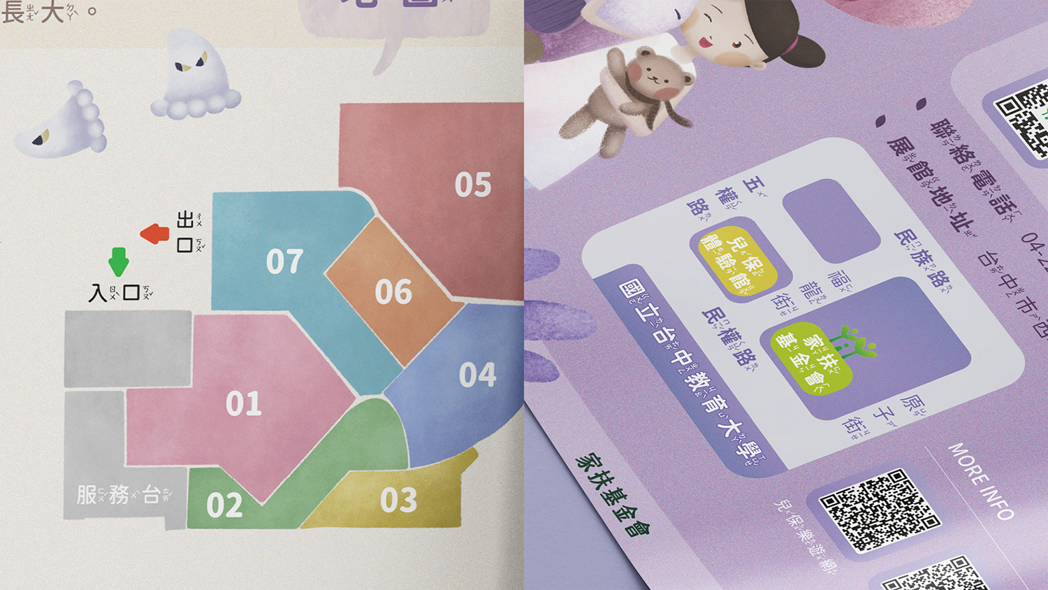
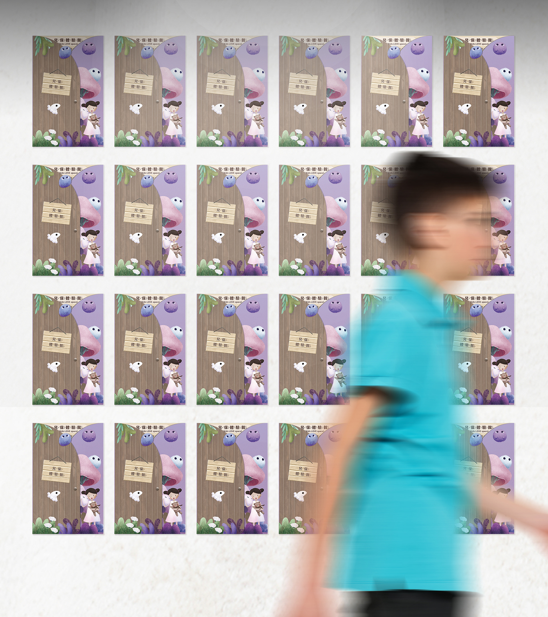
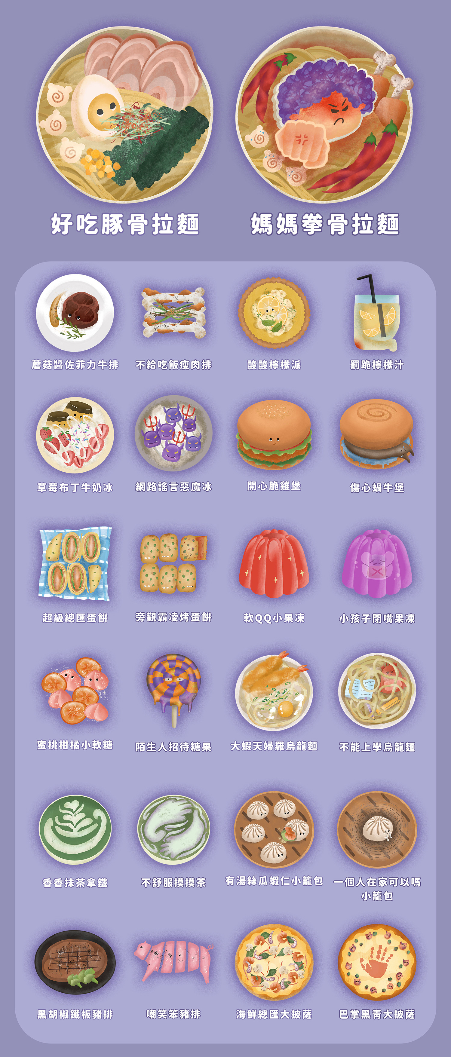
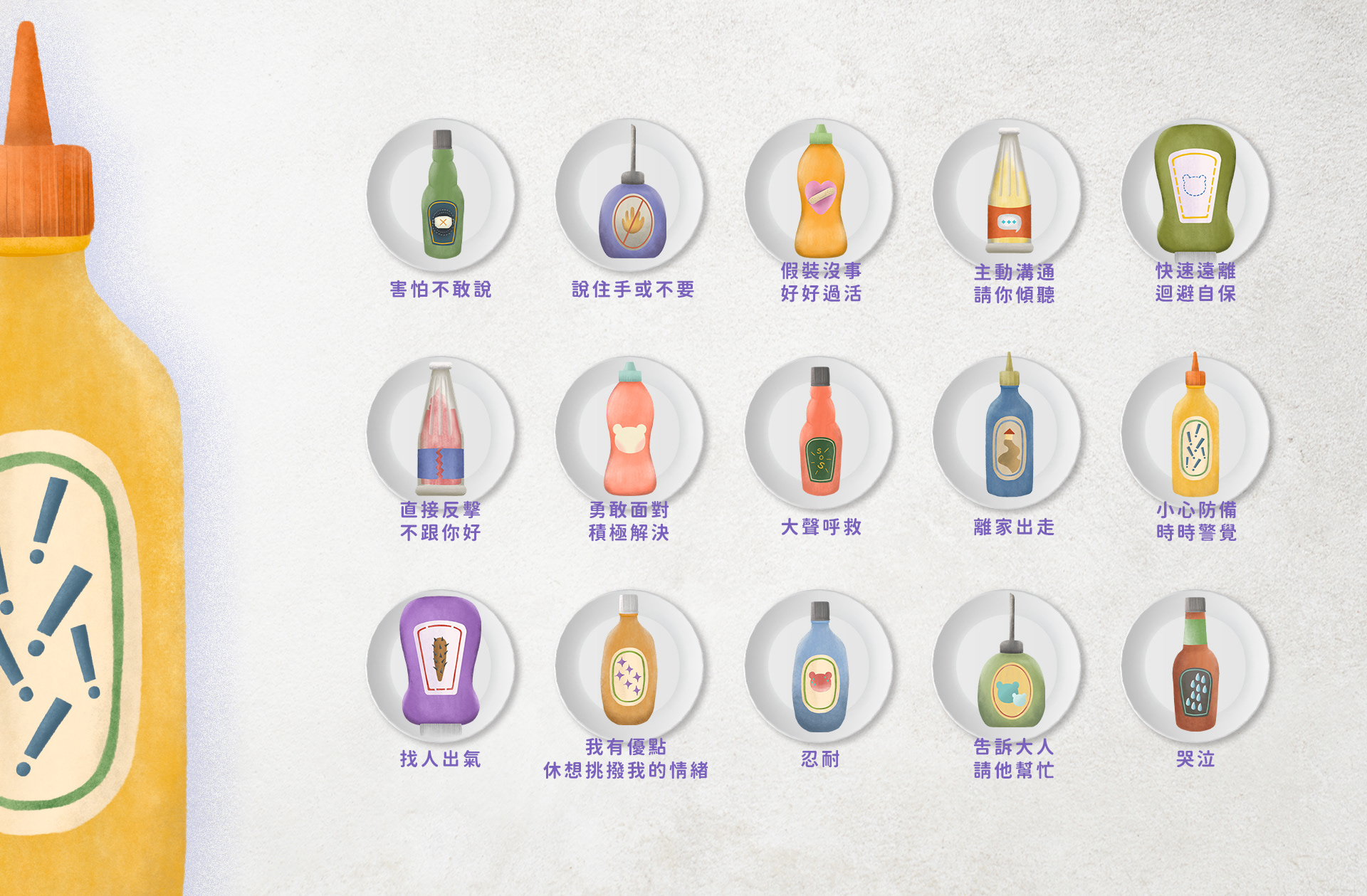
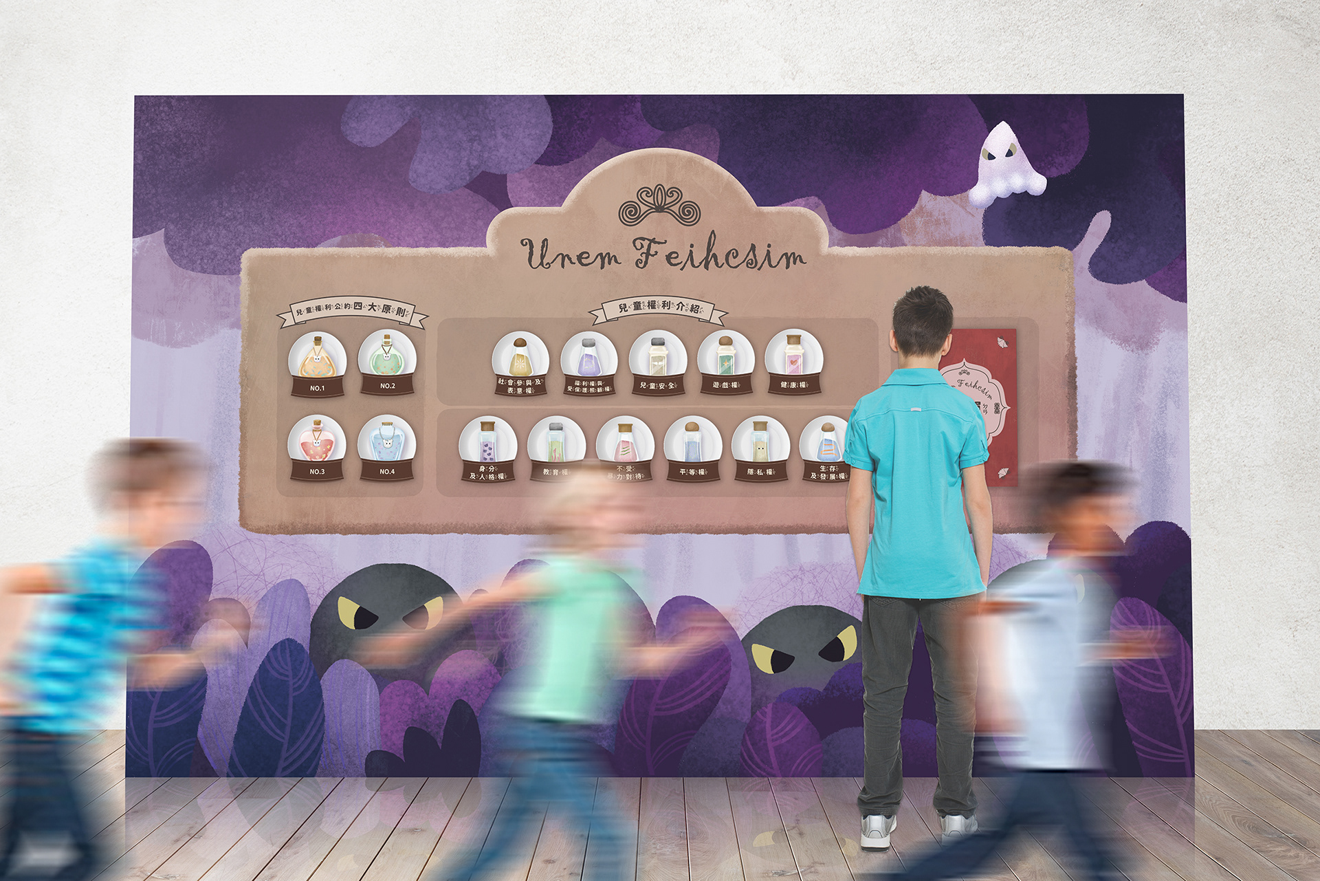
*本專案為家扶基金會「兒保體驗館」之主視覺與插畫視覺設計。設計核心旨在透過溫暖且具備療癒感的視覺語言,帶領兒童與大眾認識兒童保護與風險預防知識。視覺上採用柔和的紫粉與森林色調,建構出具備安全感與探索感的沉浸式場景,並設計了親切的導覽小熊角色。整體畫面透過細緻的紋理筆觸與直覺的幾何互動區塊,將嚴肅的兒保議題轉譯為具備高度親和力與教育宣導效益的視覺形象。
*This key visual and illustration design project was developed for the "Child Protection Pavilion" hosted by the Taiwan Fund for Children and Families (TFCF). The design utilizes a warm, healing visual language to guide children and the general public through concepts of child protection and risk prevention. Featuring a soft palette of purple, pink, and forest tones, the visual identity establishes a safe yet exploratory immersive environment, accompanied by an approachable guide bear character. Through delicate textures and intuitive geometric layouts, the composition successfully translates sensitive child protection topics into an engaging, educational, and highly accessible visual experience.


Client|科碼新媒體股份有限公司 corma new media©
Brand|家扶基金會 TFCF
Role | Illustration & Visual Design
ensu design ©