
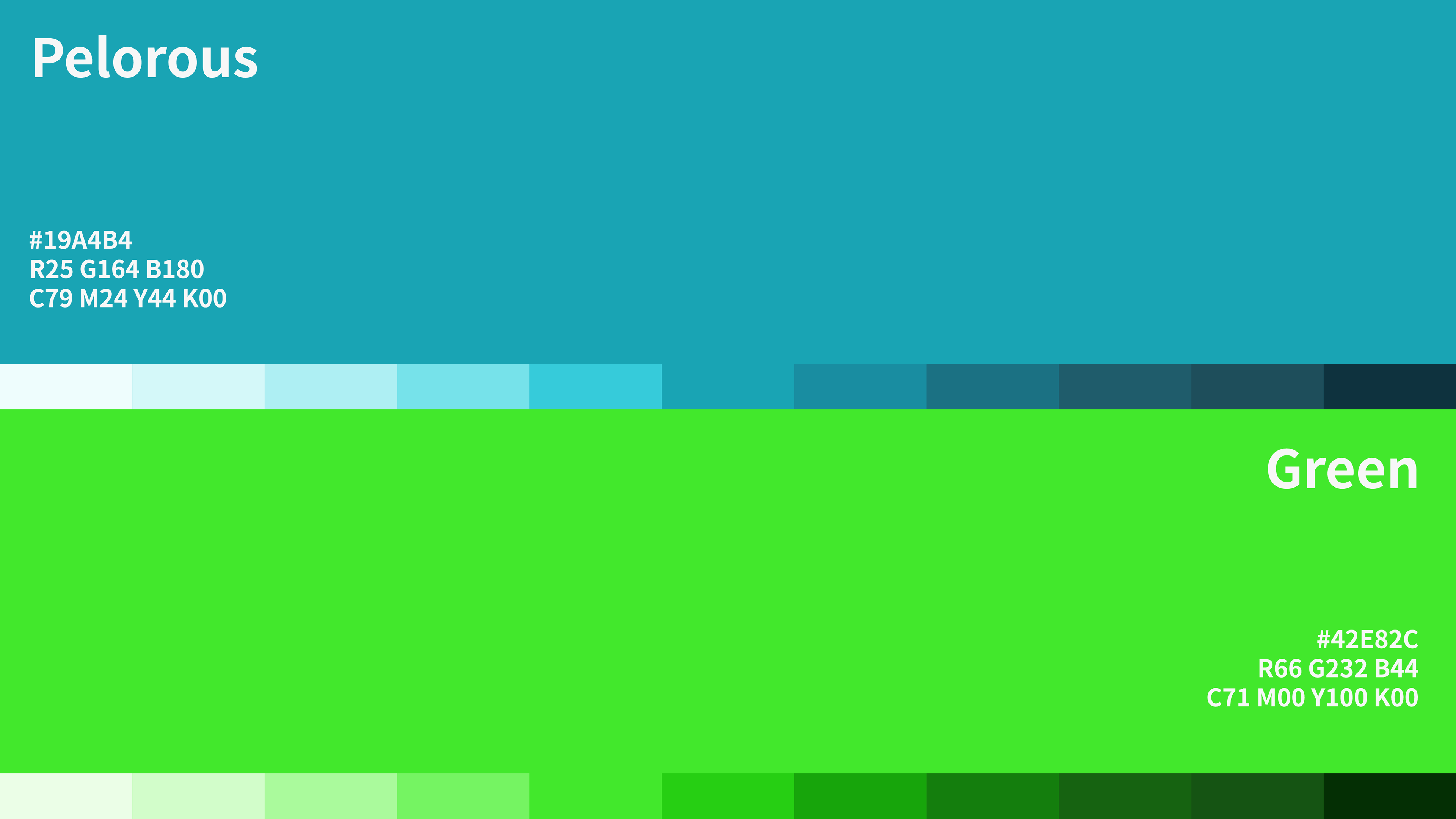
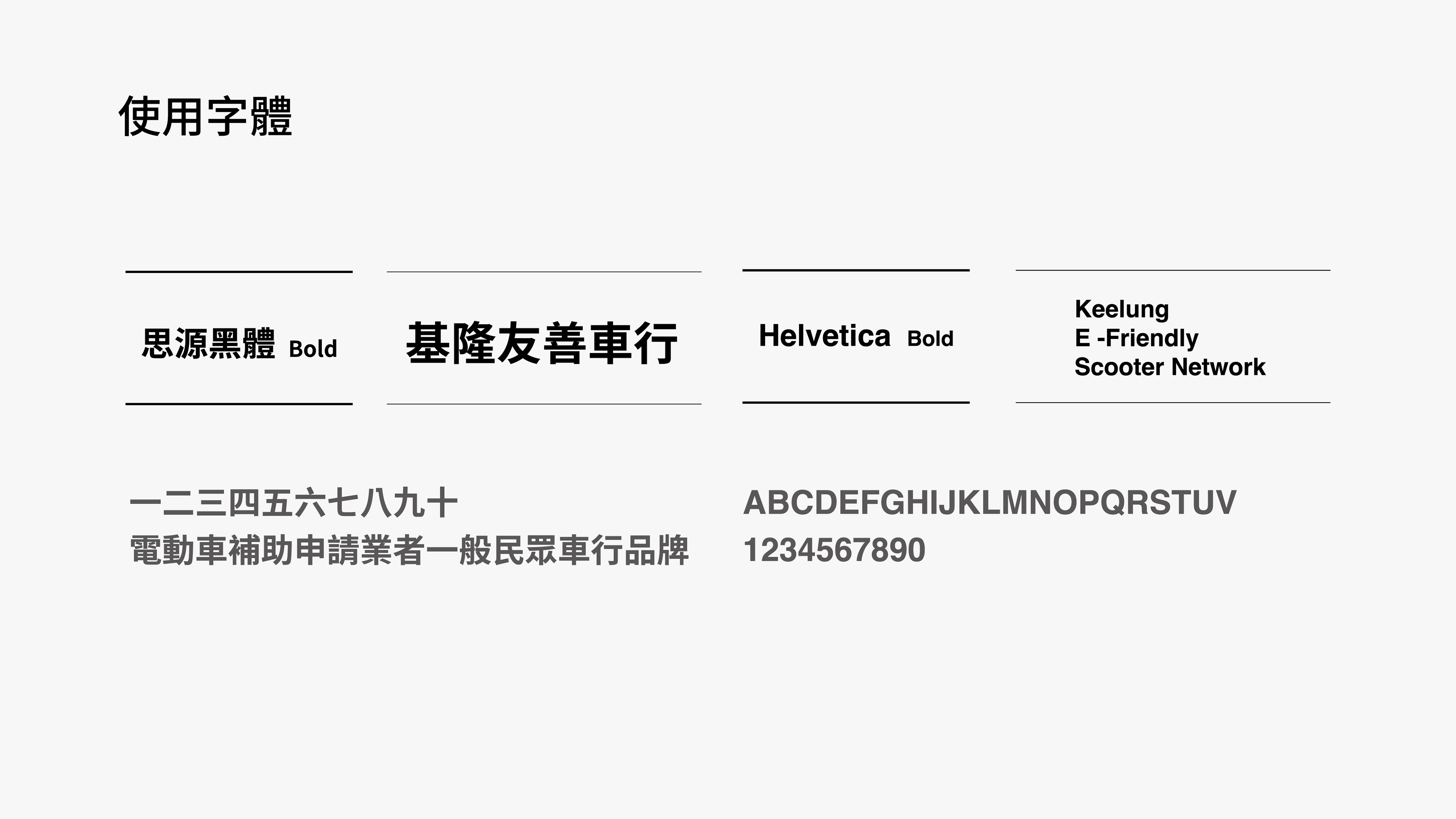
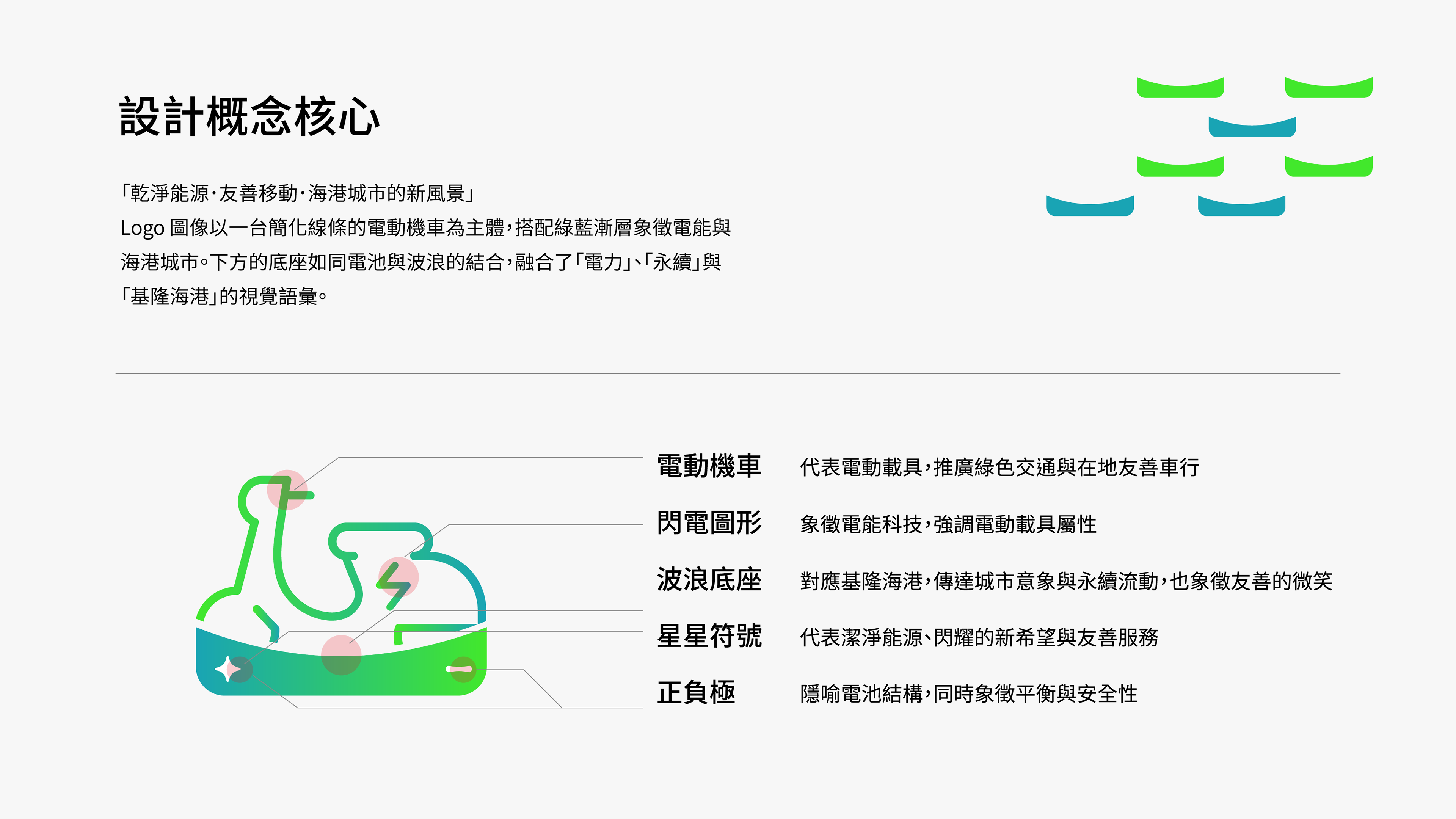
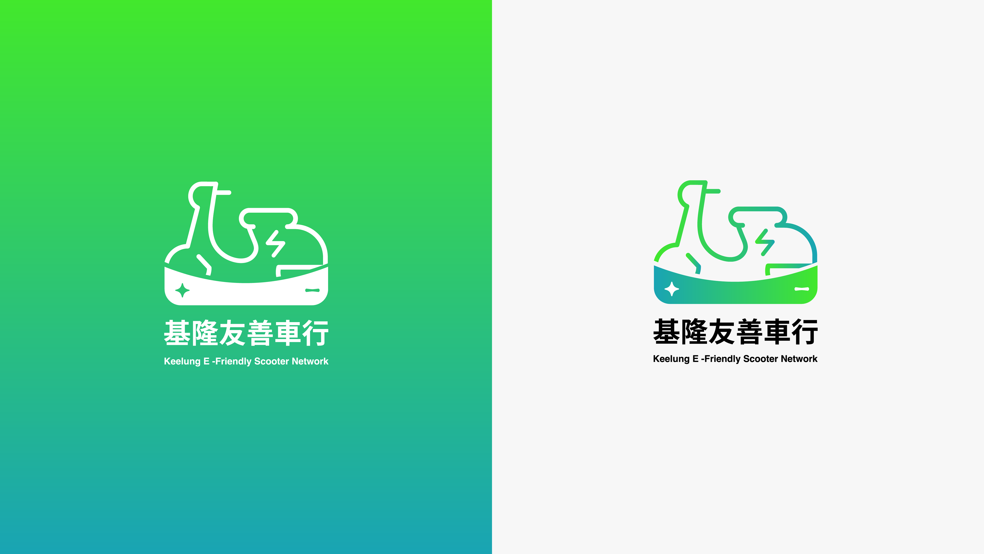
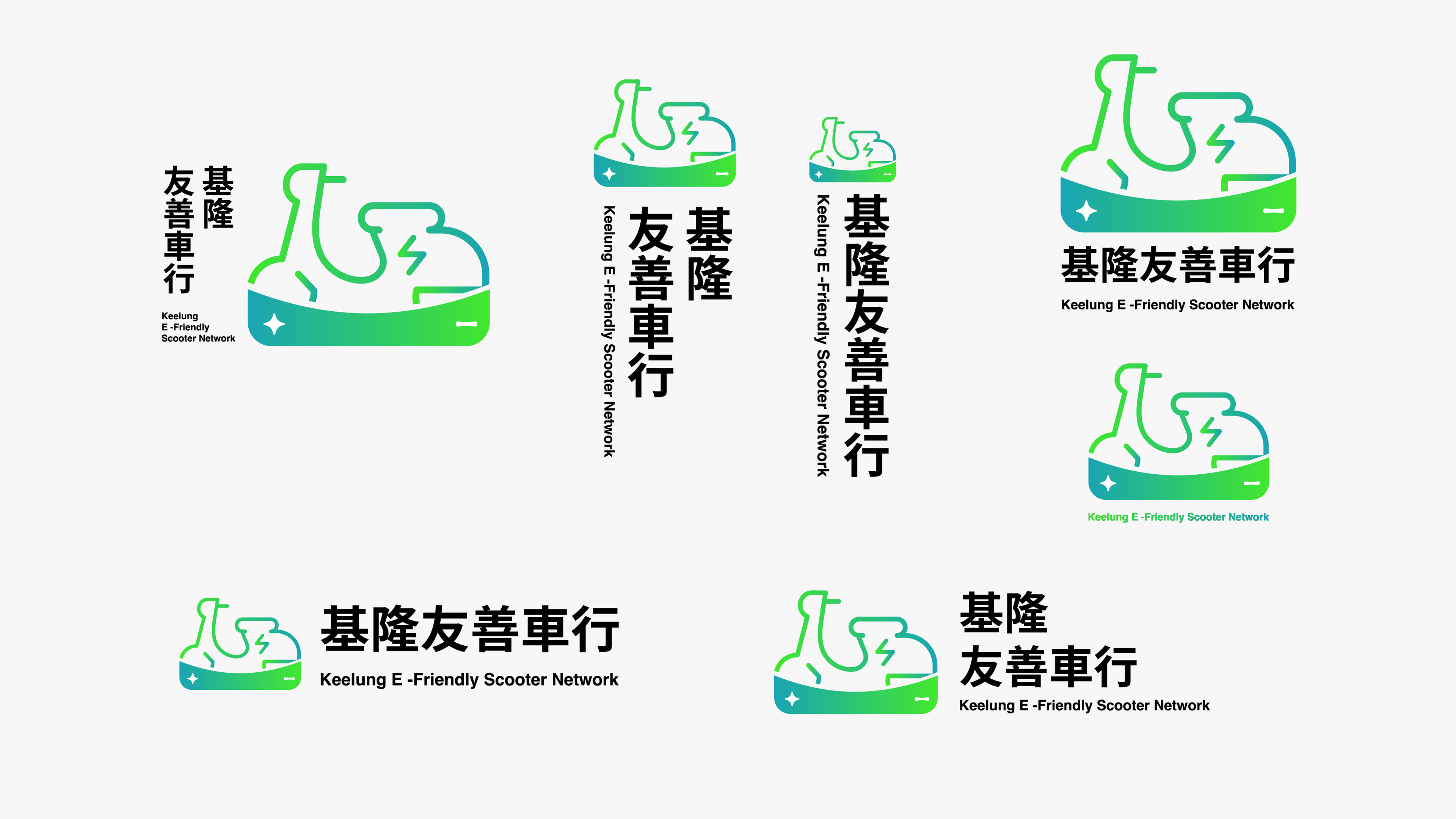
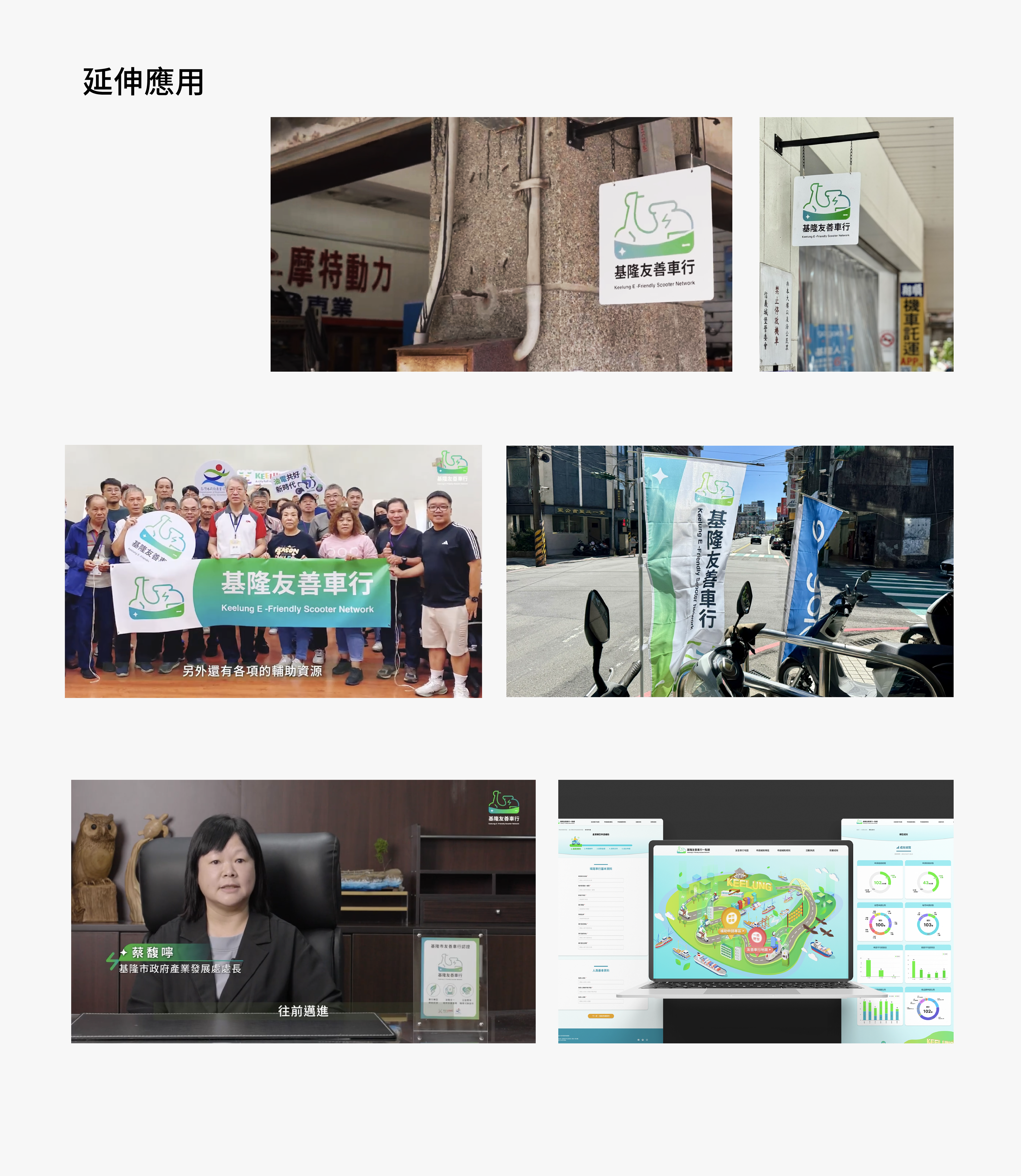
✹ 「基隆友善車行」視覺識別系統專案,以綠藍漸層電動機車意象為核心,建構完整品牌識別:包含 Logo、無文字版 Logo、色票、字體、Icon 系統與應用模板。在 UI/UX 網站設計中延伸視覺語言,展現城市友善電動車的形象,提升品牌在地能見度與識別度。
✹ The “Keelung EV-Friendly Scooter Network” brand identity project centres around the visual motif of an electric scooter in green-blue gradients. It encompasses a full brand system—logo, word-mark-free icon version, colour palette, typography, and icon set—extended into the UI/UX web design, portraying the city’s friendly electric-vehicle landscape and enhancing brand recognition within the local community.
✹ The “Keelung EV-Friendly Scooter Network” brand identity project centres around the visual motif of an electric scooter in green-blue gradients. It encompasses a full brand system—logo, word-mark-free icon version, colour palette, typography, and icon set—extended into the UI/UX web design, portraying the city’s friendly electric-vehicle landscape and enhancing brand recognition within the local community.
Client |基隆市政府產業發展處 DOEA, KLCG
Year |2025
Role|Visual Design (In-house)
Project conducted at ZOUSTEC TECHNOLOGIES CO.,LTD
ensu design ©