
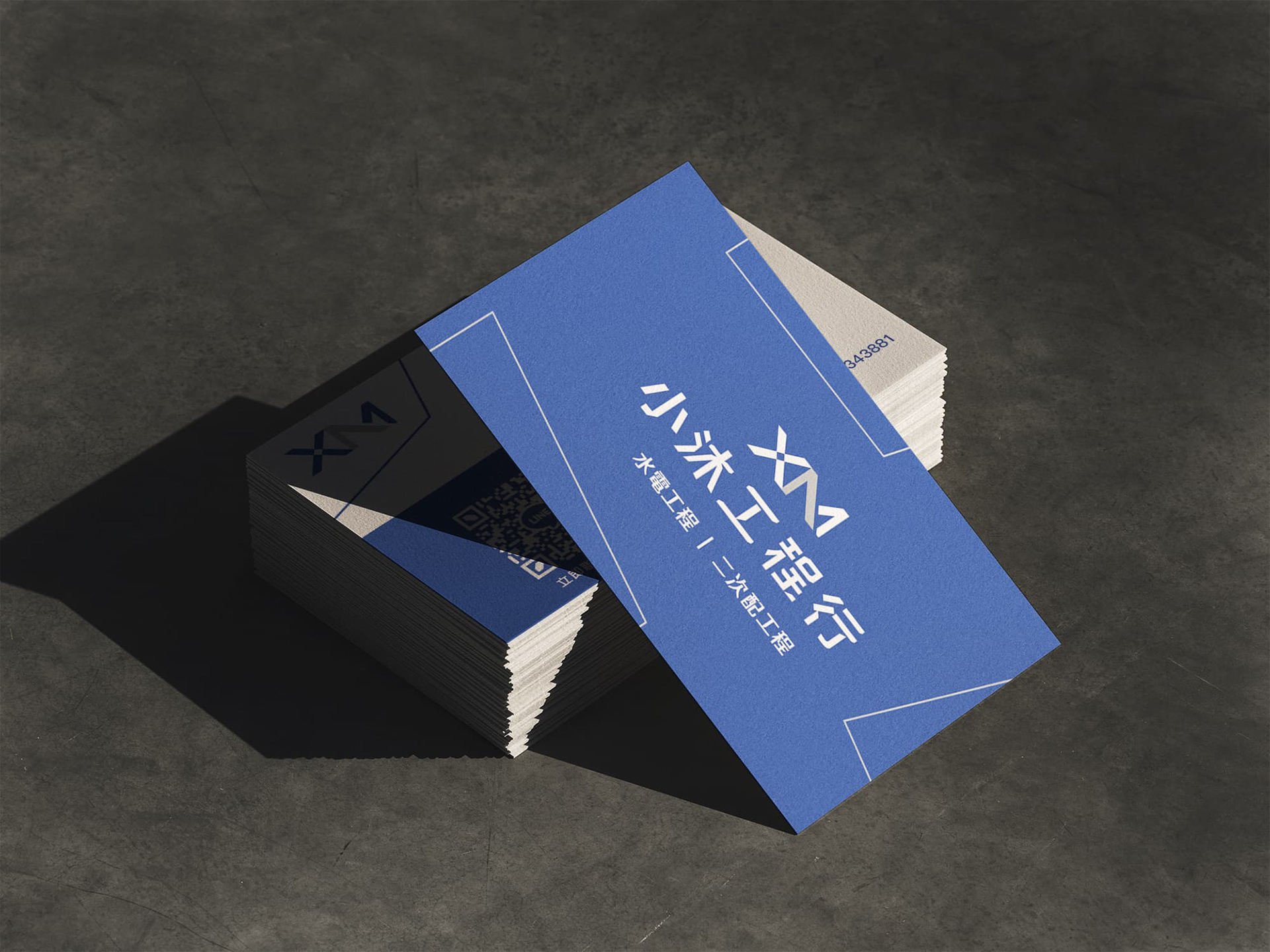
小沐工程行是一間專營水電工程與二次配(控制電路)施工的技術型團隊,客群以同業轉介為主——也就是說,看得懂這個品牌的人,往往本身就熟悉配電圖上的接點、線圈與端子台符號。這意味著品牌識別不能只是「好看」,還必須讓懂技術的人一眼認出專業門檻,同時在名片、識別證等小尺寸應用中維持清晰的辨識度。
XM operates as a water and electrical engineering contractor specializing in secondary electrical control circuits (二次配), relying primarily on industry referrals. This meant the identity had to speak fluently to an audience that already reads schematic symbols — contacts, coils, terminal blocks — while staying legible at business-card scale.
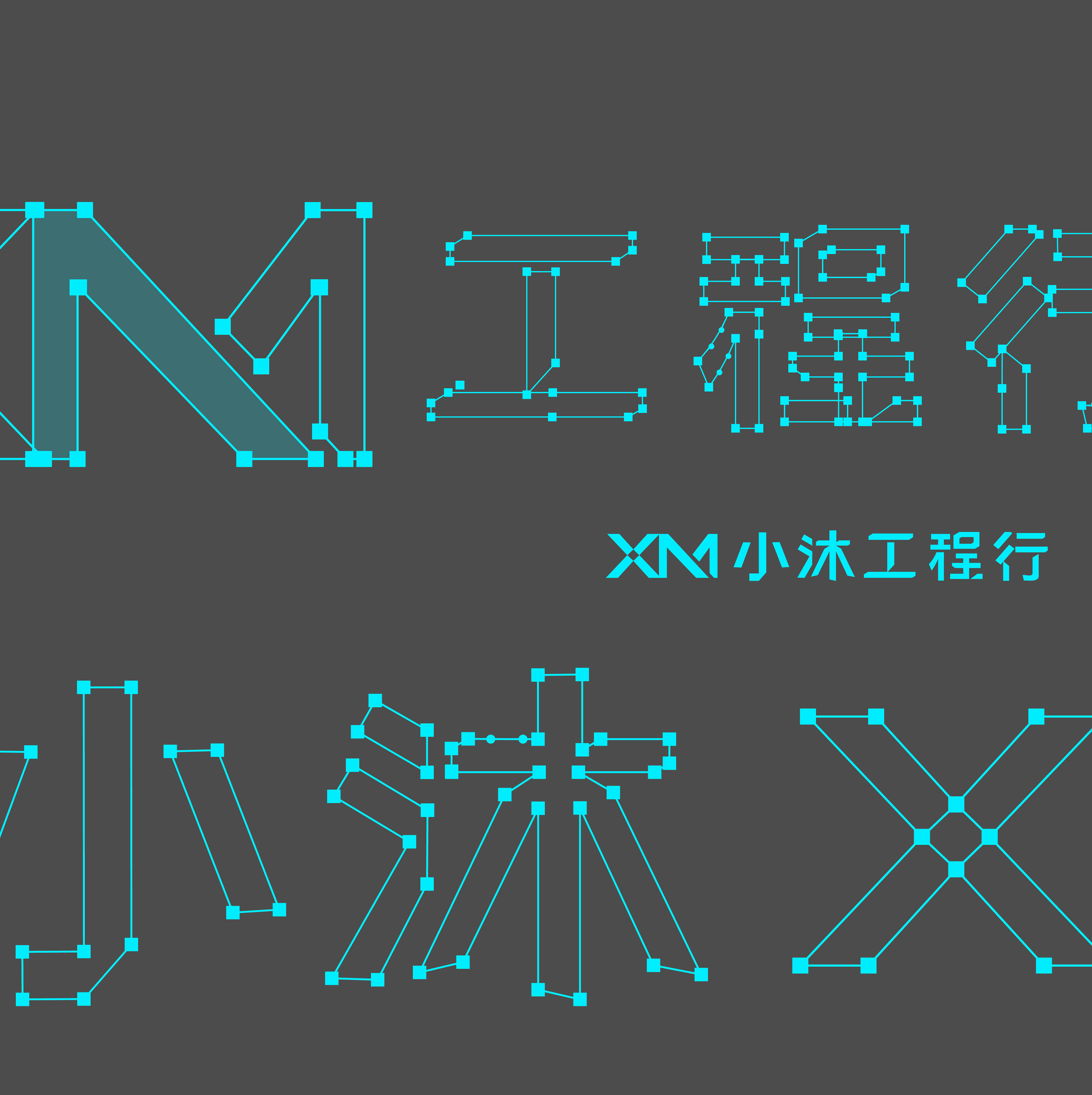
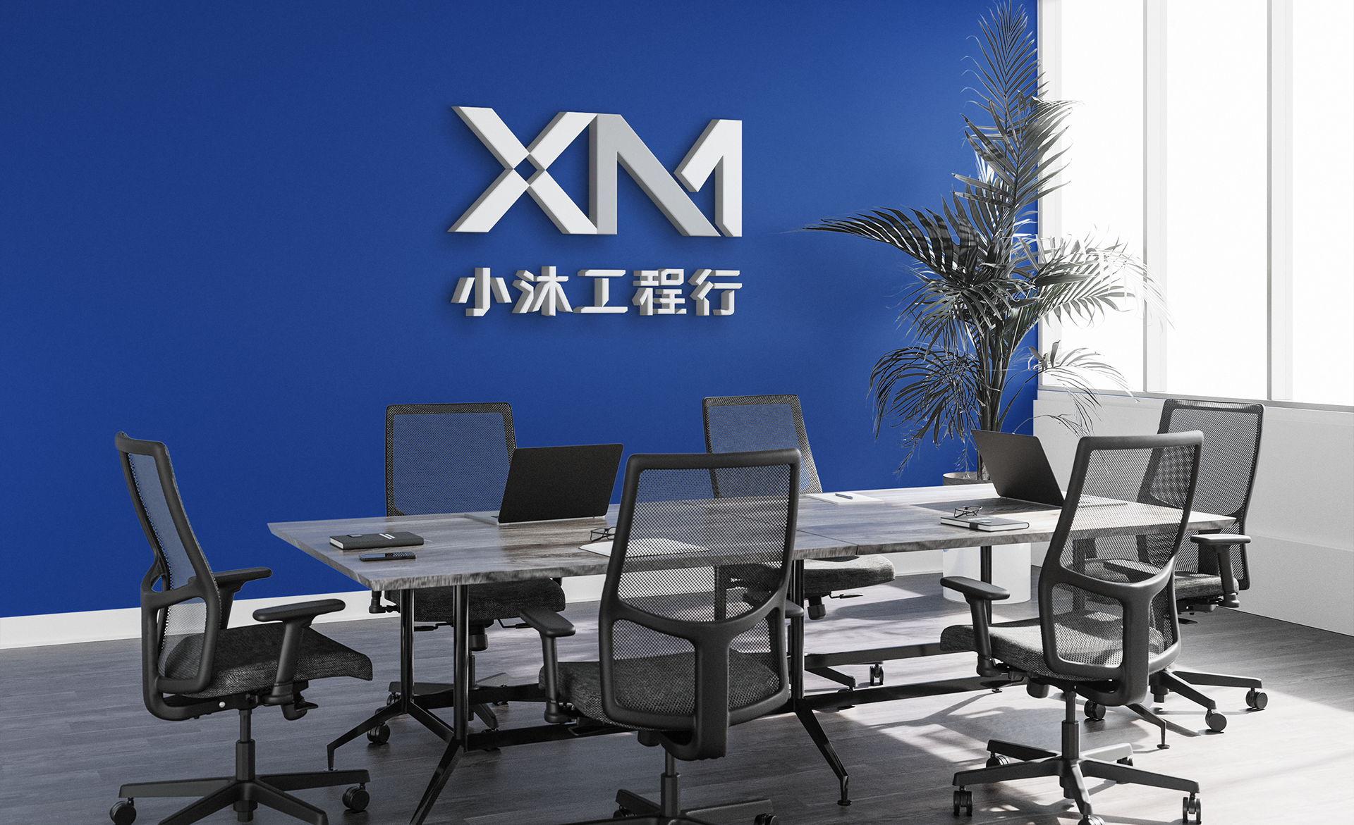
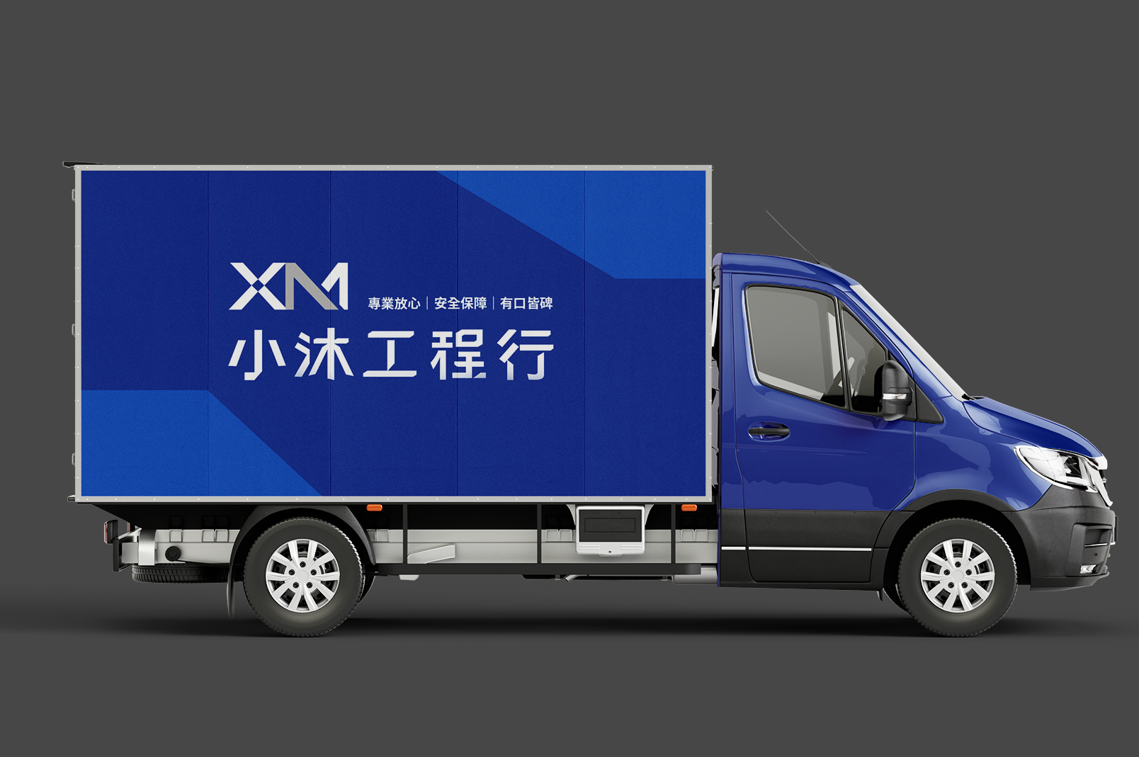
標準字採用破碎切面的處理手法,呼應二次配施工中線路斷點、接續的視覺邏輯。XM 字標本身即是核心設計亮點:M 字母內嵌入常開接點(a接點)符號,讓字母造型與電路符號產生雙重讀法——認得出這是「XM」的人,同時也能讀出這是一個「開關」。
The wordmark uses fragmented, angular cut strokes to echo the visual language of circuit breaks and connections found in secondary electrical control diagrams. The XM monogram is the design's central idea: the letter M is constructed to double as a 常開接點 (normally-open contact) symbol — a deliberate dual reading for an audience fluent in schematic notation.
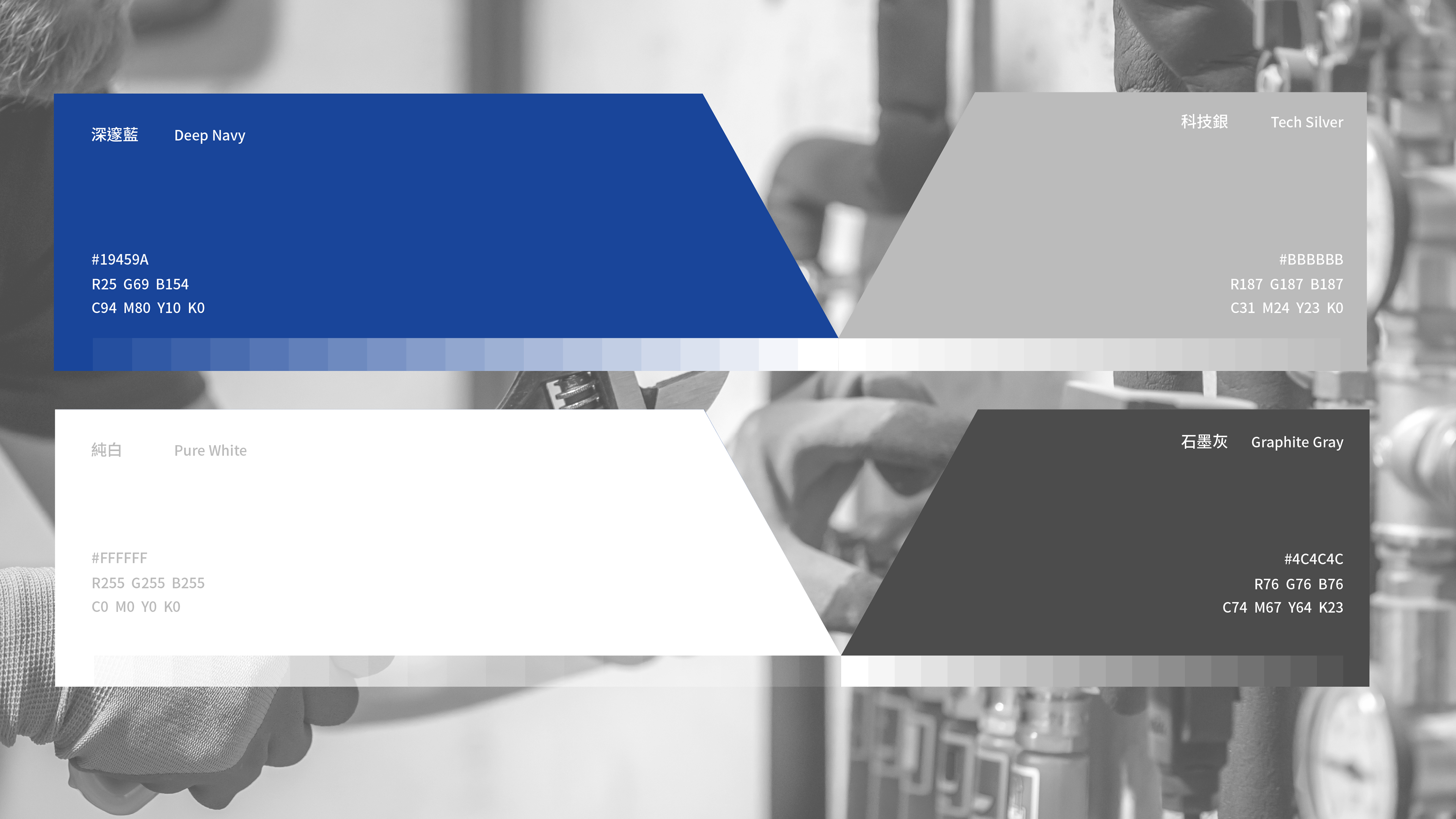
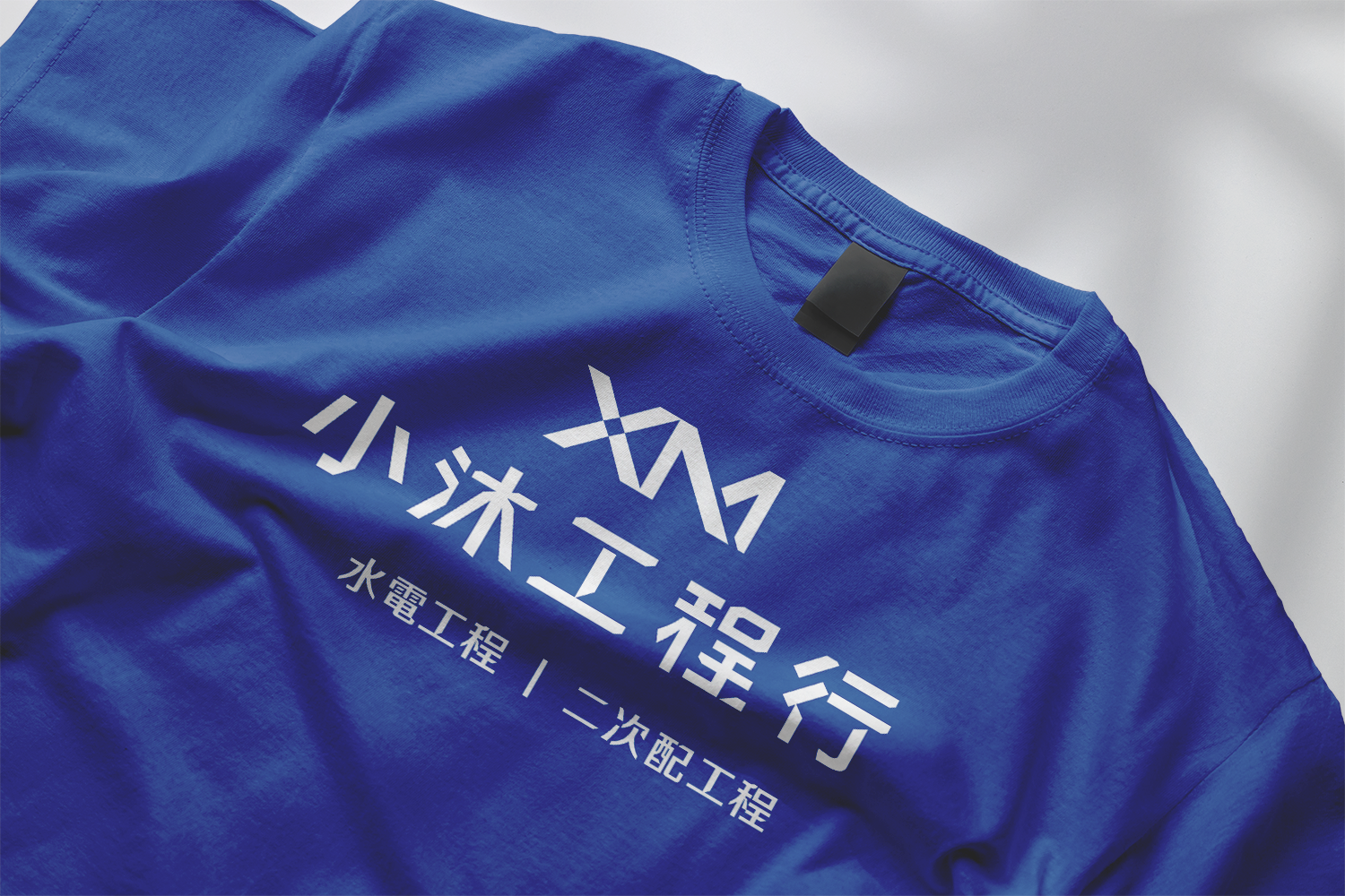
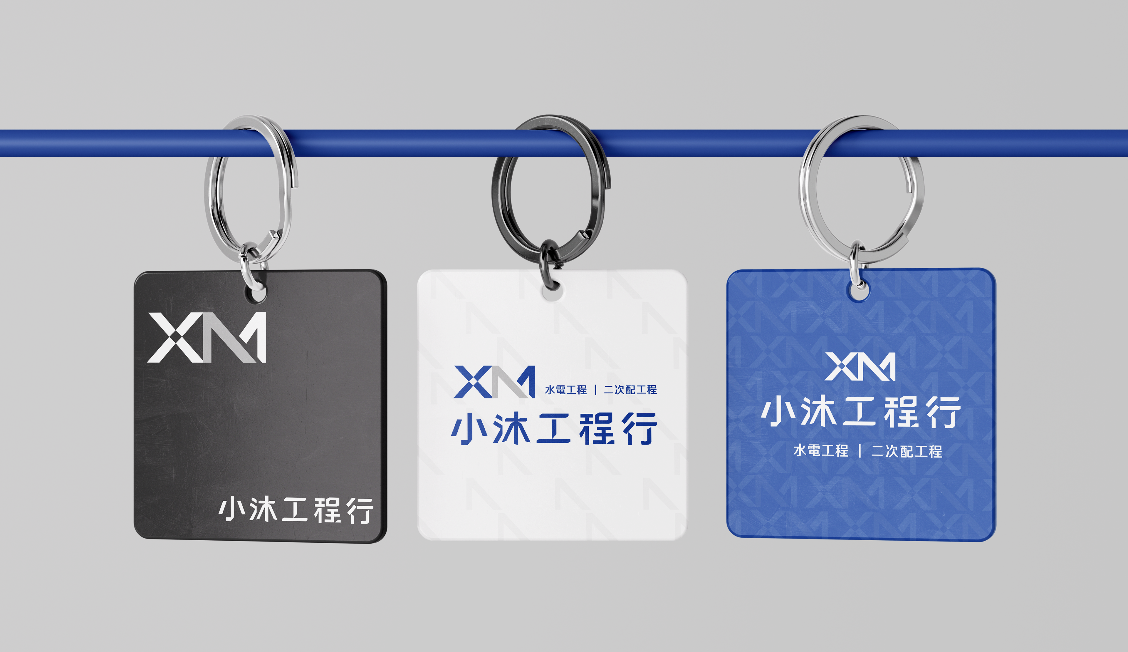
配色歷經多輪測試,比較白底深藍字、深藍底搭配灰白疊字等組合,最終確認深藍底+白字的高對比組合,在遠距離與小尺寸應用(名片、識別證)下辨識度最穩定,也最貼近工程產業慣用的沉穩專業調性。
Multiple palette directions were tested — a light background with navy type, and a navy background with layered gray-and-white type. The final direction settled on high-contrast white type on a deep navy ground, chosen for its legibility at reduced scale and its alignment with the sober, technical tone expected in the engineering trade.
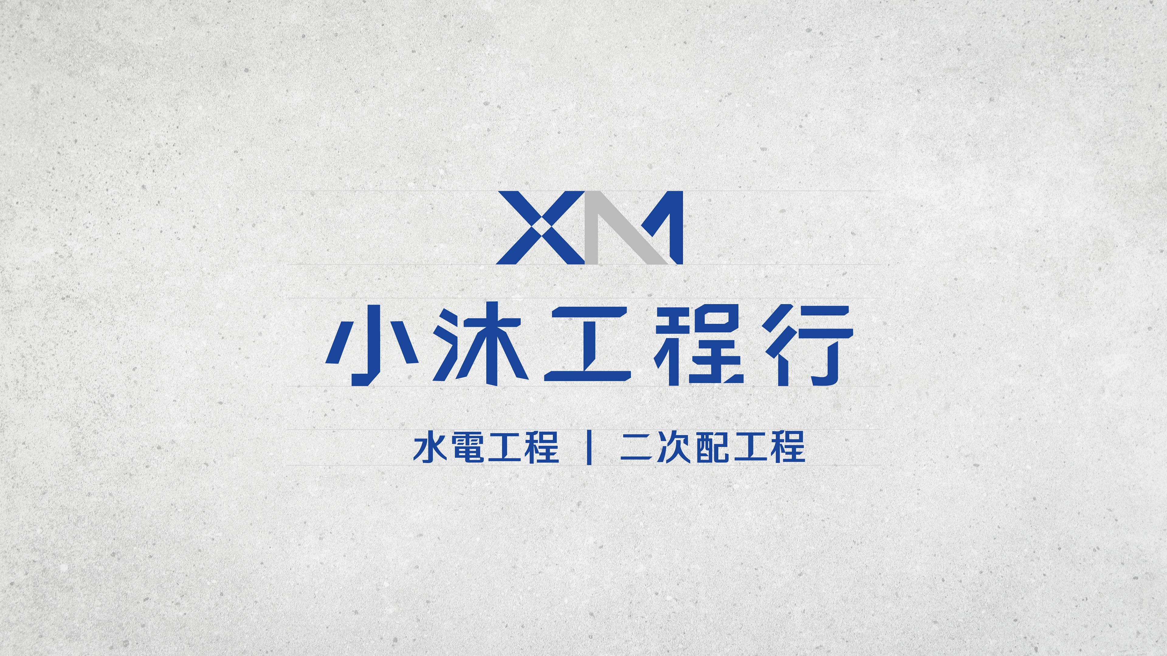
品牌標語從原先較空泛的「水電工程|二次配|品質專業」,收斂為「水電工程|二次配工程」,直接陳述業務項目,貼近同業之間的溝通習慣,而非訴諸形容詞式的品牌宣傳語。
The brand tagline was refined from a more generic "water & electrical engineering | secondary control | quality & professionalism" to a direct "water & electrical engineering | secondary control engineering" — stating the service scope plainly, in the register the trade itself uses, rather than leaning on promotional adjectives.
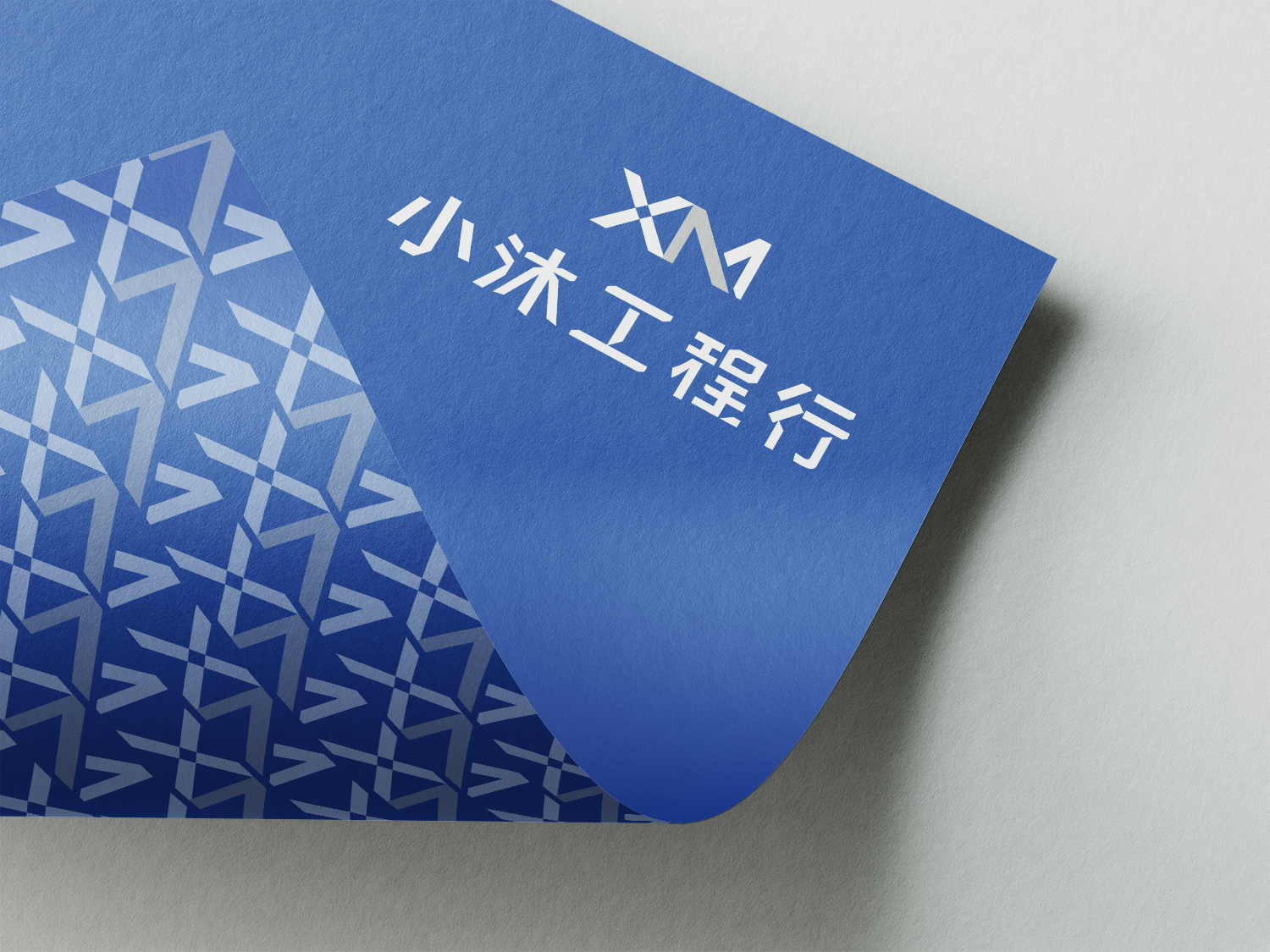

二次配控制電路中常見的視覺符號——常開接點、常閉接點、電磁接觸器線圈(MC)、端子台(TB)——被整理為一套裝飾元素庫,作為名片與識別證邊框、分隔線的延伸素材,讓技術符號本身成為可延展的品牌語彙,而非僅止於 Logo 本體。
A set of schematic symbols common to secondary control circuits — normally-open and normally-closed contacts, the magnetic contactor coil (MC), and the terminal block (TB) — was compiled into a decorative element library, extending the technical vocabulary into card borders and divider lines beyond the logotype itself.

Client|小沐工程行 XM Engineering Contractor
Year|2026
Role|Visual Identity Design
ensu design ©
Year|2026
Role|Visual Identity Design
ensu design ©