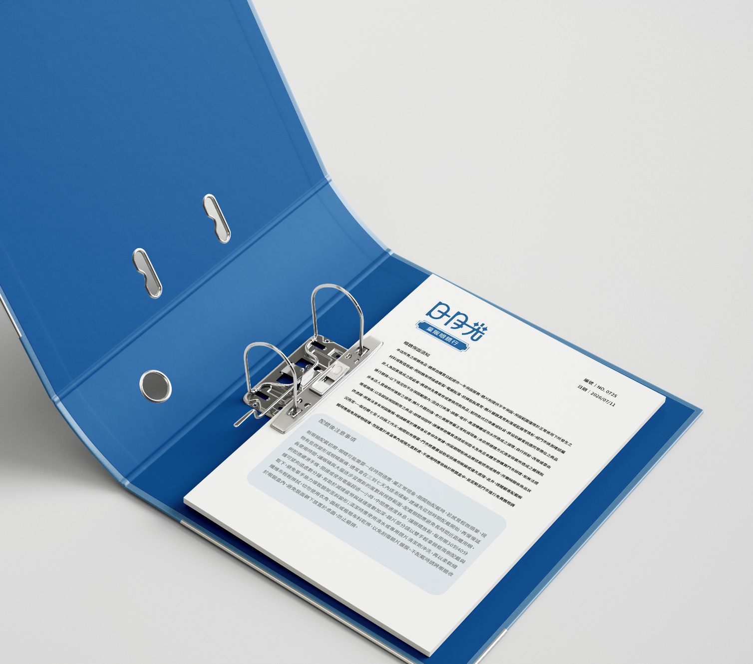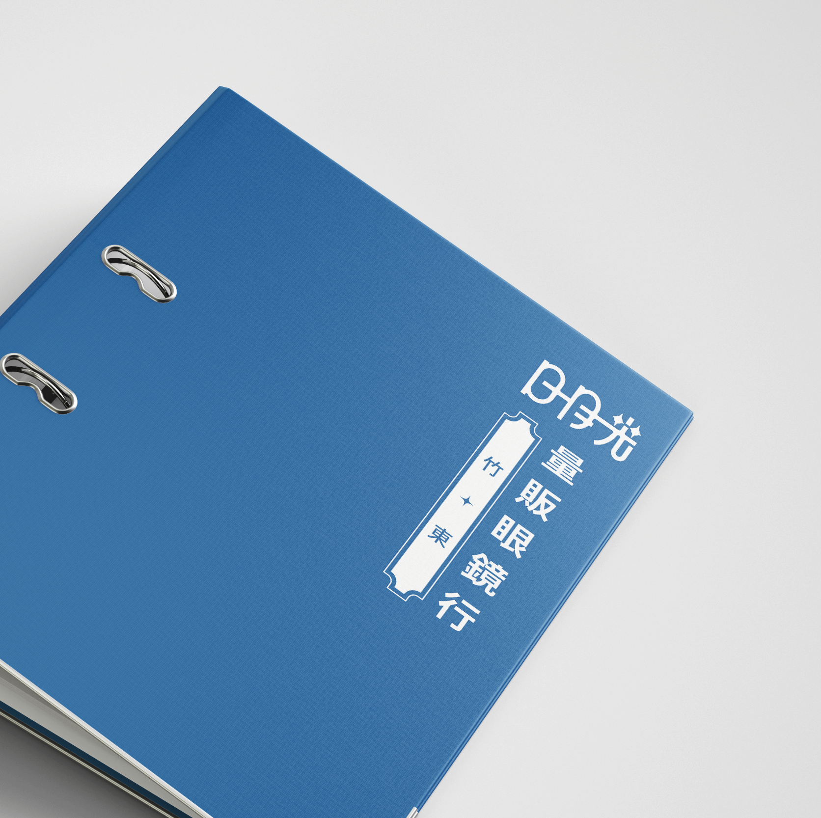
*本專案為「日月光眼鏡量販行」全新打造的品牌視覺識別系統(Brand Identity)。設計核心緊扣品牌名稱中的「日、月、光」三字,並將其與眼鏡最直觀的「鏡框雙圈」語彙進行深度解構與重組。提取「日」與「月」的幾何線條,將其有機地轉化為雙圓鏡片與鏡架的意象,打破傳統眼鏡行標誌的單一具象感。「光」字的上半部巧妙與鏡框線條融合,下半部則保持穩健的結構,傳遞出量販品牌專業、誠信且清晰的視覺感知。採用沈穩的深藍色調作為主視覺色彩,象徵光學技術的專業、精準與值得信賴,並結合現代幾何的外框設計,使品牌在量販市場中同時具備親和力與精緻度。
*This project presents a newly developed Brand Identity system for "Sun Moon Light Optical" (日月光眼鏡量販行). The core design concept seamlessly deconstructs and integrates the three Chinese characters—"Sun" (日), "Moon" (月), and "Light" (光)—with the iconic visual element of optical frames.By extracting the geometric lines of "Sun" and "Moon," the logo organically transforms these characters into the silhouette of twin lenses and frames, moving away from conventional, literal interpretations of optical branding.The upper portion of the character "Light" (光) merges fluidly with the frame design, while its lower structure remains solid and balanced. This reflects the warehouse brand's core values: professionalism, integrity, and absolute clarity.A sophisticated deep blue tone is selected as the primary brand color, symbolizing optical precision, expertise, and trust. Complemented by a modern geometric border, the identity ensures the brand stands out in the wholesale market with both accessibility and refined quality.