
*本專案為「冠群牙醫診所」之視覺識別設計,從招牌重塑出發。原招牌採用書法字體、視覺調性偏向傳統,辨識度與現代牙科形象皆有落差。重新設計以牙齒為主體,結合呼應「冠」的環繞弧線與象徵潔淨的星芒,搭配具鎮定與清潔感的海洋青綠(Ocean Teal),翻轉一般人對牙科的緊張印象,建立專業、可靠而親切的診所形象。識別並延展為橫式、直式與圓形記號等多種組合規範,應用於各式招牌載體;並自主延伸至名片、輔銷物等應用,展示標誌與輔助圖形的完整延展性。
*A visual identity for Crown Dental Clinic, developed from a signage redesign. The original calligraphic signage felt dated and read poorly, out of step with the clinic's modern dental services. The new mark centers on a tooth, pairing an arc that echoes the "crown" in the clinic's name with a star glint for cleanliness, set in a calming, hygienic Ocean Teal. It replaces the anxiety often tied to dental visits with an image that feels professional, reliable, and approachable. The identity extends into horizontal, vertical, and circular lockups across signage formats, with a self-initiated set of applications — business cards and collateral — showcasing the full adaptability of the logo and its supporting motif.
The Challenge|原招牌的問題
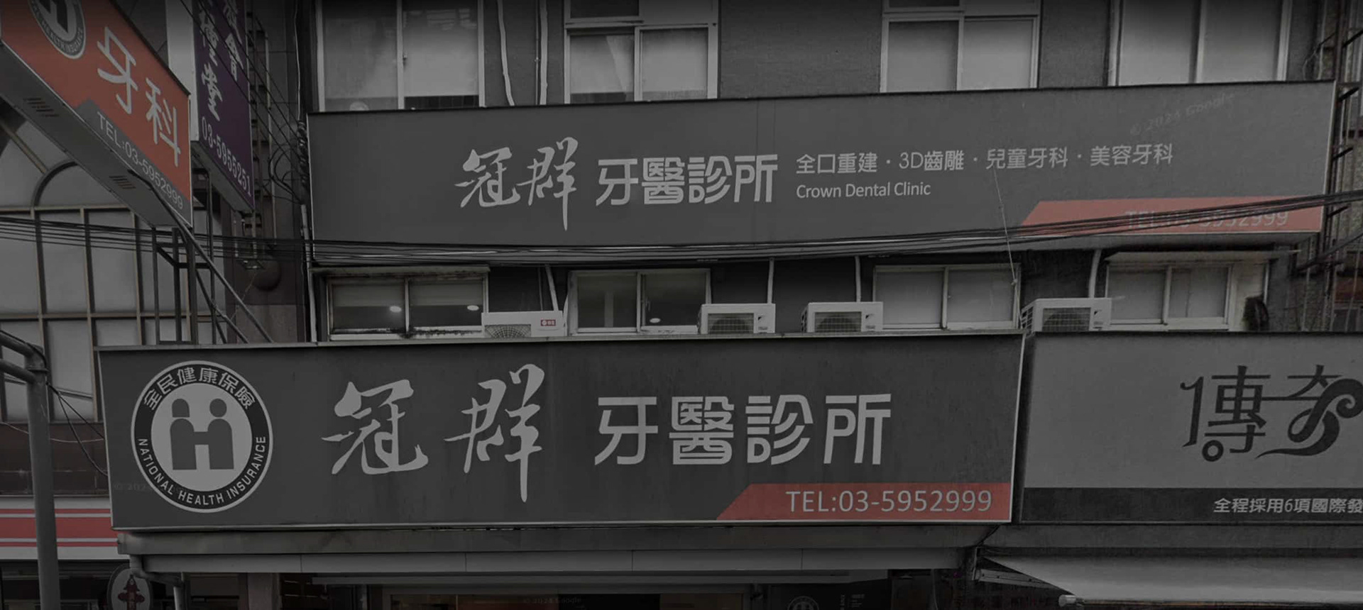
原招牌採用書法字體,於街區環境中辨識度不足,快速行經時筆劃易糊;中英文層級失衡,英文名幾乎不可見。灰底加書法的視覺調性偏向傳統,與診所主打的現代牙科服務(全口重建、3D齒雕、兒童牙科、美容牙科)產生明顯落差,也難以緩解一般人對看牙的緊張感
原招牌採用書法字體,於街區環境中辨識度不足,快速行經時筆劃易糊;中英文層級失衡,英文名幾乎不可見。灰底加書法的視覺調性偏向傳統,與診所主打的現代牙科服務(全口重建、3D齒雕、兒童牙科、美容牙科)產生明顯落差,也難以緩解一般人對看牙的緊張感
The clinic's original signage used a calligraphic typeface that was hard to read at a distance, with strokes blurring together when viewed in passing. Its bilingual hierarchy was unbalanced — the English name nearly disappeared — and the grey, brush-lettered look felt dated, disconnected from the clinic's modern services (full-mouth reconstruction, 3D dental sculpting, pediatric and cosmetic dentistry) and doing little to ease the anxiety many feel about dental visits.
The Redesign|識別重塑
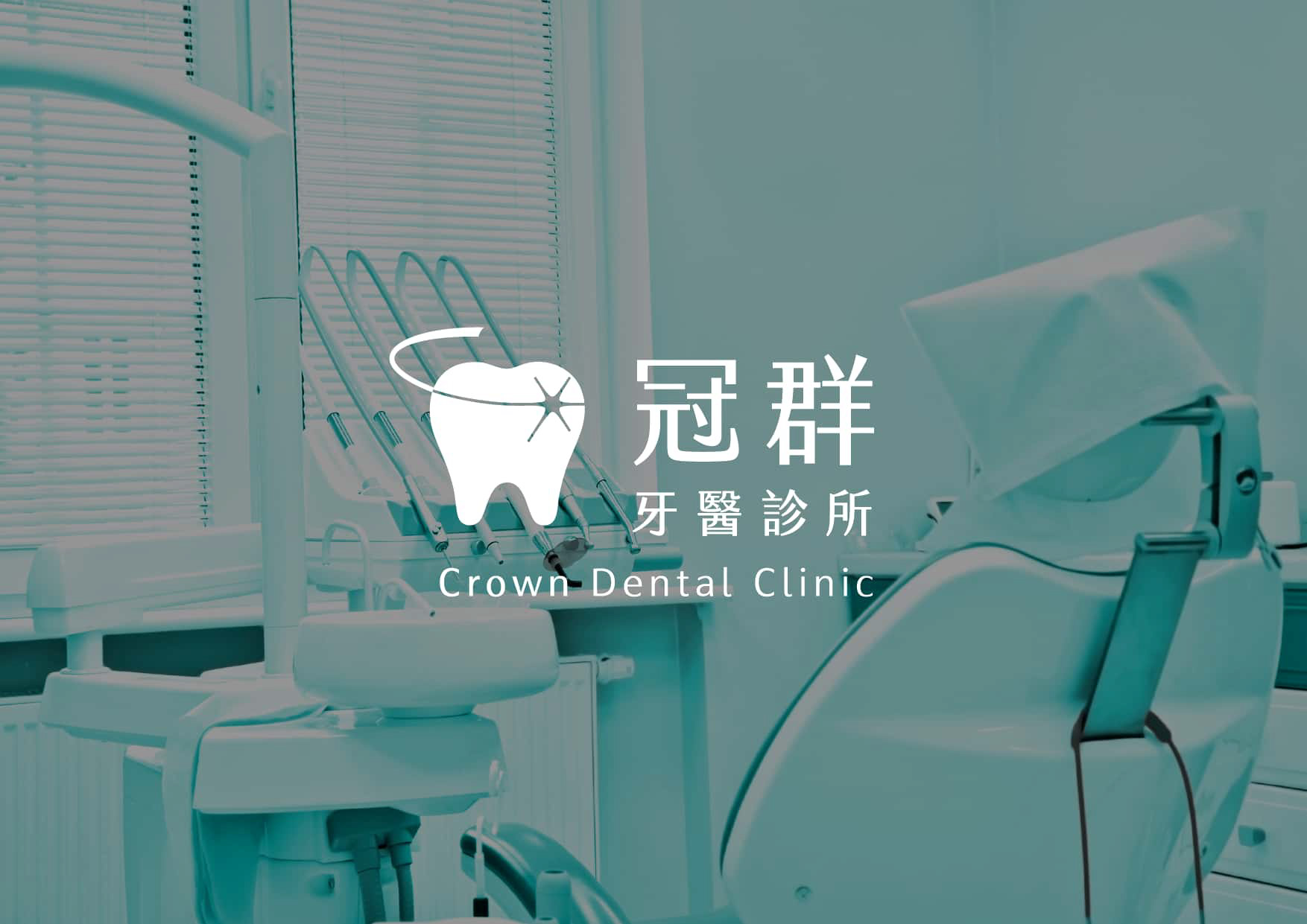
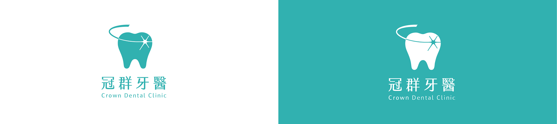
標誌以牙齒為主體,上方環繞的弧線呼應「冠」的意象——既是牙冠,也象徵守護;牙面的星芒點出潔淨與亮白,整體傳達專業、可靠而親切的診所形象。字體由書法改為結構清晰的無襯線字,大幅提升遠距與多尺寸下的辨識度,並重新梳理中文、英文與服務項目的層級關係。
標誌以牙齒為主體,上方環繞的弧線呼應「冠」的意象——既是牙冠,也象徵守護;牙面的星芒點出潔淨與亮白,整體傳達專業、可靠而親切的診所形象。字體由書法改為結構清晰的無襯線字,大幅提升遠距與多尺寸下的辨識度,並重新梳理中文、英文與服務項目的層級關係。
The mark centers on a tooth, wrapped by an arc that echoes the "crown" in the clinic's name — at once a dental crown and a sense of protection — while a star glint on the tooth's surface signals cleanliness and brightness. The calligraphic lettering was replaced with a clean sans-serif for far stronger legibility across sizes, and the Chinese, English, and service-line hierarchy was rebuilt from the ground up.
Color|色彩計畫
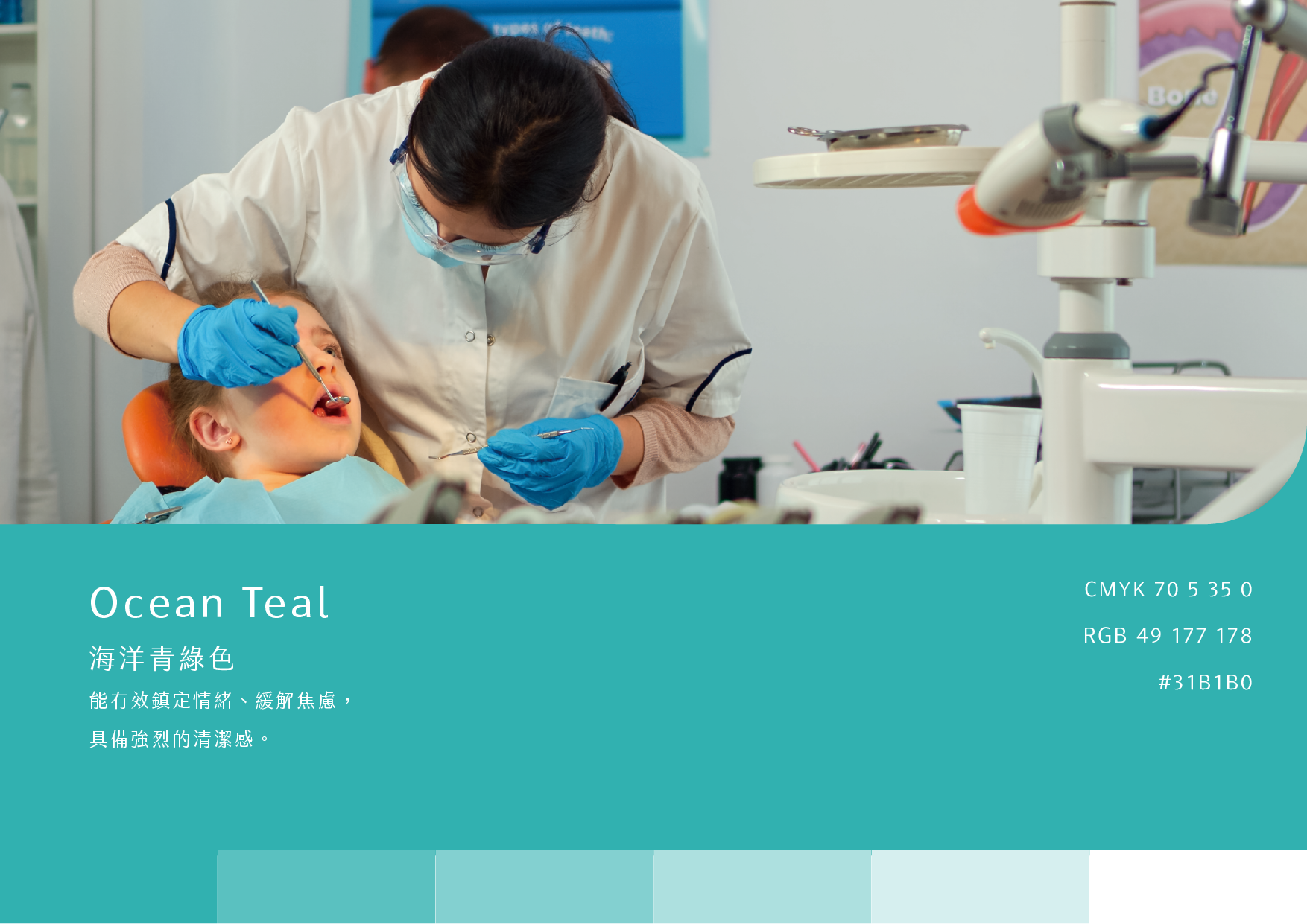
主色選用海洋青綠。相較舊招牌的灰,青綠色具鎮定情緒、緩解焦慮的心理效果,同時帶來清潔與衛生的聯想——正對應牙科最需要傳達的兩件事:安心與潔淨。
主色選用海洋青綠。相較舊招牌的灰,青綠色具鎮定情緒、緩解焦慮的心理效果,同時帶來清潔與衛生的聯想——正對應牙科最需要傳達的兩件事:安心與潔淨。
The palette centers on Ocean Teal. In place of the old grey, teal carries a calming, anxiety-easing quality while evoking cleanliness and hygiene — addressing the two things dental care most needs to communicate: reassurance and cleanliness.
Identity System|識別組合規範
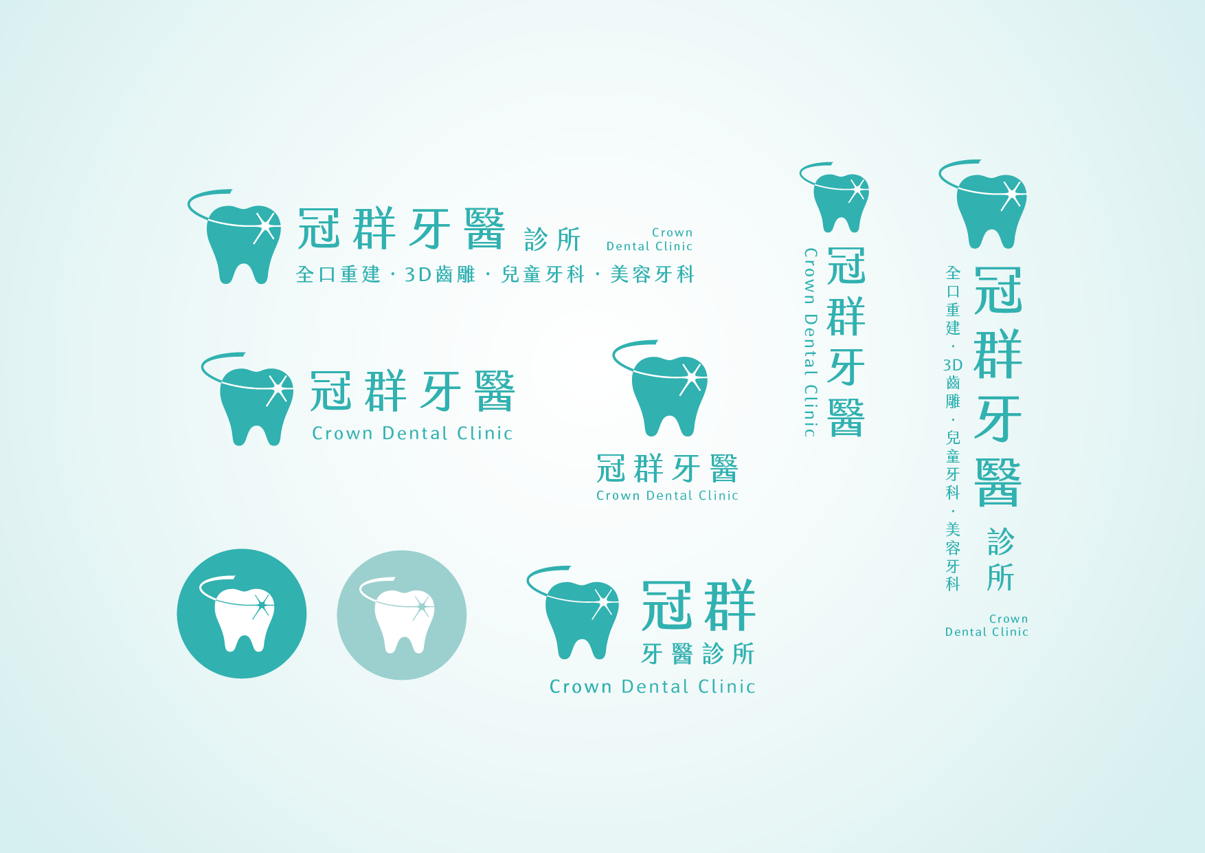
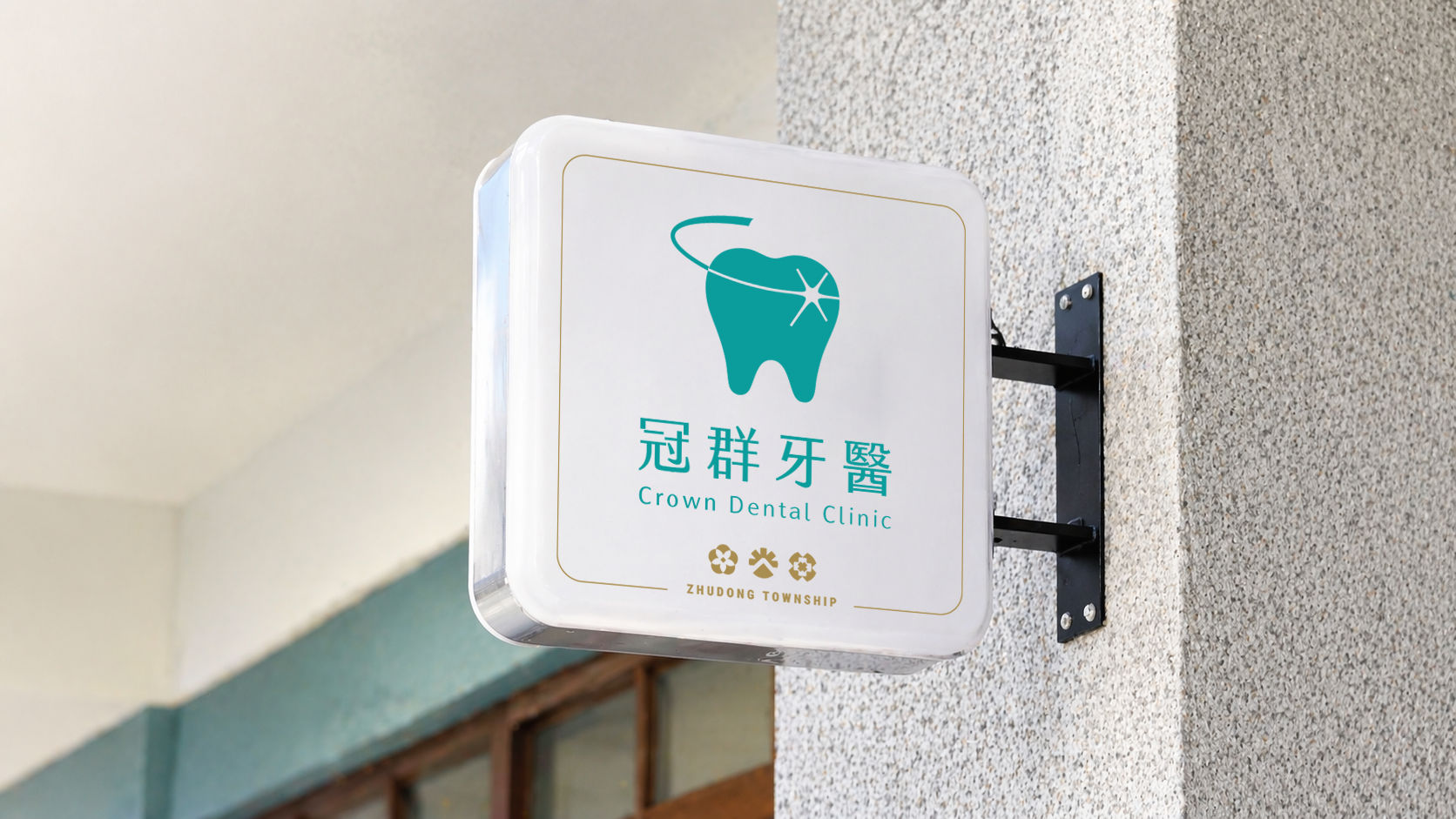
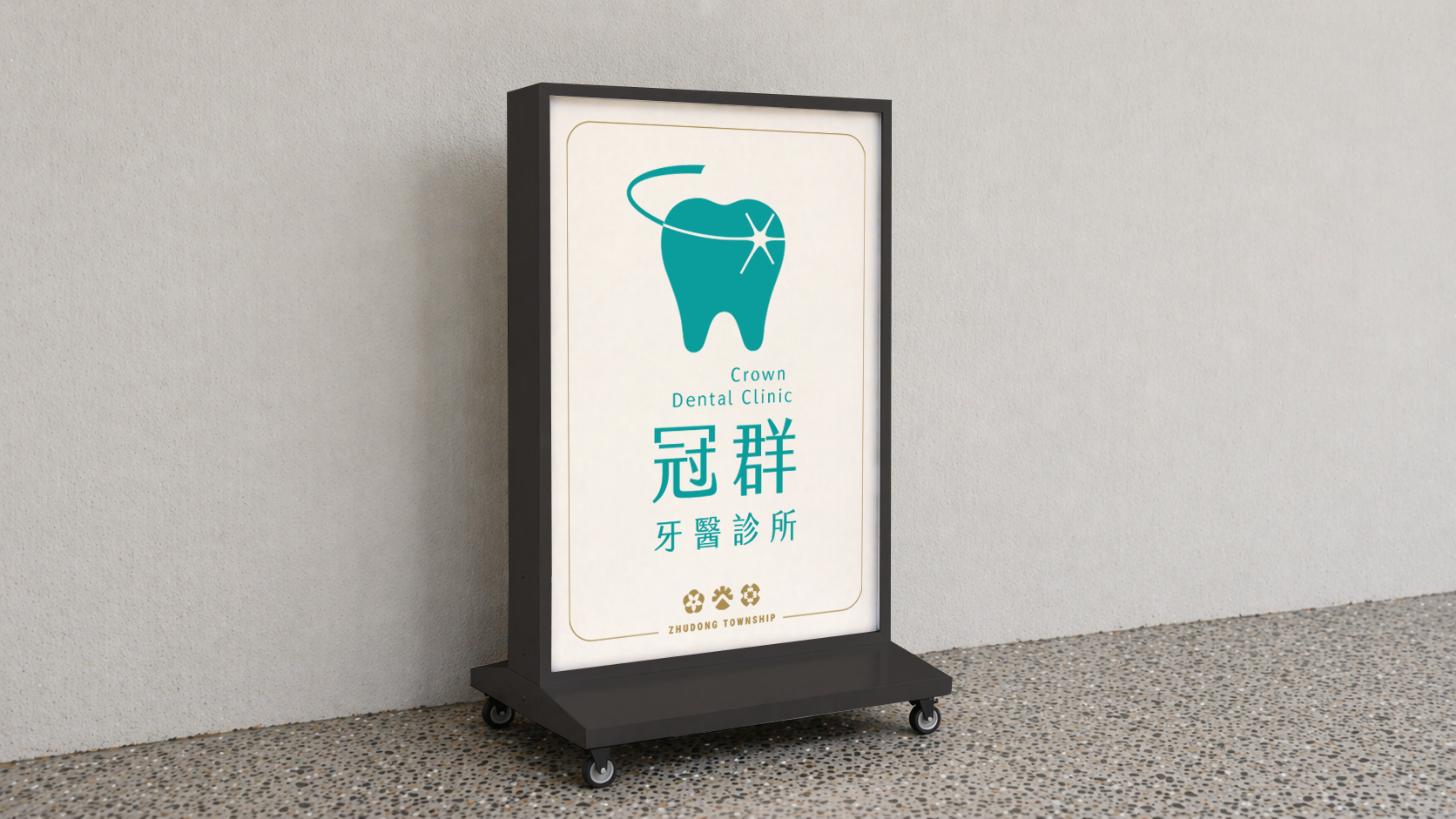
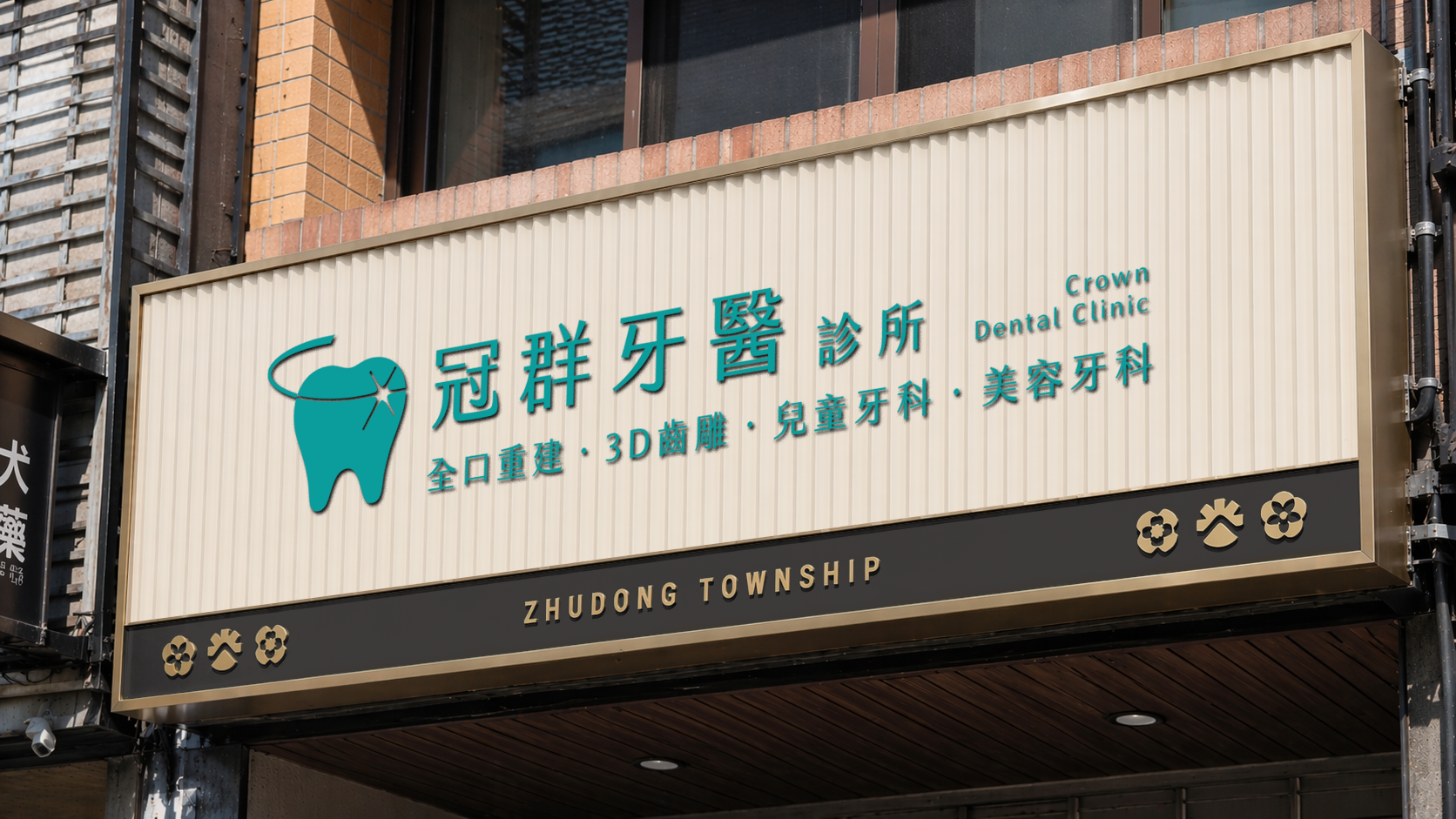
識別建立了橫式、直式與圓形記號等多種組合規範,涵蓋完整版(含服務項目與英文)到精簡版,確保標誌在直式招牌、橫式招牌、圓形燈箱等不同載體與尺寸下都能保持一致與辨識度。
識別建立了橫式、直式與圓形記號等多種組合規範,涵蓋完整版(含服務項目與英文)到精簡版,確保標誌在直式招牌、橫式招牌、圓形燈箱等不同載體與尺寸下都能保持一致與辨識度。
The identity includes horizontal, vertical, and circular lockups, ranging from a full version (with service lines and English) to simplified marks, keeping the logo consistent and legible across vertical signs, horizontal signs, and circular light boxes at any size.
Extended Application|延伸應用
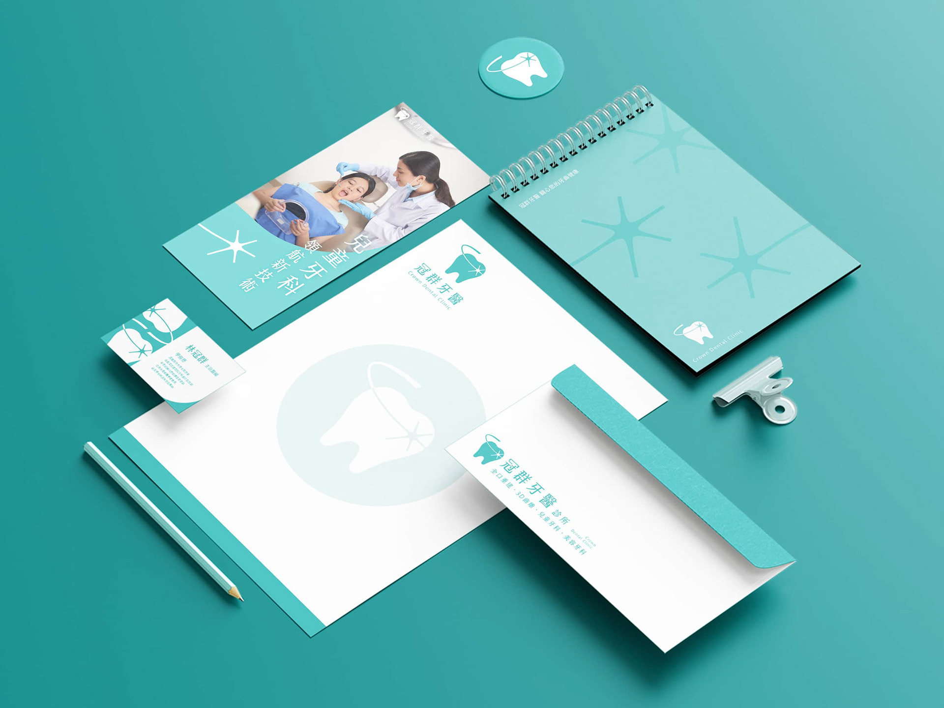
於招牌委託之外,更進一步自主延伸應用,將標誌與星芒輔助圖形展開於名片、信封、便條本、杯墊與資料夾等物件,探索識別系統完整落地的樣貌,並驗證其在各式載體上的一致性與延展性。
於招牌委託之外,更進一步自主延伸應用,將標誌與星芒輔助圖形展開於名片、信封、便條本、杯墊與資料夾等物件,探索識別系統完整落地的樣貌,並驗證其在各式載體上的一致性與延展性。
Beyond the signage commission, extended the identity on my own initiative — applying the logo and its star motif across business cards, envelopes, notepads, coasters, and folders — to explore how the system comes to life in full and to test its consistency and adaptability across formats.
Brand | 冠群牙醫診所 Crown Dental Clinic
Client | 富博創意股份有限公司 RICH ERUDITE CREATIVE CO., LTD.
Year | 2026
Role | Visual Identity & Graphic Design
ensu design ©