
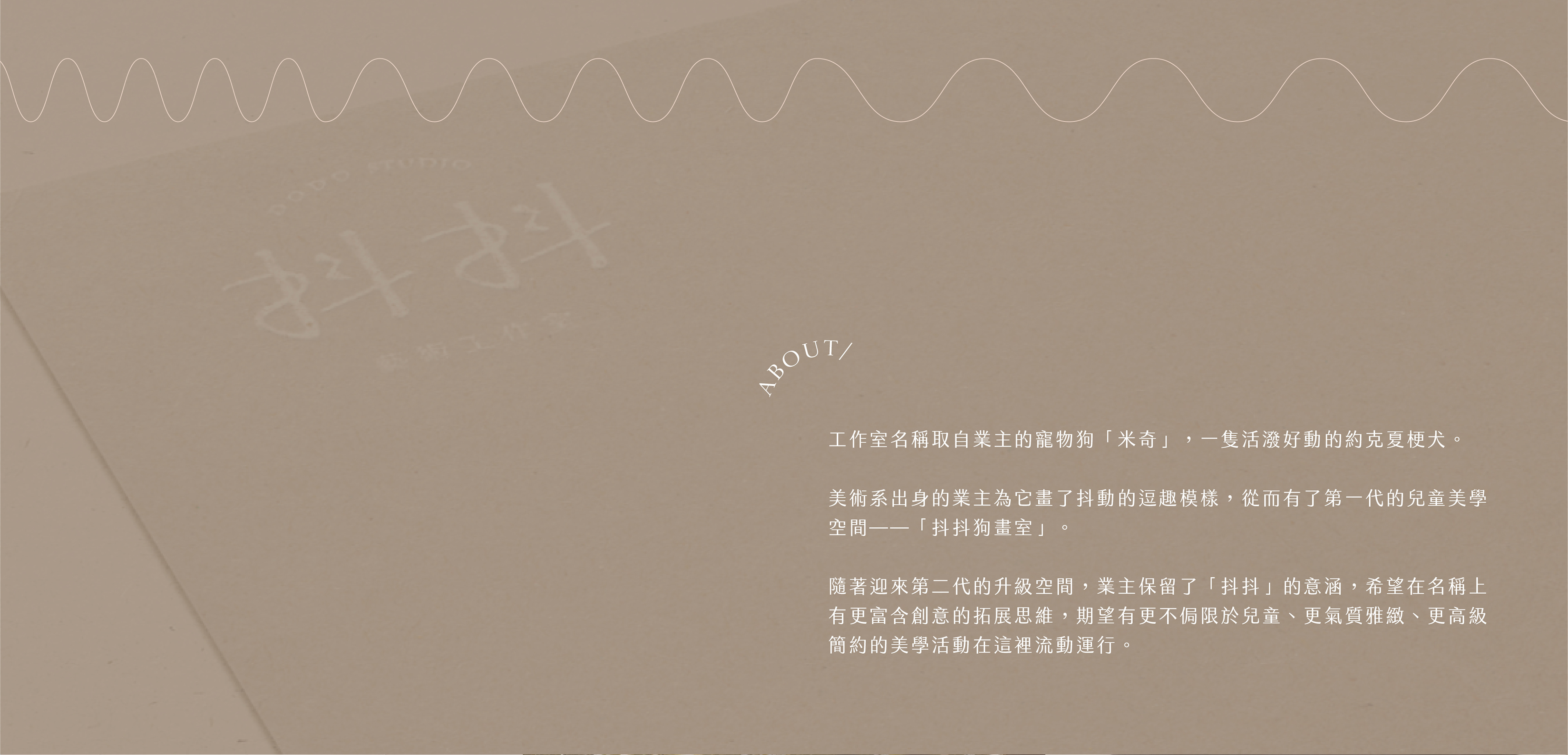
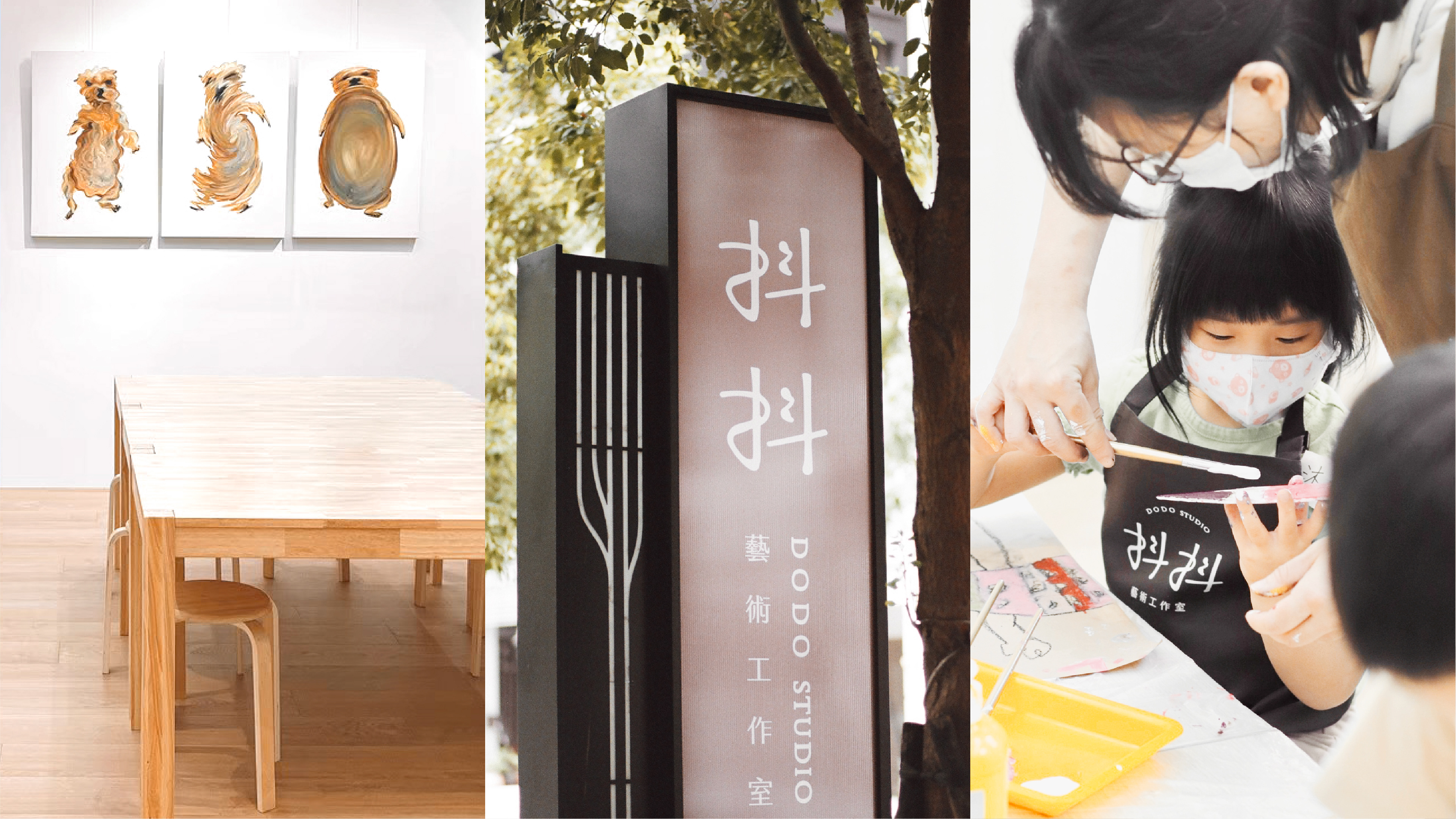
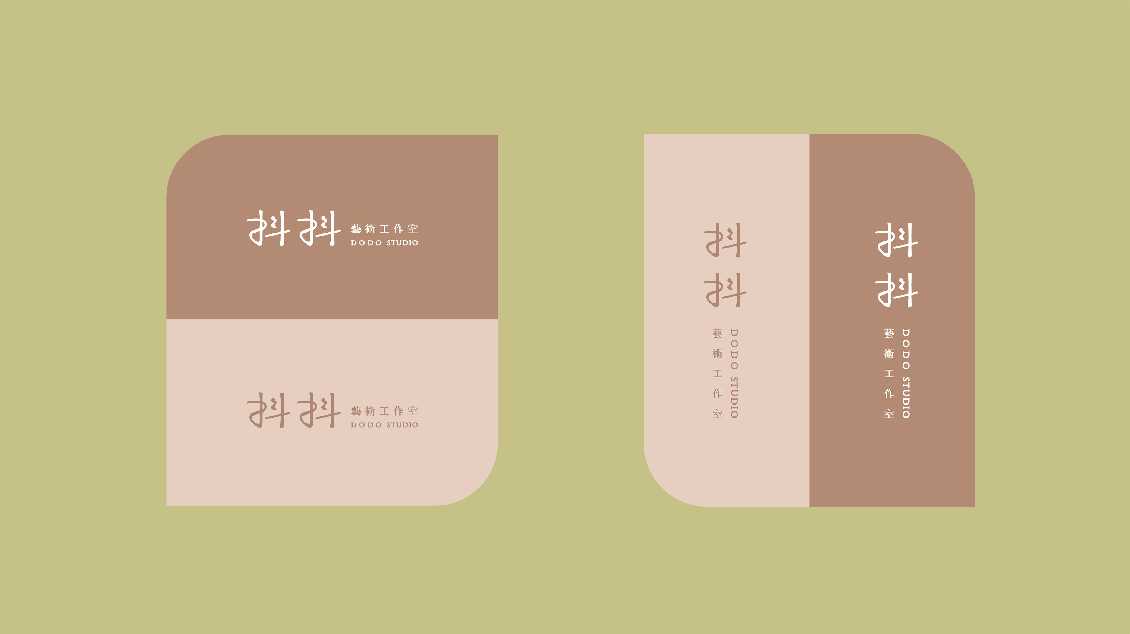
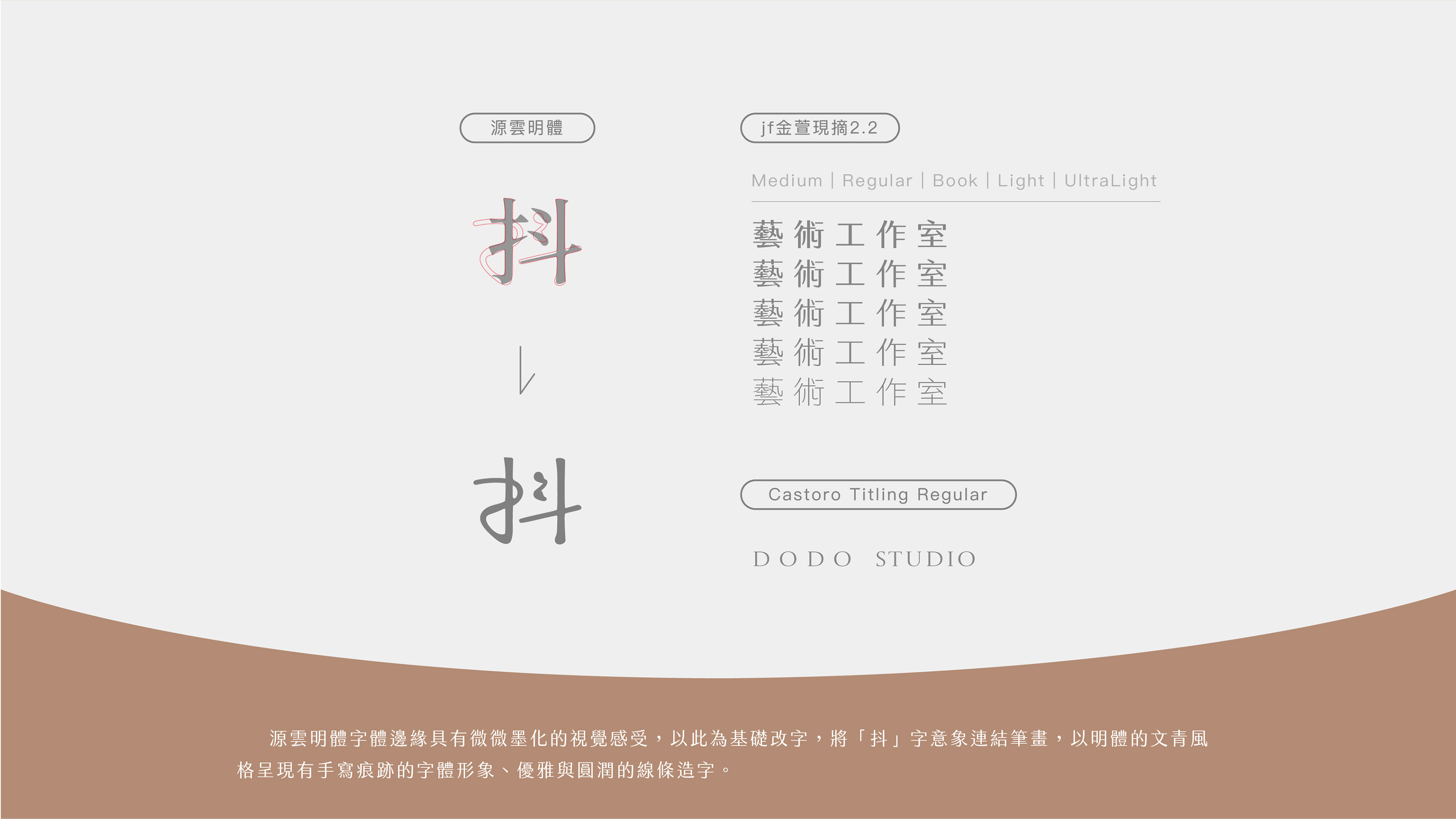
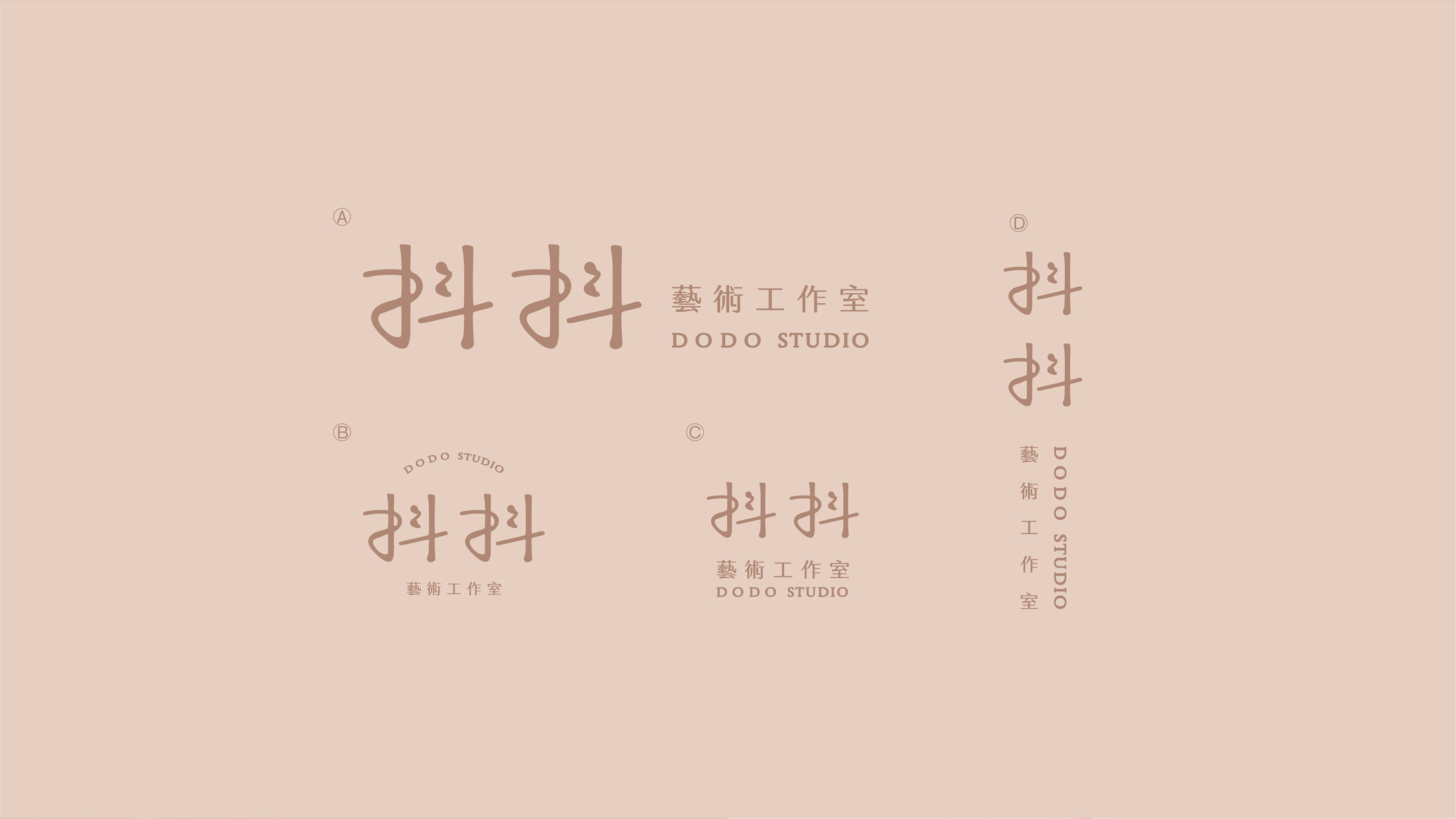
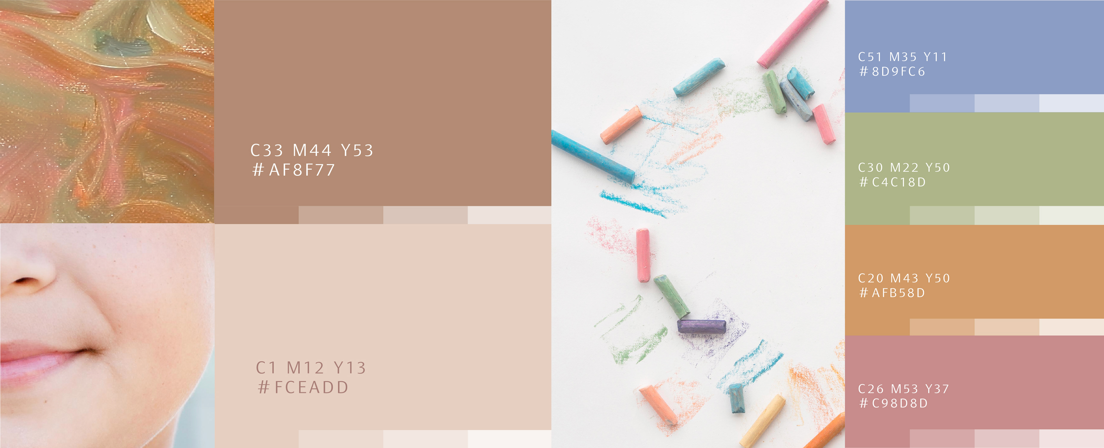
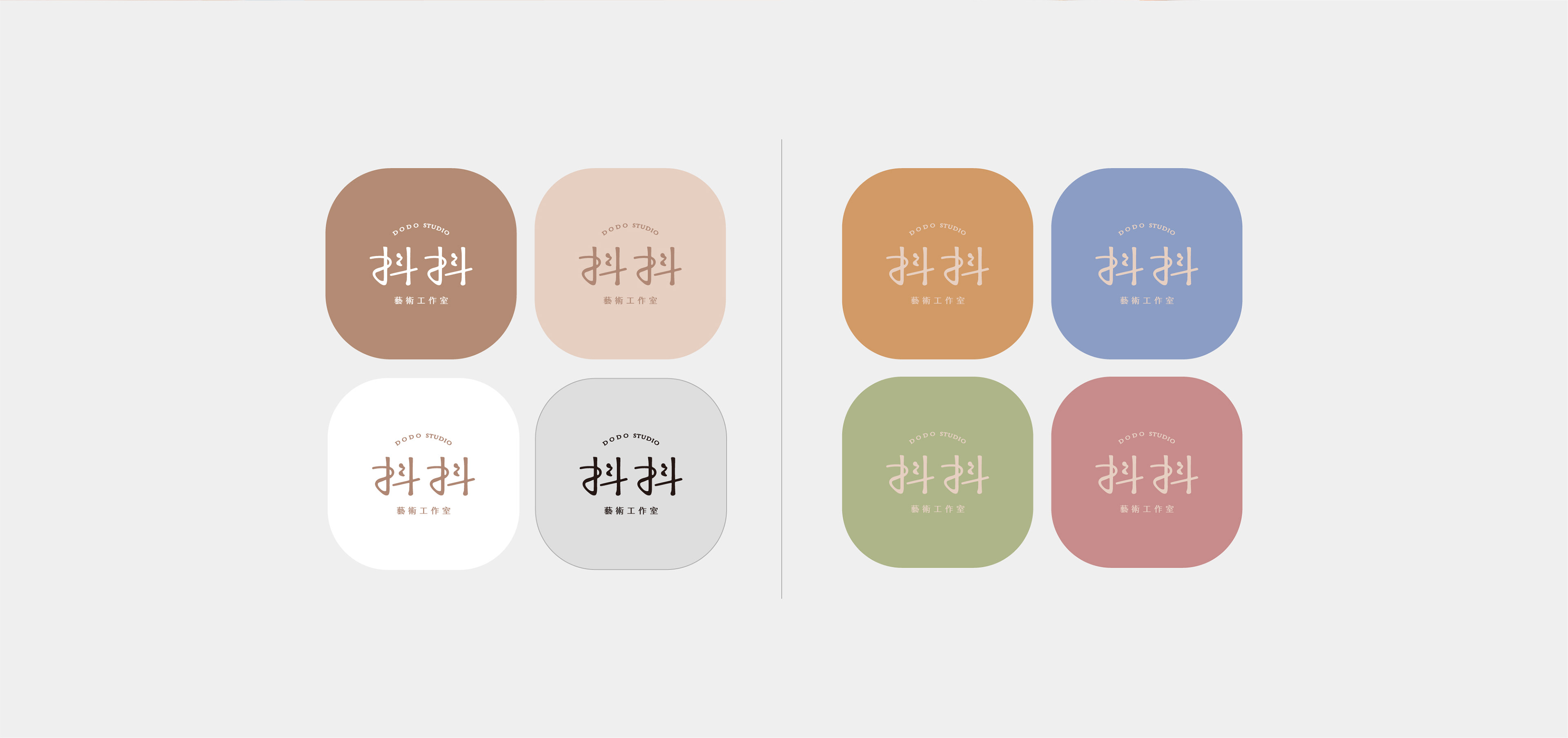
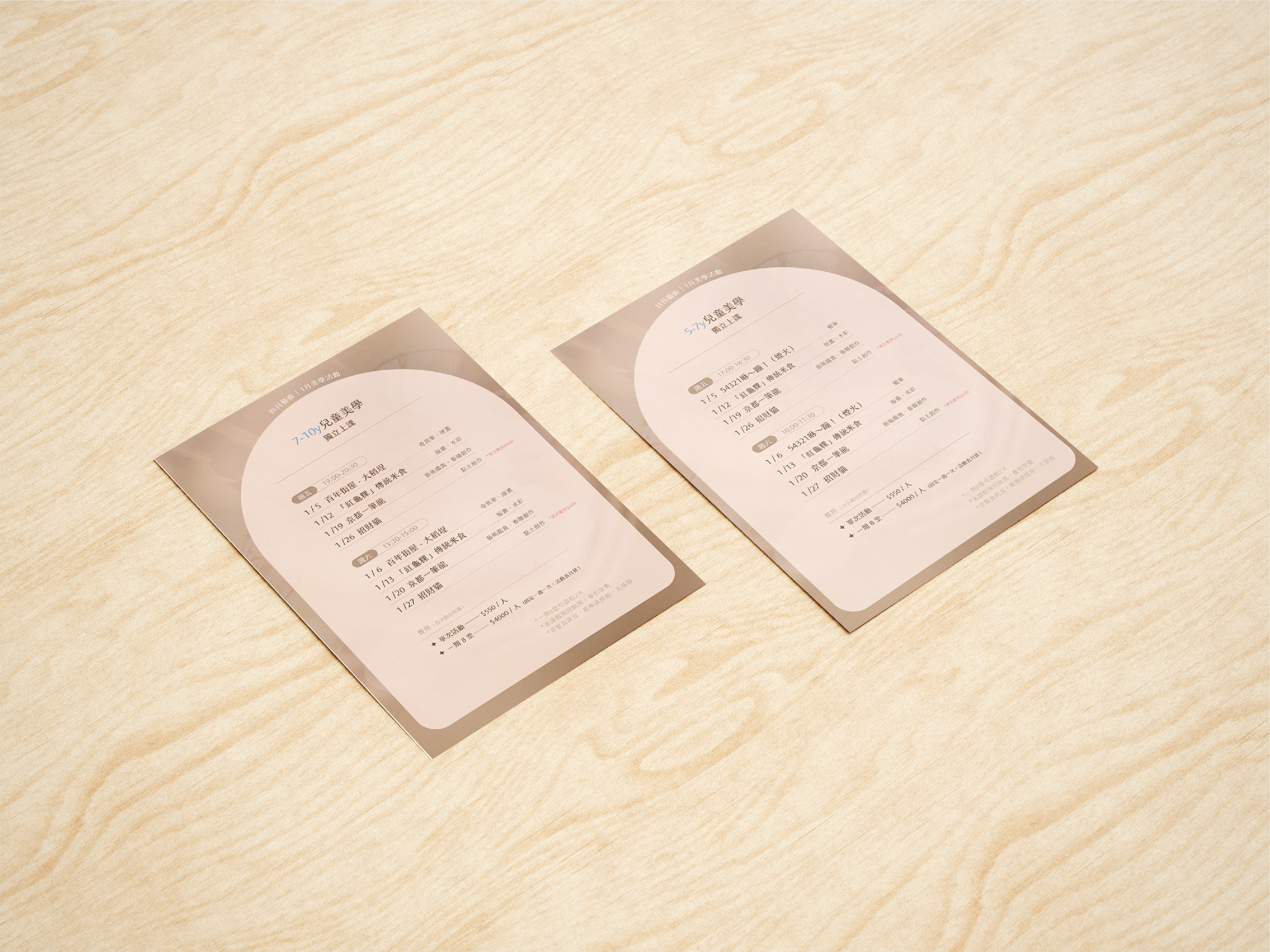
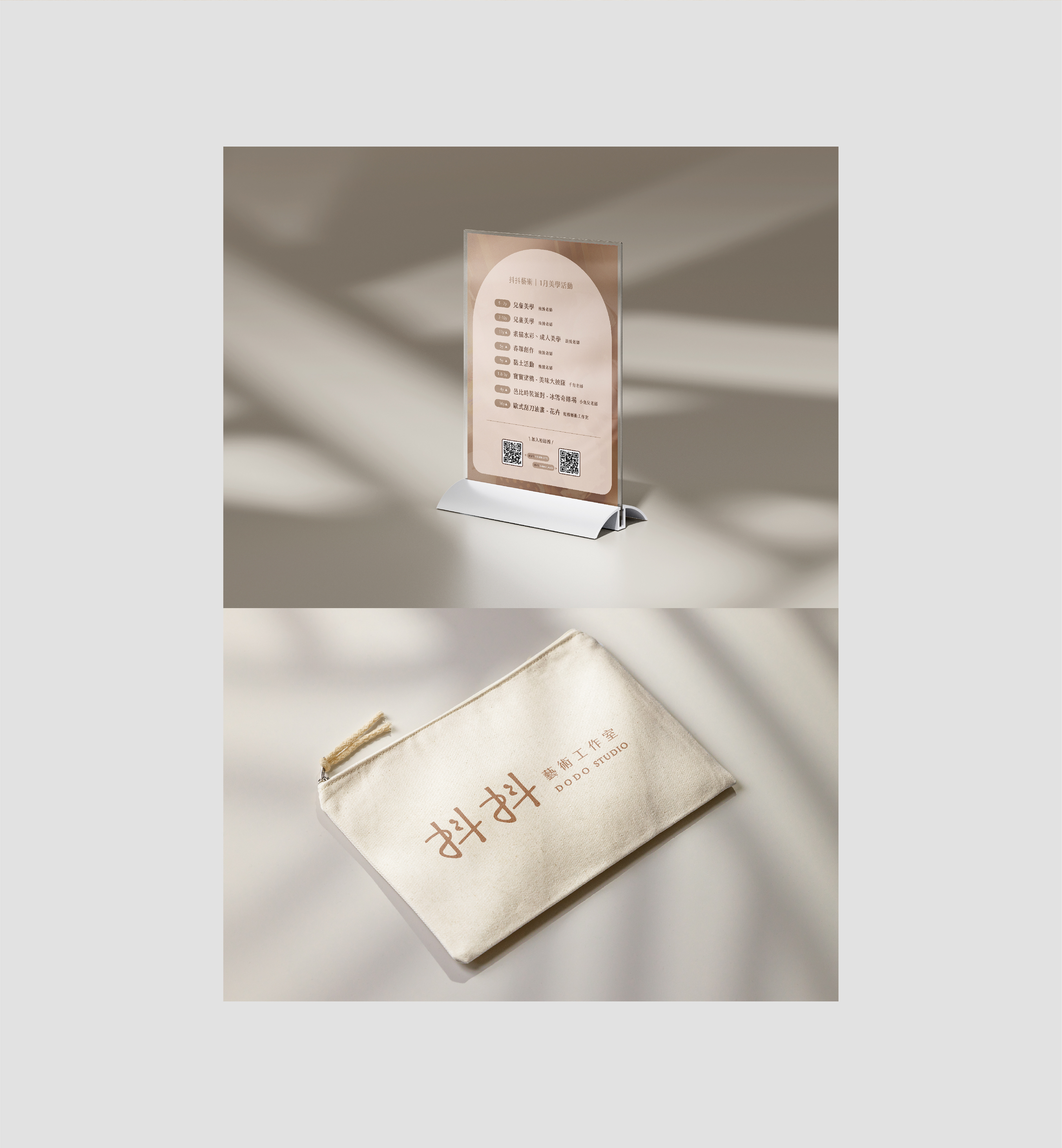
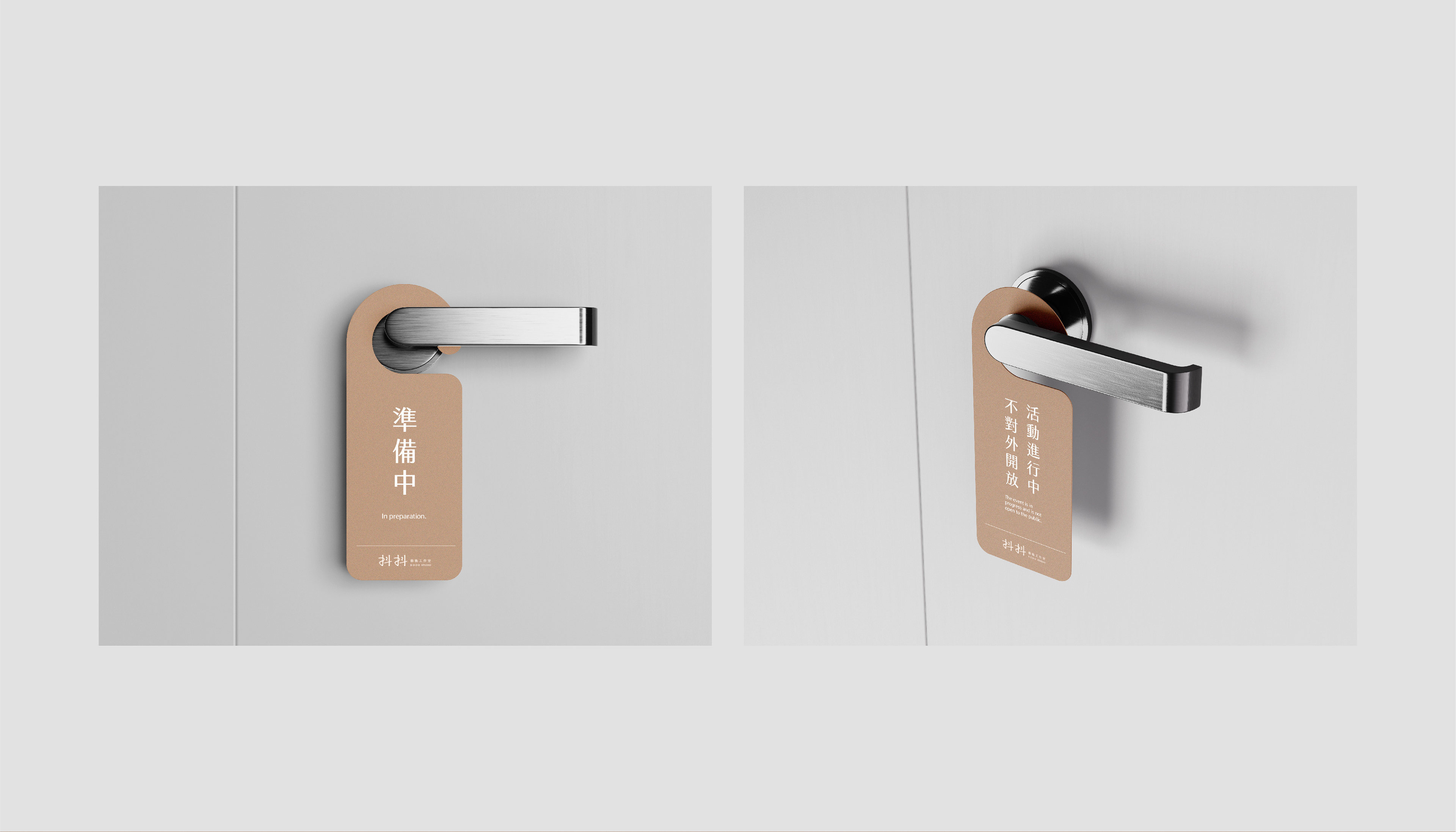
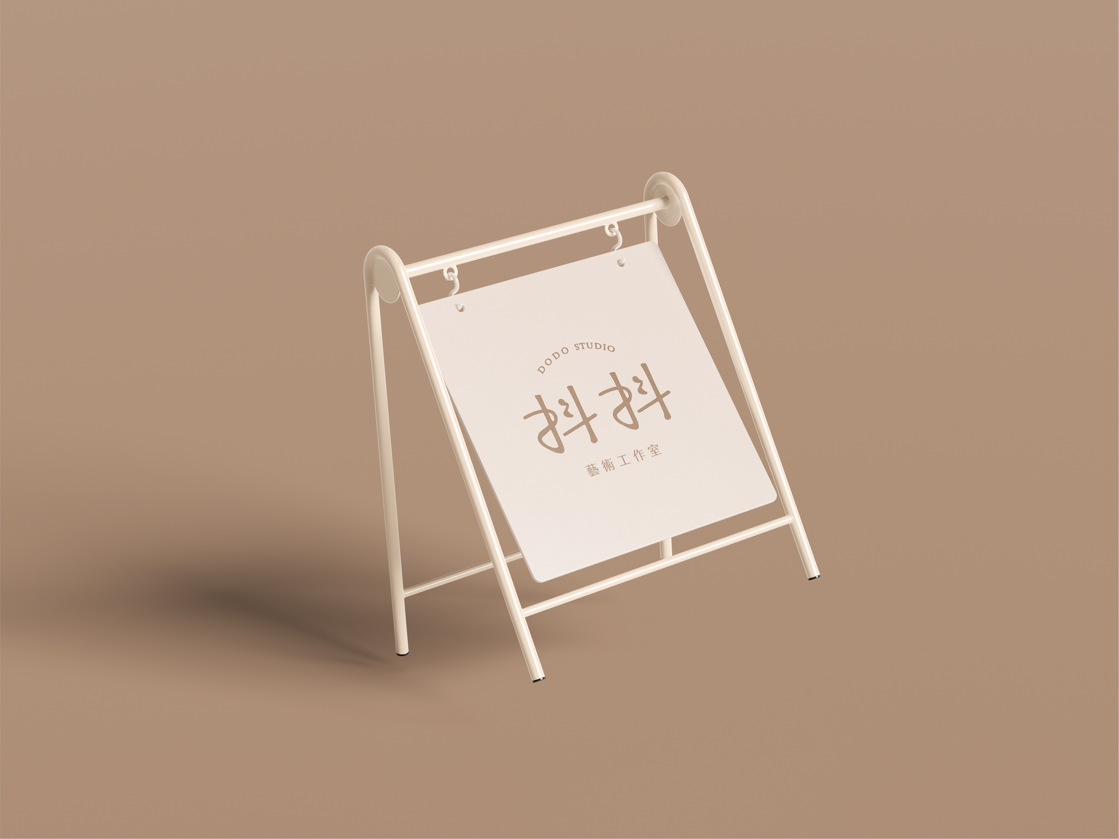
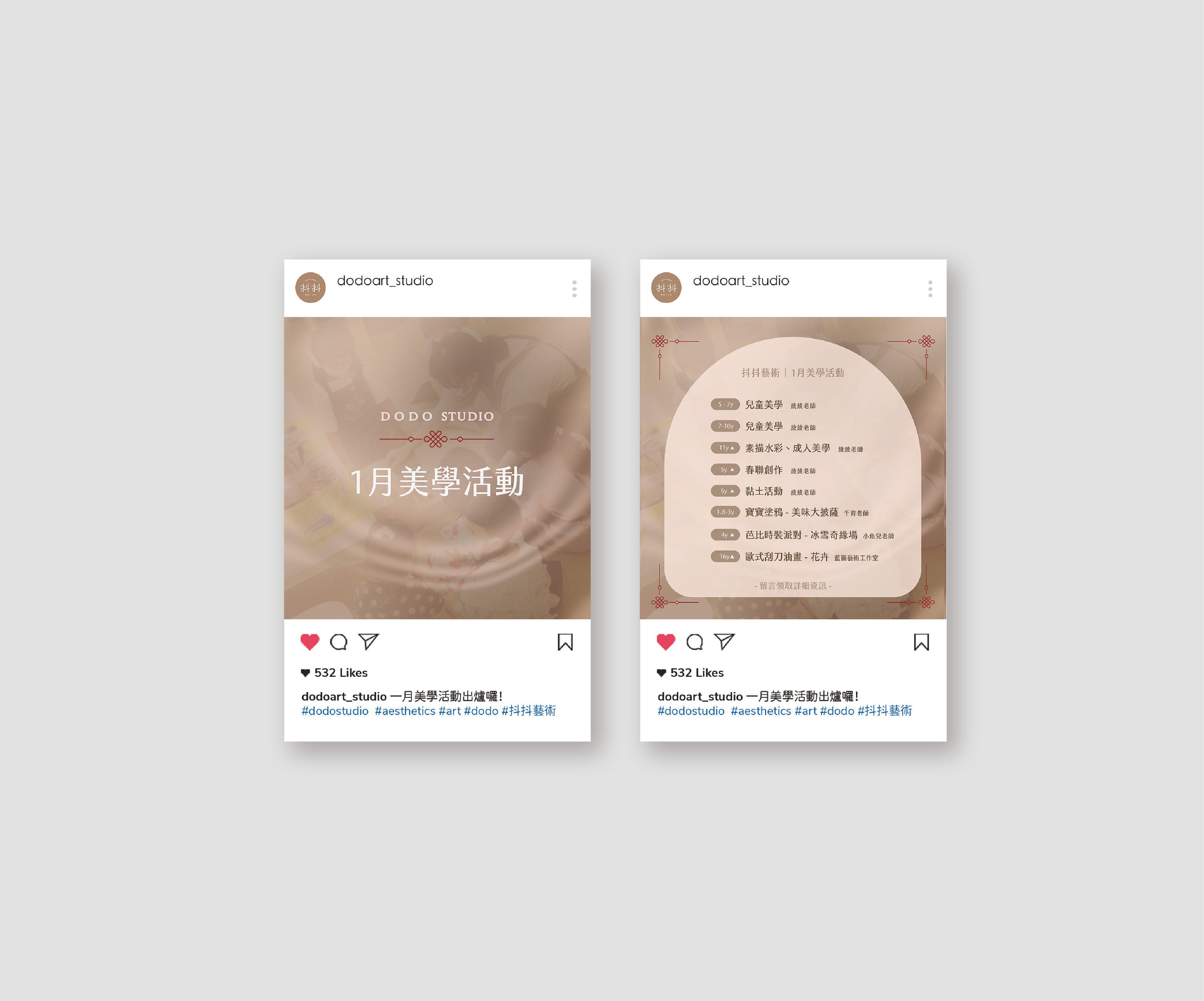
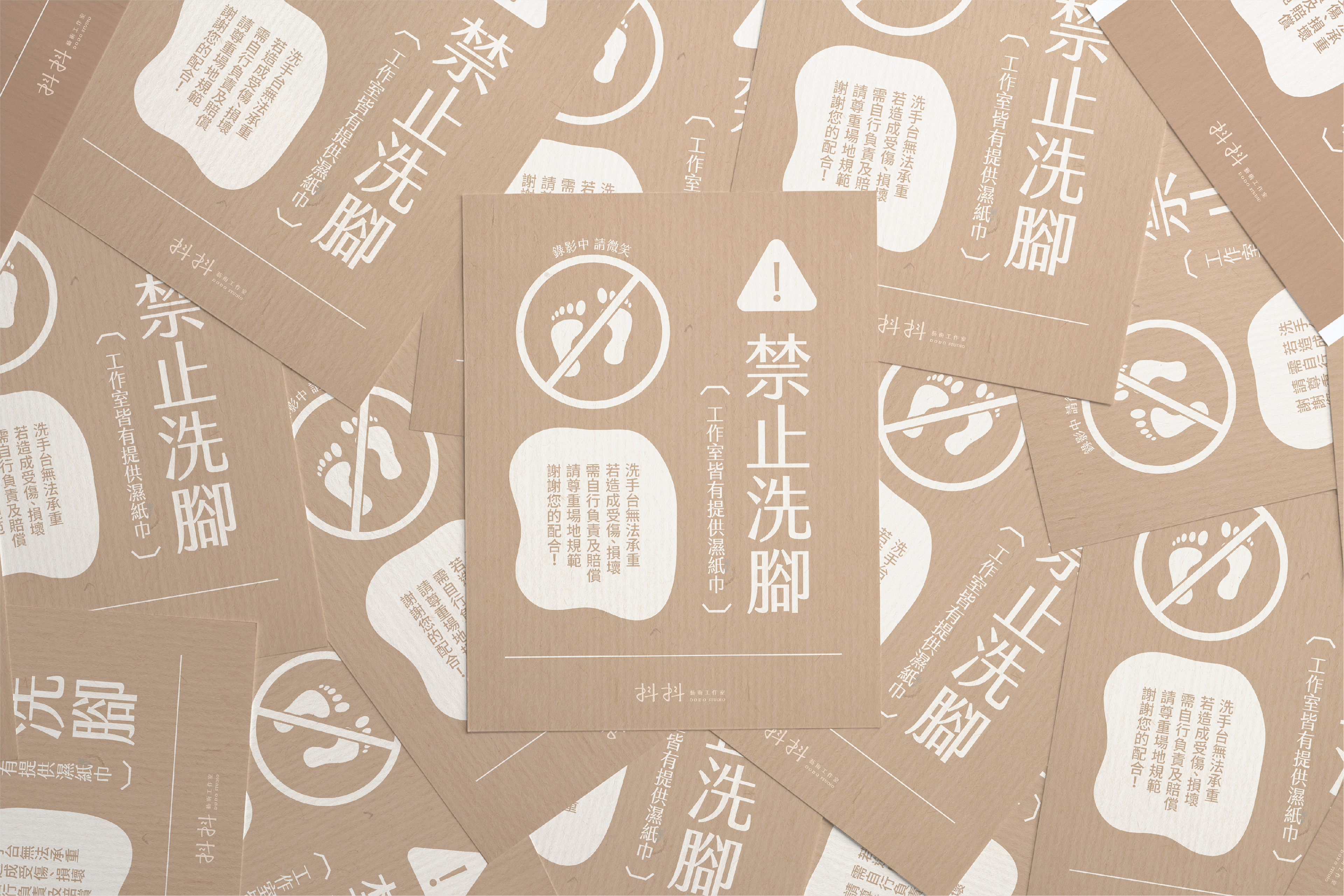
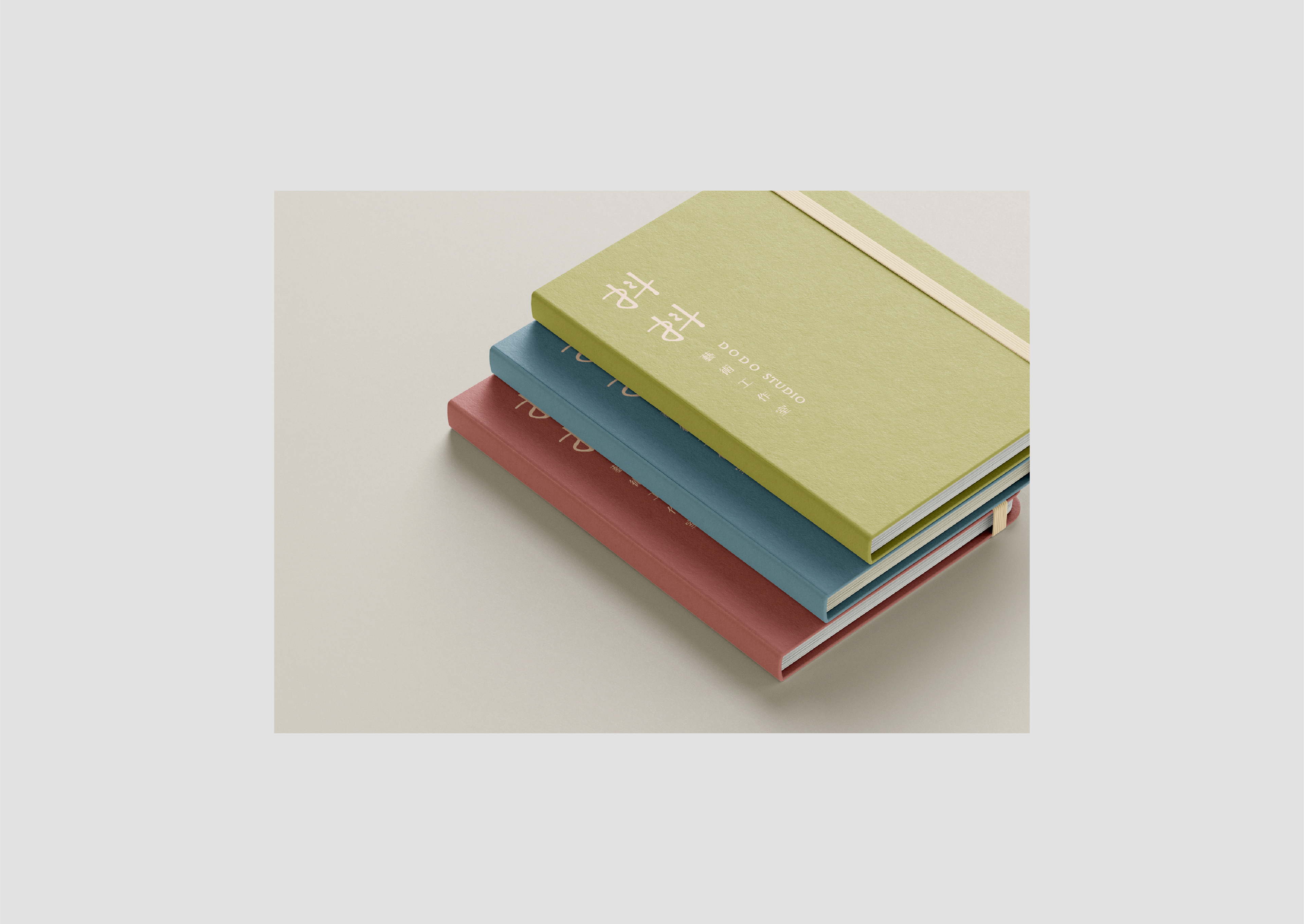
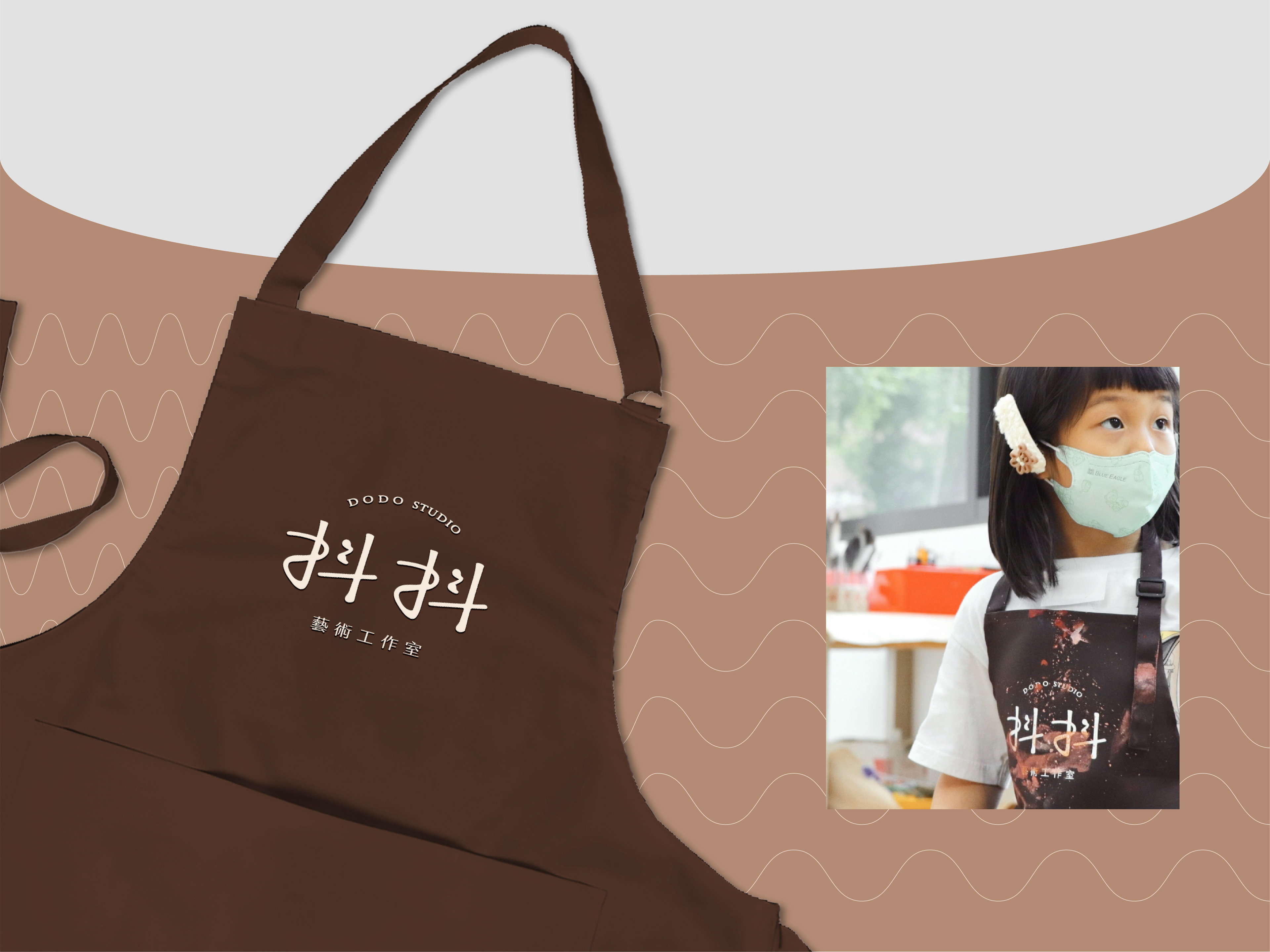
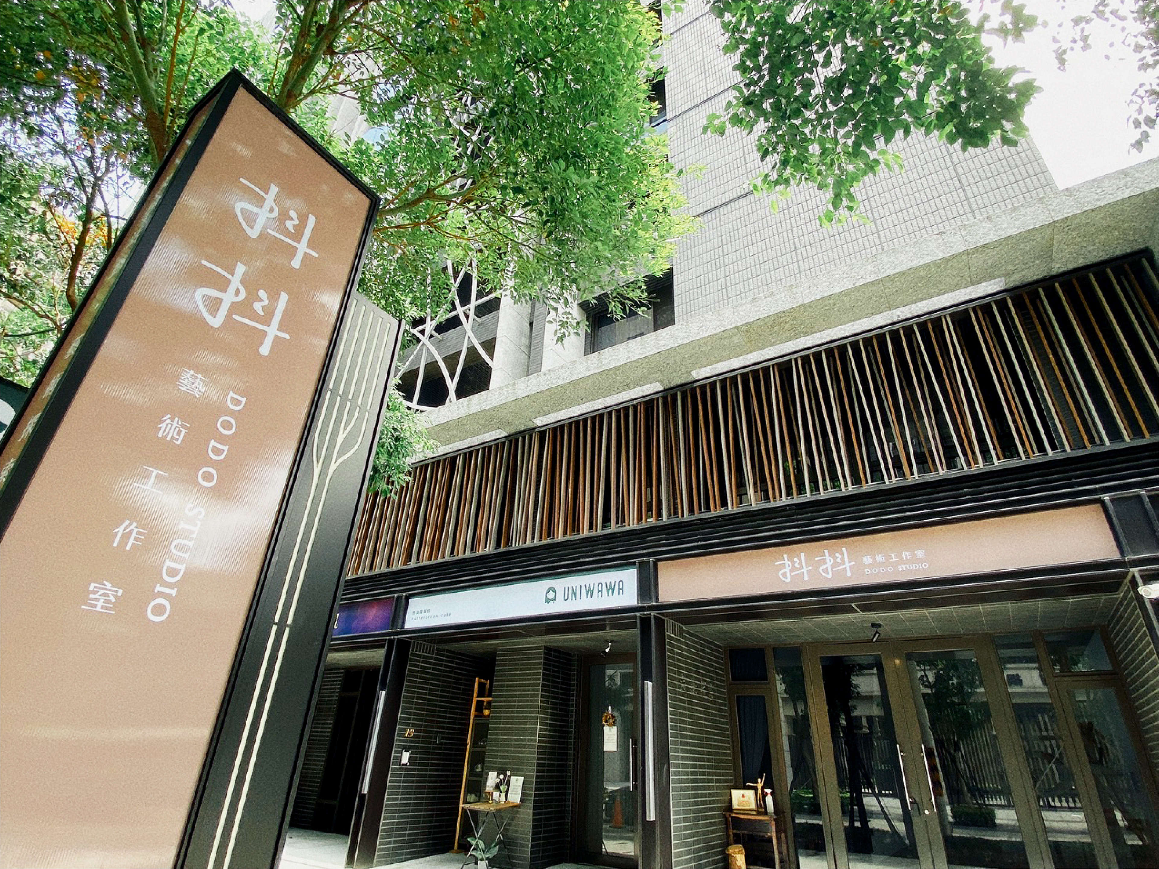
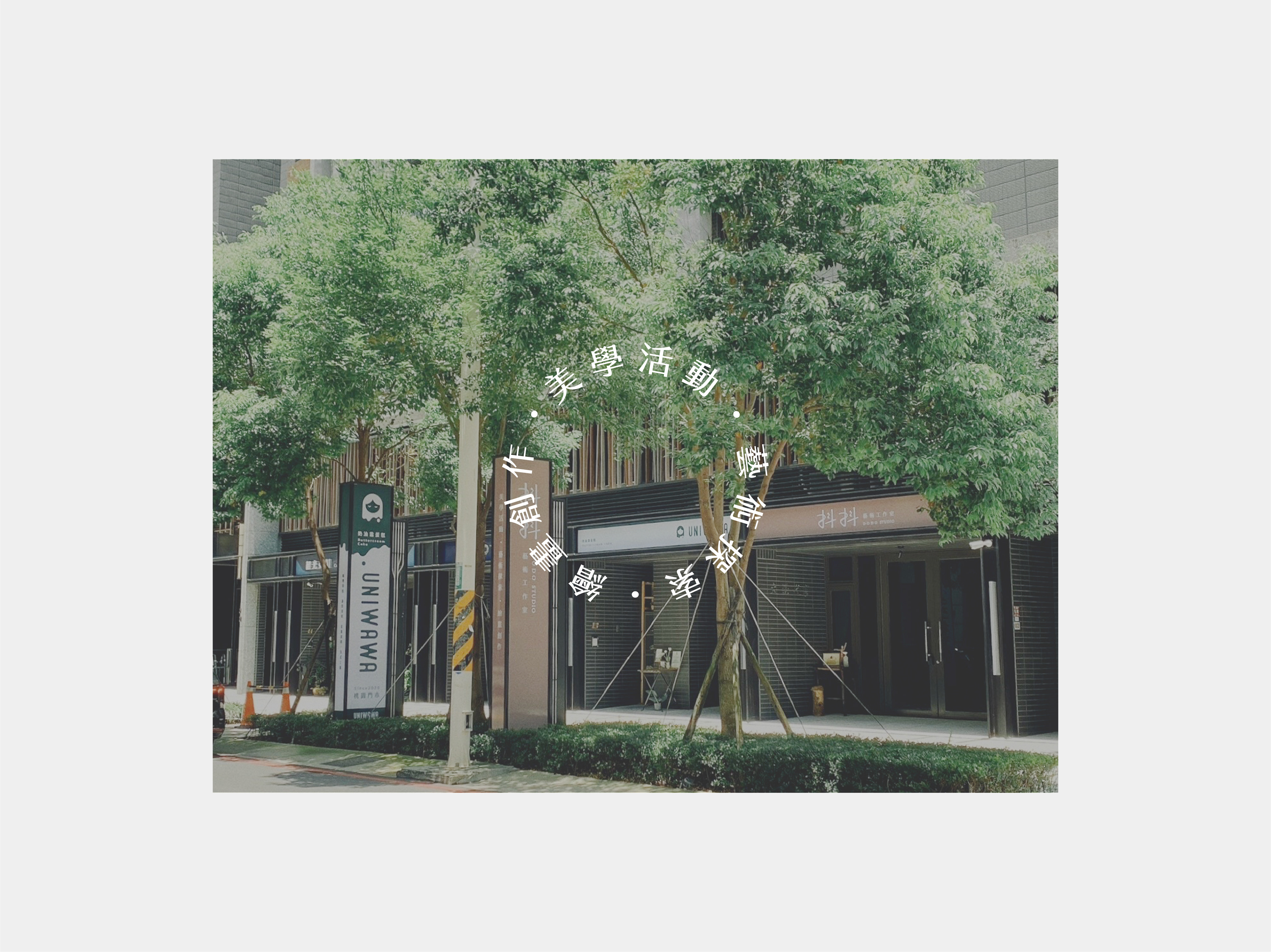
*本專案為「抖抖藝術工作室(DODO STUDIO)」之品牌視覺識別系統(BI)設計。設計核心旨在轉譯藝術創作的純粹性與包容力,視覺上大膽揉合手感溫度的線條與質樸的標準字設計,打破傳統藝術空間生硬、高冷的面貌。整體視覺透過溫暖的中性大地色調與豐富的油彩筆觸紋理相互交織,建構出兼具藝術包容性與現代視覺張力的形象系統,為工作室奠定極具品牌辨識度與人文溫度的美學語彙。
*This brand identity (BI) design project was developed for DODO STUDIO. The core objective of the design was to translate the purity and inclusivity of artistic creation, utilizing hand-drawn, organic lines paired with an unpolished, tactile logotype to challenge the traditionally rigid and detached aesthetics of art spaces. The visual system blends warm, neutral earth tones with rich, textured oil brushstrokes, establishing an identity that balances artistic warmth with modern visual impact, defining a highly recognizable and human-centric aesthetic language for the studio.


Client | 抖抖藝術工作室 DODO STUDIO
Year | 2026
Role | Brand Identity Design
ensu design ©