
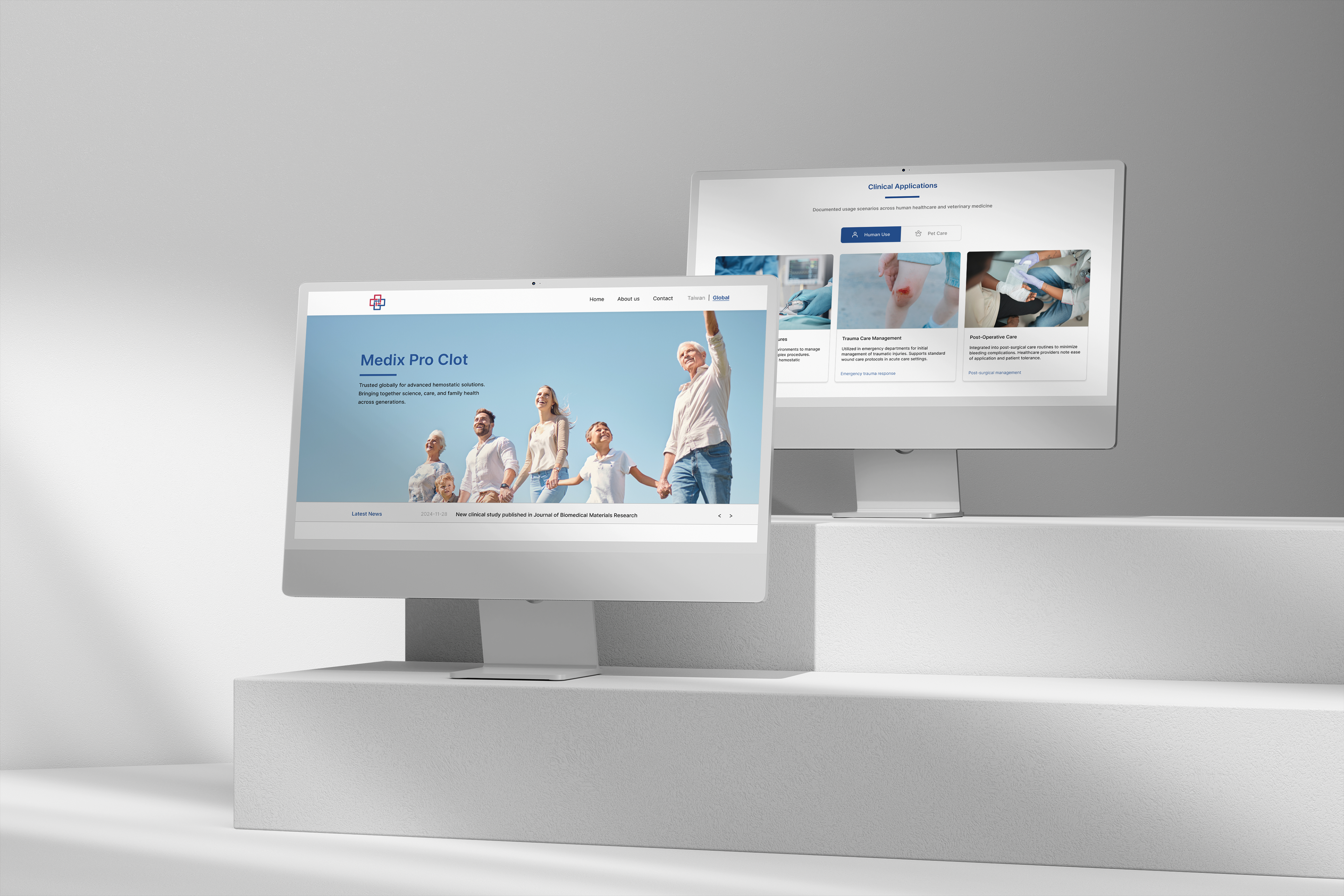
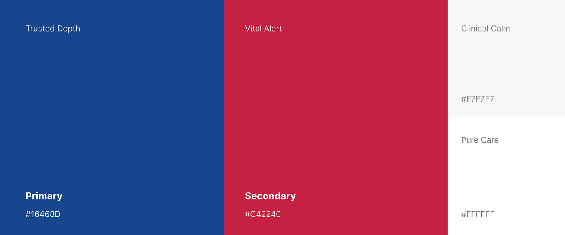
*本專案為生醫科技品牌「MEDIX LLC.」之官方網站介面與使用者體驗(UI/UX)設計。為了傳遞品牌在醫療檢驗與生物科技領域的權威性與專業信任度,網頁視覺以洗鍊的深藍色調為基底,搭配高通透感的白灰空間排版。整體架構採用響應式網頁設計(RWD),將複雜的生醫產品線與技術數據進行模組化圖像轉譯,透過直覺的導覽動線與清晰的資訊層級,為國際醫療客戶打造兼具前瞻科技感與流暢操作體驗的數位品牌門面。
*This UI/UX and web design project was developed for the official website of MEDIX LLC., a leading biomedical technology brand. To convey the brand's authority and professional trust within the medical testing and biotechnology sectors, the web interface utilizes a sophisticated deep blue base paired with a highly translucent, clean white-and-gray spatial layout. Employing a fully responsive web design (RWD) framework, the system translates complex biomedical product lines and technical data into intuitive, modular graphics. Through streamlined navigation and a clear information hierarchy, the platform delivers a forward-thinking, seamless digital brand experience tailored for global healthcare clients.
The Challenge|設計挑戰
MEDIX LLC. 的止血科技產品線橫跨人類與寵物照護市場,涵蓋臨床創傷、術後照護、居家急救等多元使用情境。如何在同一套介面架構中,清楚區分「Human Use」與「Pet Care」兩條產品線,同時維持專業、可被信賴的品牌調性,是本案的核心設計挑戰。
As a hemostatic technology brand serving both human and veterinary markets, MEDIX LLC.'s product line spans clinical trauma care, post-operative recovery, and at-home emergency use. The core challenge was structuring a single interface that clearly separates "Human Use" and "Pet Care" audiences while preserving a consistent, trustworthy brand tone across both.
The Redesign|介面重構
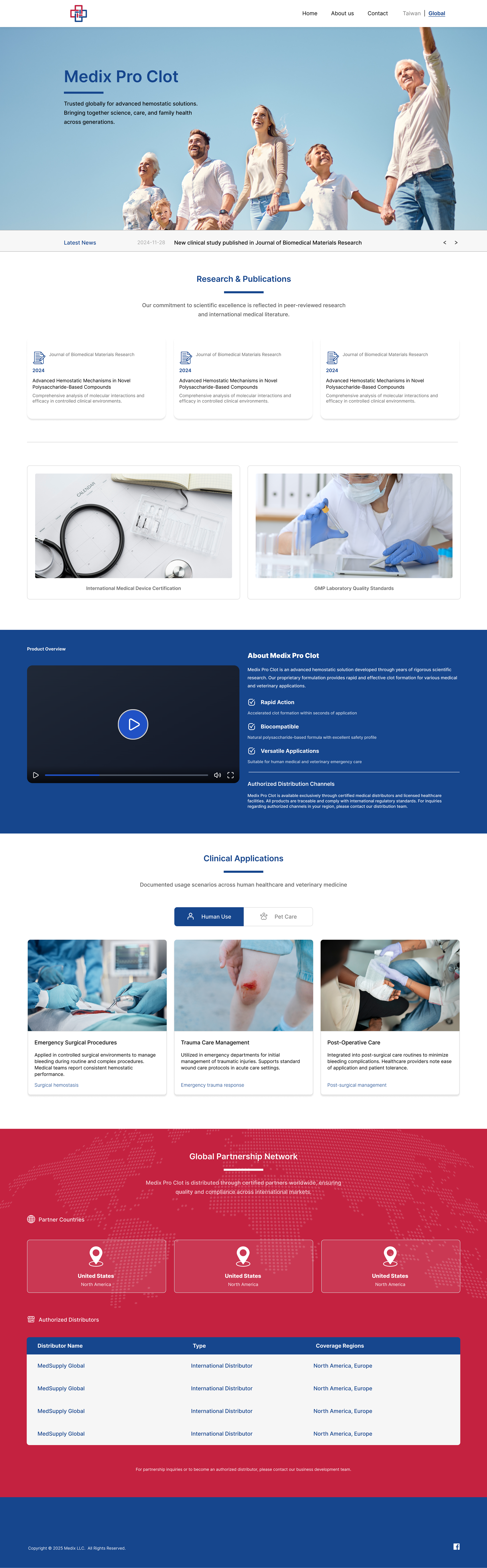
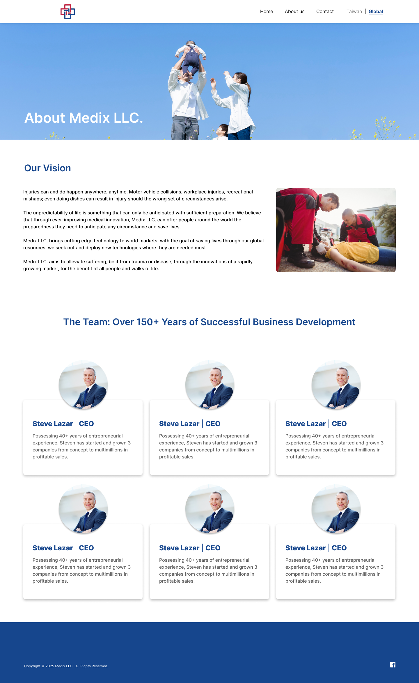
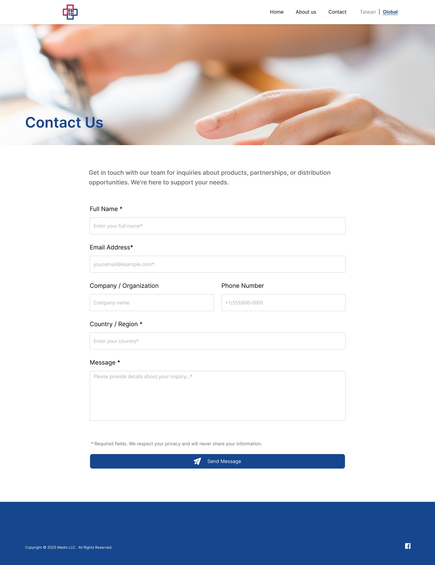
首頁採用長版式資訊架構,從情感訴求開場——跨世代家庭生活影像搭配品牌標語,接著以跑馬燈呈現最新消息,再依序展開研究文獻、認證資訊、產品介紹影片、產品特色列點,最後透過 Human Use / Pet Care 頁籤呈現臨床應用情境。子頁面(About us、Contact)則簡化為單一敘事重點:About us 聚焦品牌願景與團隊陣容,Contact 則是清楚分區的聯絡表單,降低跨國客戶的填寫門檻。
The homepage follows a long-form information architecture: it opens with an emotional appeal — a multigenerational family image paired with the brand statement — followed by a news ticker, then unfolds through research publications, certifications, a product overview video, and a feature checklist, closing with a Human Use / Pet Care toggle for clinical application scenarios. The subpages (About us, Contact) each hold a single narrative focus: About us centers on brand vision and team, while Contact offers a clearly sectioned inquiry form that lowers the barrier for international clients.
Visual Foundation|視覺基礎規範
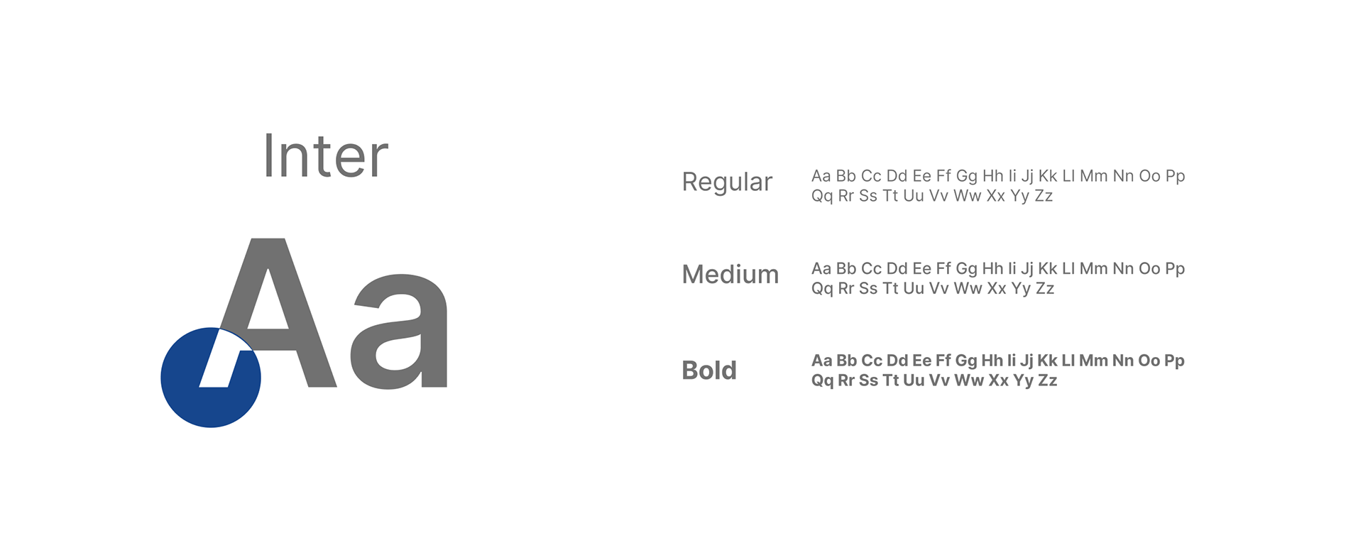
字體選用 Inter,其清晰的幾何線條與多層級字重(Regular / Medium / Bold),確保在複雜的臨床數據與產品資訊中,仍維持良好的閱讀節奏與視覺層級。
Typography is set in Inter, whose clean geometric structure and multiple weights (Regular / Medium / Bold) preserve strong readability and visual hierarchy across dense clinical data and product information.
Client | MEDIX LLC.
Year | 2026
Role | UI/UX & Web Design
ensu design ©