
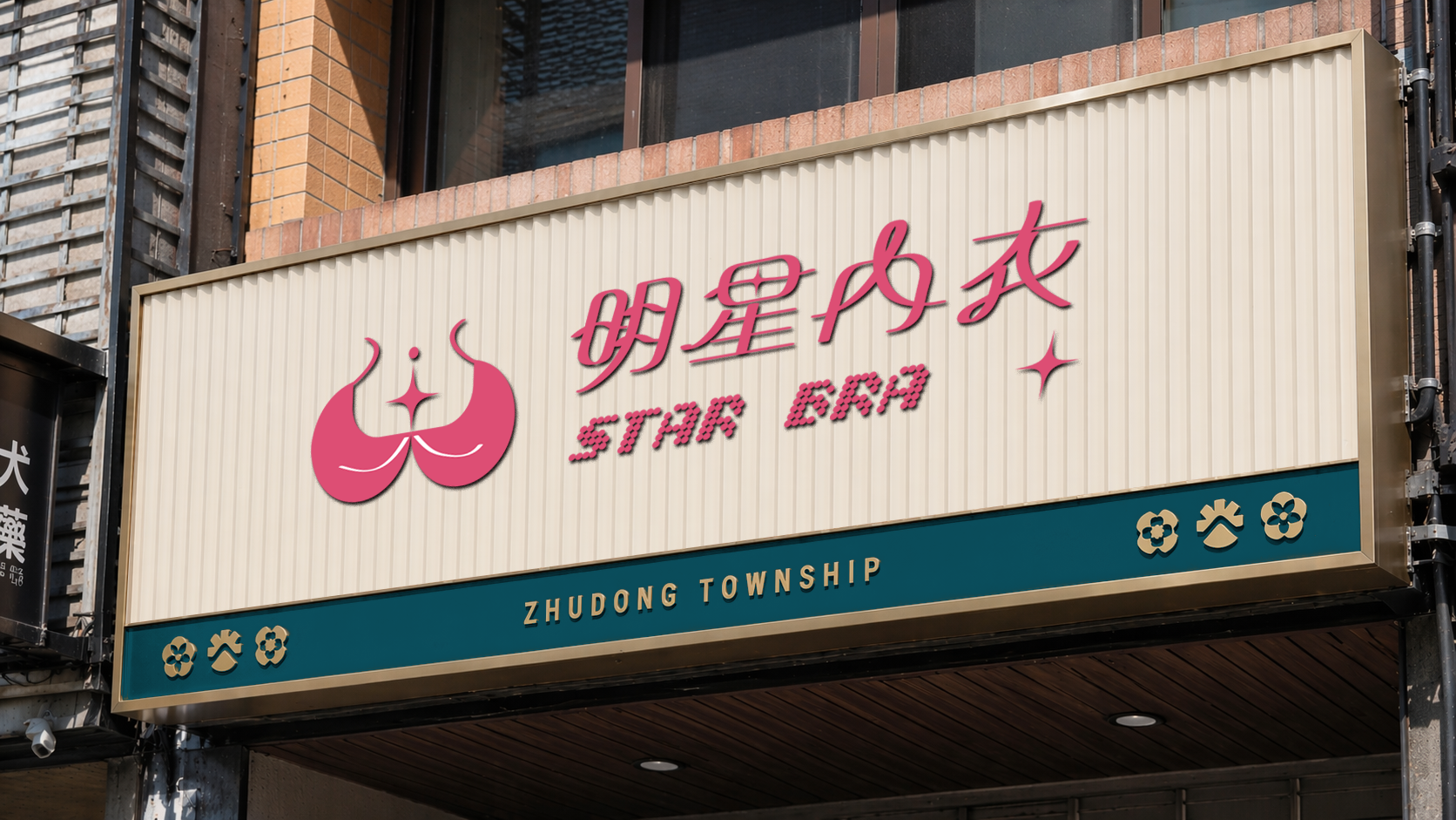
*本專案為「明星內衣 STAR BRA」之視覺識別設計,從招牌重塑出發。標誌以內衣的支撐結構與蕾絲弧度為造型基礎,中心轉化為向外發散的四角星芒,象徵女性散發的自信光采;線條對稱流暢、宛如花瓣舒展,呼應產品的親膚舒適。字體排印上,中文採細膩流線設計仿若絲綢飄動,英文則融入 Y2K 復古點陣風格,將傳統貼身衣物零售轉化為具美學語彙的品牌形象,傳遞「每一位女性都能成為焦點」的品牌精神。
*A visual identity for STAR BRA, developed from a signage redesign. The mark builds on the supportive structure of lingerie and the soft arc of lace, resolving into a four-pointed star that radiates outward — a symbol of the confidence a woman carries. Its symmetrical, fluid linework unfurls like petals, echoing the softness of the product itself. The Chinese logotype flows like silk in motion, while the English typography draws on retro Y2K pixel forms, lifting intimate apparel retail into something closer to an aesthetic statement: every woman can be the center of attention.
The Challenge|原招牌的問題
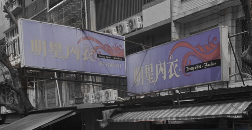
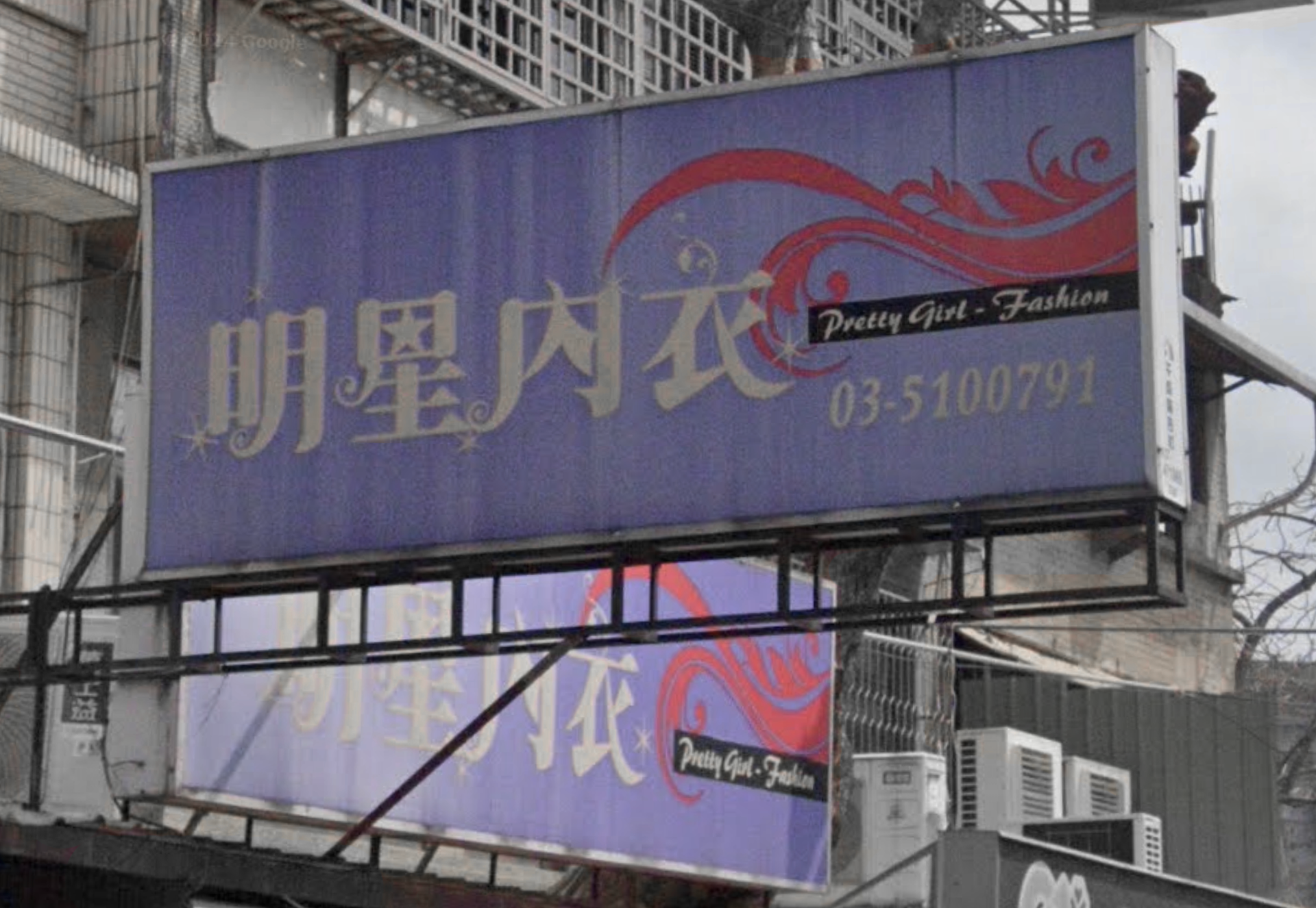
原招牌採用紫底搭配明體字與紅色花藤紋飾,色彩對比強烈但層次雜亂,主標與裝飾線條互相干擾,遠距辨識度不足。英文「Pretty Girl - Fashion」以細筆手寫字呈現,於招牌尺度下幾乎無法閱讀。整體視覺語彙偏向早期傳統內衣店的印象,與現代女性內衣品牌所訴求的自信、時尚定位有明顯落差;兩面招牌的排版與比例也各自獨立,缺乏統一的識別系統。
The original signage paired gold calligraphy with red floral scrollwork on a purple ground — high in contrast but cluttered, with decorative linework competing against the shop name and weakening legibility at a distance. The English line, "Pretty Girl - Fashion," was set in a thin script that all but disappeared at signage scale. The overall visual language read as a traditional neighborhood lingerie shop, at odds with the confidence and contemporary style the brand wanted to project, while the two sign faces followed separate layouts with no shared identity system.
The Redesign|識別重塑
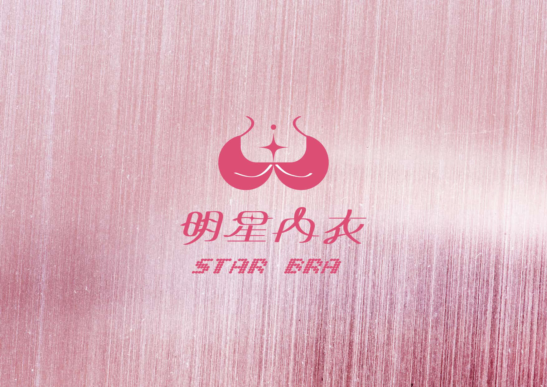
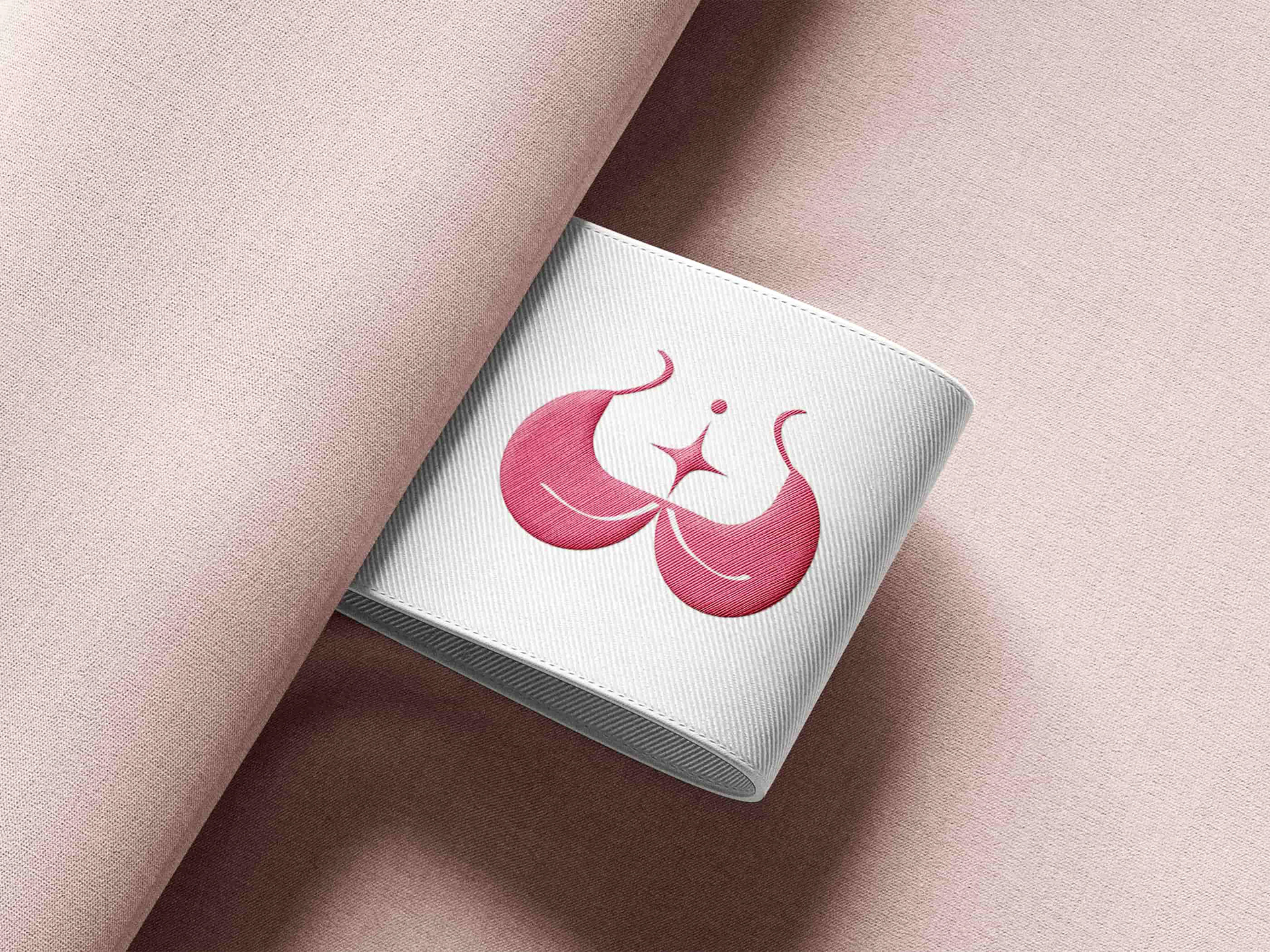
標誌以內衣罩杯的支撐結構與蕾絲的輕盈弧度為造型基礎,兩側對稱線條宛如花瓣舒展,體現產品的親膚舒適;中心收束為向外發散的四角星芒,象徵女性自身散發的自信光采。中文字體採細膩流線設計,筆畫仿若絲綢飄動;英文則融入 Y2K 復古點陣風潮,在精緻與流行語彙之間取得平衡,讓品牌同時具備質感與當代識別度。
The mark begins with the supportive structure of a bra cup and the light arc of lace, its symmetrical lines unfurling like petals to echo the softness of the product. At the center, the form resolves into a four-pointed star radiating outward — the confidence a woman carries on her own. The Chinese logotype is drawn with a fine, flowing line that moves like silk, set against English typography built from retro Y2K pixel forms, balancing refinement with a contemporary edge.
Color|色彩計畫
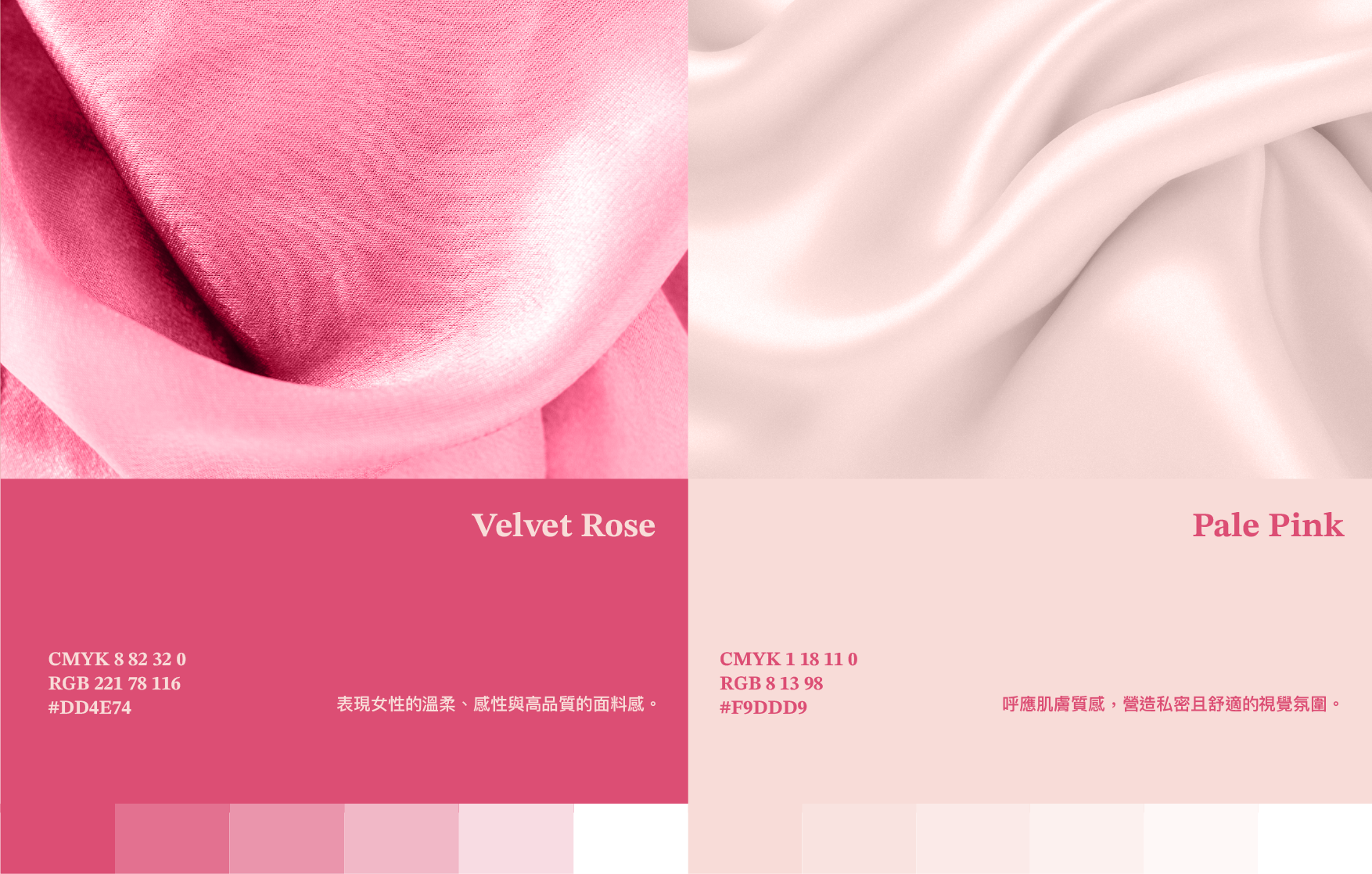
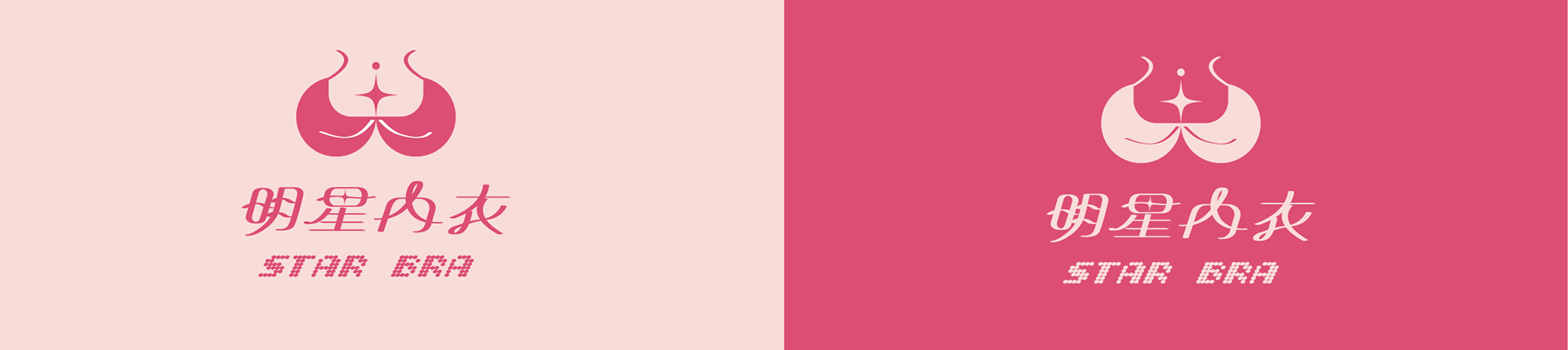
色彩以絲絨玫瑰(Velvet Rose)為主色,表現女性的溫柔、感性與高品質的面料感;輔以淡粉(Pale Pink)呼應肌膚質感,營造私密而舒適的視覺氛圍。相較原招牌的紫底與金字,新色彩系統回歸材質本身的語言,讓品牌從街邊招牌的視覺喧鬧,轉為柔和且具辨識度的存在。
The palette centers on Velvet Rose, carrying the softness, sensuality, and material quality of fine fabric, supported by Pale Pink, which echoes skin and builds an intimate, comfortable atmosphere. In place of the original purple and gold, the new system returns to the language of the material itself — trading visual noise for a presence that is softer and far more recognizable.
Identity System|識別組合規範
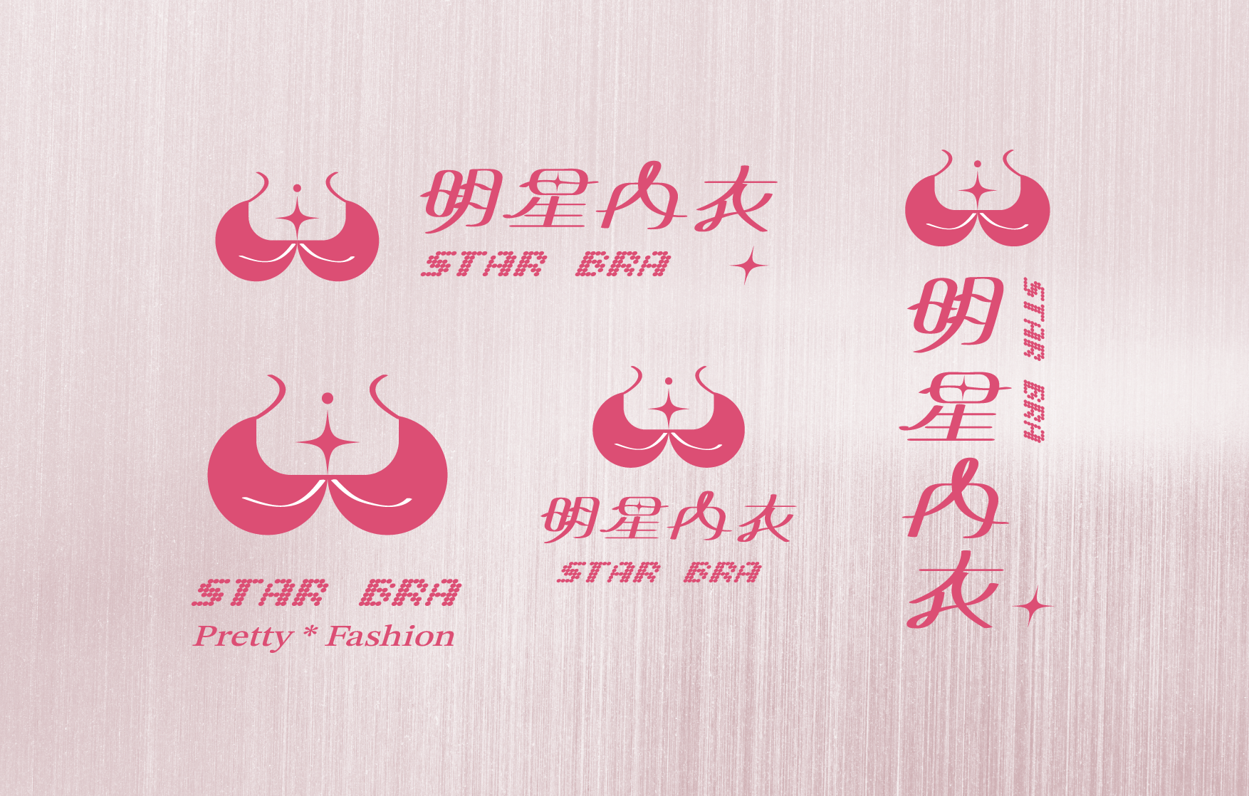
識別建立了橫式、直式與精簡版等多種組合規範,涵蓋含品牌標語「Pretty * Fashion」的完整版到僅保留標誌與中英文的精簡版,確保標誌在橫式招牌、直式招牌與各式尺寸下都能維持一致的比例與辨識度。
The identity includes horizontal, vertical, and simplified lockups, ranging from a full version carrying the brand line "Pretty * Fashion" down to the mark with bilingual type alone — keeping proportion and legibility consistent across horizontal signage, vertical signage, and every size in between.
Extended Application|延伸應用
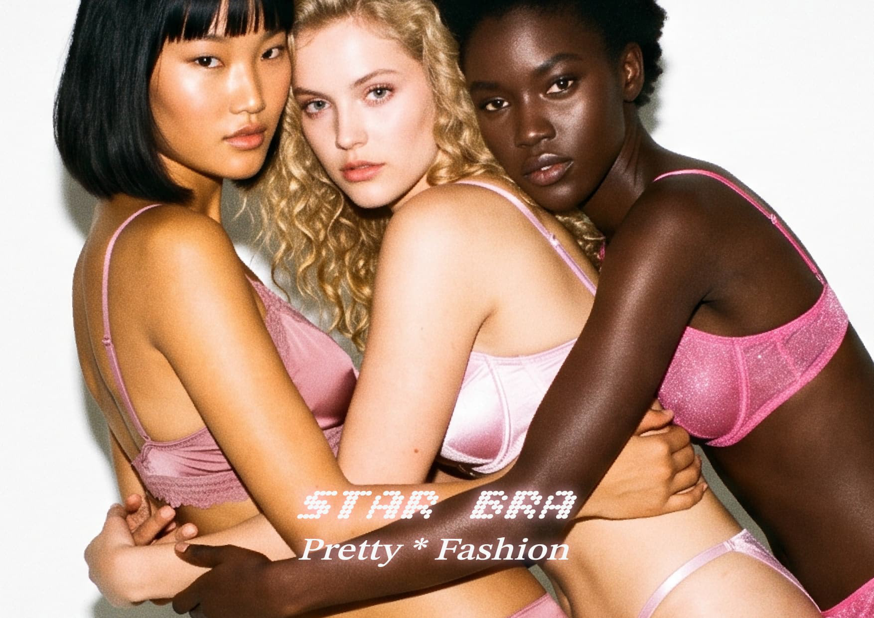
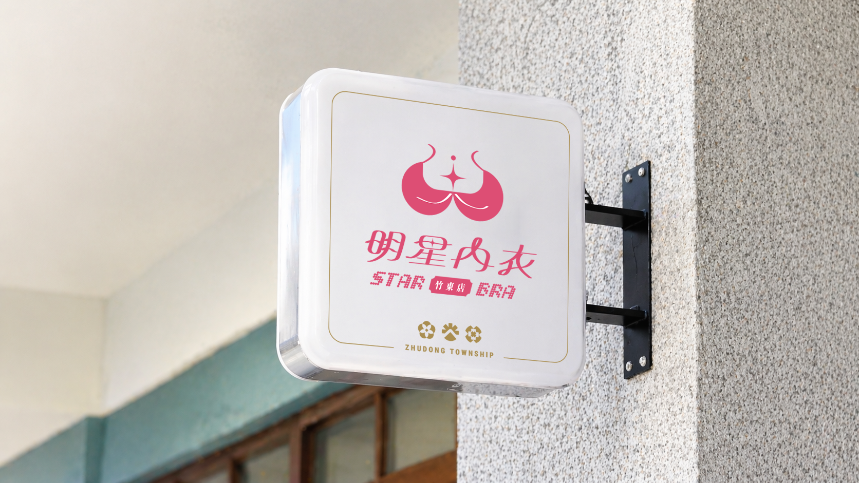
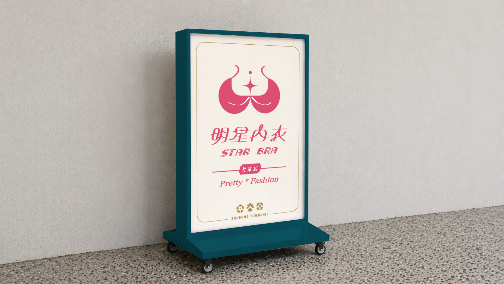
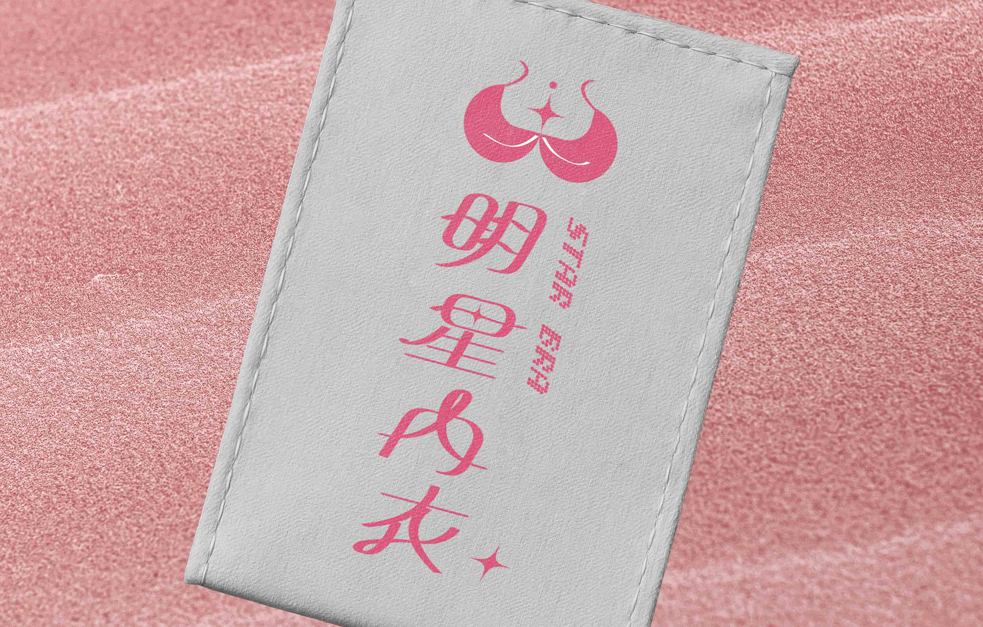
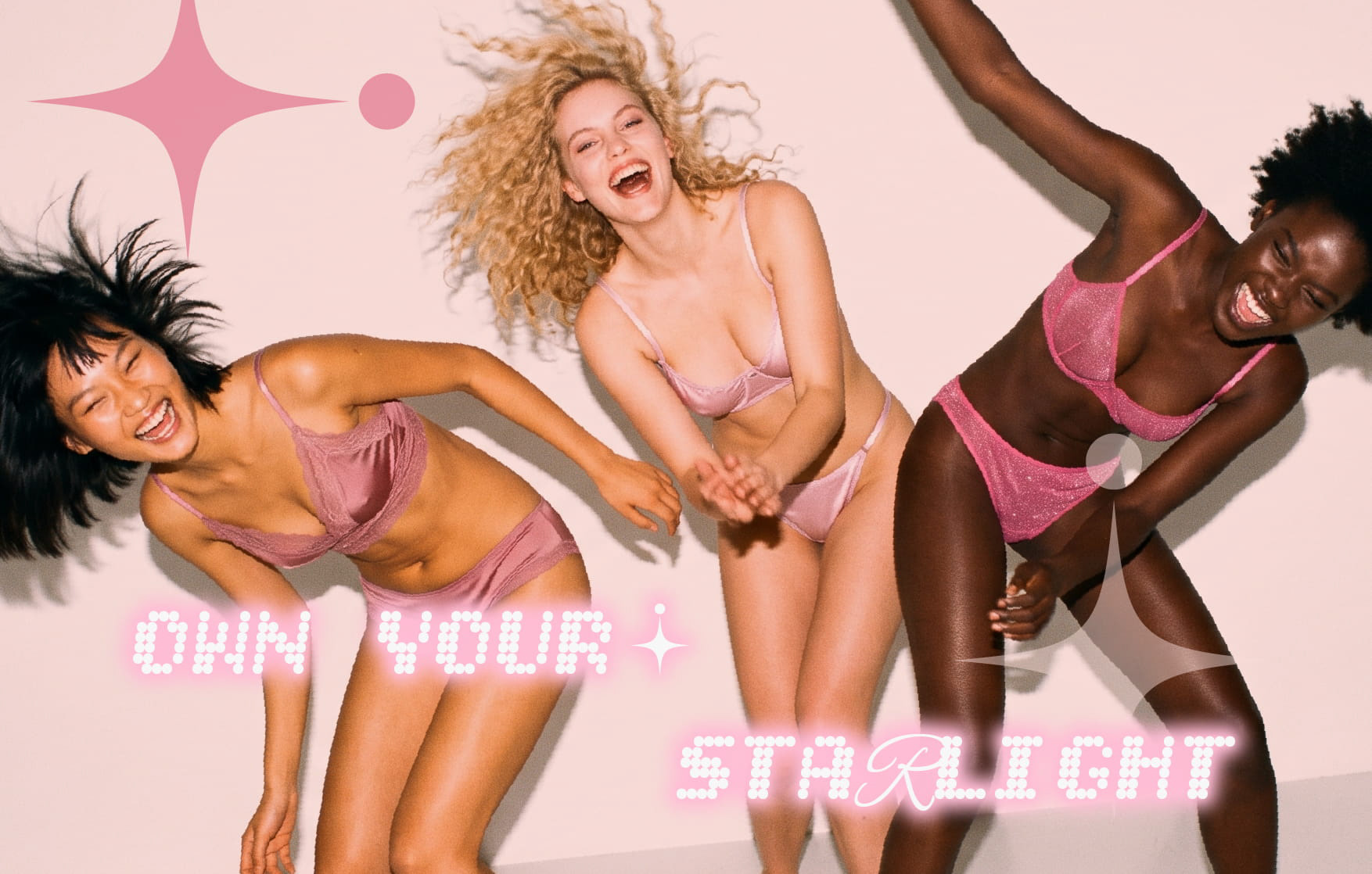
於招牌委託之外,識別進一步延伸應用於品牌主視覺、吊牌與包裝等物件,並以點陣霓虹字延伸出品牌標語「OWN YOUR STARLIGHT」,探索識別系統完整落地的樣貌,驗證其在各式載體上的一致性與延展性。
Beyond the signage commission, the identity was extended across key visuals, hangtags, and packaging, with the brand line "OWN YOUR STARLIGHT" rendered in glowing pixel type — a self-initiated exploration of how the system comes to life in full, and a test of its consistency and adaptability across formats.
Brand | 明星內衣 Star Bra
Client | 富博創意股份有限公司 RICH ERUDITE CREATIVE CO., LTD.
Year | 2026
Role | Visual Identity & Graphic Design
ensu design ©